

Adaptive layouts with ViewThatFits
In iOS 16 SwiftUI introduces a new API to create adaptive layouts ViewThatFits. This API allows us to provide alternative views when a certain view doesn't fit into available space.
I've been experimenting with ViewThatFits to see what kind of layouts we can achieve and I would like to share my findings so far in this post.
# Adaptive arrangements for views with fixed frames
We might have an HStack of views with fixed frames or minimum width set. Depending on the width of the views, this layout can break on smaller devices or in constrained width situations because the views can't adapt.
ViewThatFits lets us provide an alternative arrangement for such views. For example, we can show a HStack when it has enough space to accommodate it and switch to a VStack in smaller space.
ViewThatFits {
    HStack {
        CardStack()
    }
    VStack {
        CardStack()
    }
}
ViewThatFits displays the first view that fits in provided space from the views we pass to it. It will always display only one view. If none of the given views fit in the space, the last view will be displayed even if it doesn't fit.
You can find the demo code for adaptive arrangements on GitHub.
# Avoiding text truncation
In some cases we want our text views to never truncate. In these scenarios we can provide shorter text or even a symbol image if the preferred text doesn't fit in the available space without truncating. ViewThatFits can help with that as well.
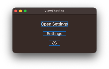
Imagine we would like to define a SettingsButton view. It should always fit on one line, display "Open Settings" text if it fits, otherwise fall back to "Settings" text. If even "Settings" text doesn't fit, then it will display a symbol gear image.
struct SettingsButton: View {
    var body: some View {
        ViewThatFits {
            Text("Open Settings")
            Text("Settings")
            Image(systemName: "gearshape")
        }
        .lineLimit(1)
    }
}
Since in our case the text is constrained vertically by lineLimit(1), it will have to grow horizontally. If it's too long to horizontally fit into available space, ViewThatFits fill fall back to the next best alternative.
Here is how our button will adapt to different frame constraints. The blue lines on the screenshot indicate frame limits.
You can find the demo code for adaptive button on GitHub.
# Expandable text with fixed height
With ViewThatFits we can also build some more interesting layouts with text. For example, we might have some long text that we initially want to be constrained to a specific height, so that it doesn't occupy too much space on screen. If the entire text doesn't fit in the specified height, we want to add a button to let users expand it if they want to.
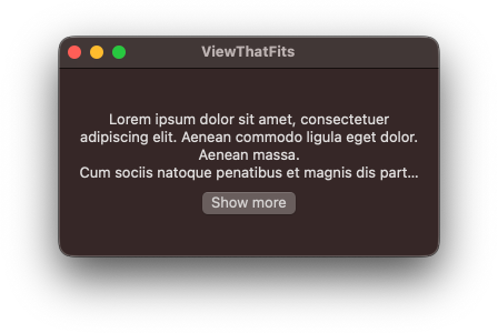
Here is how we can build an expandable text component. If text is expanded, we just show the whole text with no constraints. If it's not expanded, we wrap it in ViewThatFits and constrain its frame. In this case we want the text to wrap and grow vertically to its ideal size, so we'll need to tell ViewThatFits to only check the vertical axis. If the ideal size of the text doesn't fit in the frame, ViewThatFits falls back to the alternative view provided.
struct ExpandableText: View {
    let text: String
    let initialHeight: Double
    @State private var isExpanded = false

    var body: some View {
        if isExpanded {
            Text(text)
            Button("Show less") {
                isExpanded = false
            }
        } else {
            ViewThatFits(in: .vertical) {
                Text(text)
                VStack {
                    Text(text)
                    Button("Show more") {
                        isExpanded = true
                    }
                }
            }
            .frame(height: initialHeight)
        }
    }
}
Since we only want to display "Show more" button if there is more text to show, we need to know that the full text doesn't fit in the frame. In our example, ViewThatFits will only display VStack with the button if the ideal height of non-truncated text didn't fit. This is exactly what we are after.
This example and the following one are inspired by How to check if Text is truncated in SwiftUI post by Federico Zanetello. Before we had ViewThatFits API, we had to measure the text with GeometryReader, pass the size up as a preference and compare sizes of the measured and displayed text ourselves. ViewThatFits makes things much simpler in this case.
You can find the demo code for expandable text on GitHub.

Level up your Swift skills!$35
100+ tips to take your Swift code to the next level
Swift Gems
- Advanced Swift techniques for experienced developers bypassing basic tutorials
- Curated, actionable tips ready for immediate integration into any Swift project
- Strategies to improve code quality, structure, and performance across all platforms
Level up your Swift skills!
100+ tips to take your Swift code to the next level
Swift Gems
# Expandable text with line limit
We might not want to constrain the height of our expandable text, but rather provide the initial line limit for the text. It would be better in situations where we want to show a certain number of lines independent of accessibility font setting.
This is a bit more complicated but still doable with ViewThatFits. We can't just reuse the version of ExpandableText we wrote above, because lineLimit() does not constrain the text in the same way the frame() does. The first text inside ViewThatFits will truncate if it's too large, ViewThatFits will decide that it fits and display the truncated text without "Show more" button.
Instead, we need to do something a little hacky. We'll display the text with the provided line limit. We'll add background() modifier to it with ViewThatFits inside it. The view inside background() modifier is always constrained by the frame of the view background() is applied on, in our case it's the original text view. This means that ViewThatFits will have a constrained frame, the size of which is the original text with the line limit.
With this constrained frame ViewThatFits can do its magic again and pick the view that fits the frame. We set the text inside ViewThatFits to be hidden, so that SwiftUI doesn't attempt to display it, we only need this text for size measurement.
struct ExpandableText: View {
    let text: String
    let initialLineLimit: Int
    @State private var isExpanded = false
    @State private var showButton = false

    var button: Button<Text> {
        if isExpanded {
            return Button("Show less") {
                isExpanded = false
            }
        } else {
            return Button("Show more") {
                isExpanded = true
            }
        }
    }

    var body: some View {
        Text(text)
            .lineLimit(isExpanded ? nil : initialLineLimit)
            .background {
                ViewThatFits(in: .vertical) {
                    Text(text)
                        .hidden()
                    Color.clear
                        .onAppear {
                            showButton = true
                        }
                }
            }
        if showButton {
            button
        }
    }
}
If the hidden text fits the frame, it means that the original text is not truncated, and we don't need to do anything. ViewThatFits will pick it as fitting, but since that text is hidden nothing will happen. We'll only have the original text on screen, which is what we want.
If the hidden text doesn't fit the frame, then ViewThatFits will skip it and pick the next view down. The next view down is Color.clear, it won't display anything but it will still trigger its onAppear closure if picked by ViewThatFits. In this closure we can tell our view that it should display "Show more" button. If this closure is called, it means that the original text is truncated.
You can find the demo code for expandable text with line limit on GitHub.
Note that this solution doesn't seem to work at the moment if ExpandableText is placed in a LazyVStack.
ViewThatFits is a nice addition to the framework and I'm only starting to explore what it has to offer. I think it makes it easier to display alternative views and can help to avoid using too many GeometryReaders that pass preferences up, which can create infinite loops and crashes if not used carefully.
Worth pointing out though, that ViewThatFits might not be appropriate for situations when we need to create layouts with animated transitions.
You can get all the example code for this post on GitHub.
Enhance older apps with SwiftUI!$40
A detailed guide on gradually adopting SwiftUI in UIKit projects
Updated for iOS 18 and Xcode 16!
Integrating SwiftUI into UIKit Apps
- Upgrade your apps with new features like Swift Charts and Widgets
- Support older iOS versions with effective backward-compatible strategies
- Seamlessly bridge state and data between UIKit and SwiftUI using the latest APIs
Enhance older apps with SwiftUI!
A detailed guide on gradually adopting SwiftUI in UIKit projects
Integrating SwiftUI
into UIKit Apps
Updated for iOS 18 and Xcode 16!