Build and style a chart with the new Swift Charts framework
Apple have just announced Swift Charts framework that we can use to create charts in our applications. From my quick look over the API, the framework can provide a lot more than the basic graphics generated by apps like Numbers etc. In this post I would like to share my initial experiments with the APIs. I hope to get into more detail in future articles, so follow me on X and check back here for more articles and tips throughout the WWDC 2022 week and after.
For the examples, I'll be using a data set of popular US baby names over time.
# Build a stacked area chart
Here is how we can create a simple stacked area chart.
struct SimpleBabyNameView: View {
    let data: [BabyNamesDataPoint]

    var body: some View {
        Chart(data) { point in
            AreaMark(
                x: .value("Date", point.year),
                y: .value("Count", point.count)
            )
            .foregroundStyle(
                by: .value("Name", point.name)
            )
        }
    }
}
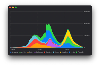
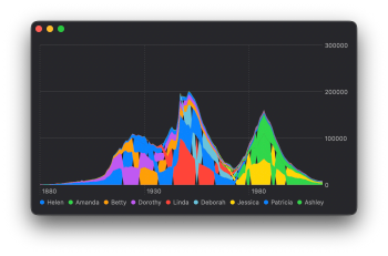
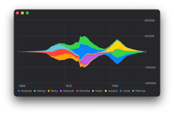
The basic chart is great but it just does not fit in the aesthetics of my app. Stacked areas are all built up from the base of the chart and create a very heavy feeling. I would like to instead play around with creating a streamgraph to better show the organic flow over time and centre the data visually. Luckily, Swift Charts make this really easy!
By changing the constructor of AreaMark to the one that takes a MarkStackingMethod option, I can build a stacked area graph around the centre.
struct SimpleBabyNameView: View {
    let data: [BabyNamesDataPoint]

    var body: some View {
        Chart(data) { point in
            AreaMark(
                x: .value("Date", point.year),
                y: .value("Count", point.count),
                stacking: .center
            )
            .foregroundStyle(
                by: .value("Name", point.name)
            )
        }
    }
}
# Customise the chart style
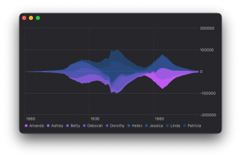
I would now like to look into adjusting the chart colours. The bright colours that have been automatically chosen are really good for quickly reading the chart, but they clash with the rest of my app so I need to come up with something else.
I can adjust the colour ramp that is being used with the chartForegroundStyleScale(range:) modifier. It can be placed at multiple levels within the chart structure. I will place it directly on the Chart view, to apply the customisation to all data ranges within the chart.
struct SimpleBabyNameViews: View {
    let data: [BabyNamesDataPoint]

    var body: some View {
        Chart(data) { point in
            AreaMark(
                x: .value("Date", point.year),
                y: .value("Count", point.count),
                stacking: .center
            )
            .foregroundStyle(
                by: .value("Name", point.name)
            )
        }
        .chartForegroundStyleScale(
            range: Gradient (
                colors: [
                    .purple,
                    .blue.opacity(0.3)
                ]
            )
        )
    }
}
# Add labels to the chart
This chart is starting to look like it will fit nicely into my app, however, it's now quite difficult to match the name to the corresponding region in the graph. It would be much nicer if I could place the labels directly on the graph.
I need to position these labels in such a way that it's clear what section they are labelling and they should not overlap. It would be perfect if I could label the point on the graph where the baby name was at its highest proportion of usage.
# Compute values for annotations
First thing to do is to find these dates. For this kind of work I like to use SwiftUI task(id:) modifier. It lets me easily run code asynchronously without blocking the main thread.
struct SimpleBabyNameViews: View {
    let data: [BabyNamesDataPoint]

    // We need a spot to save computed data
    @State var datesOfMaximumProportion: [
        (date: Date, name: String)
    ] = []

    var body: some View {

        //.... existing Chart code goes here ....//

        .task(id: data.count) {
            // reset the state
            self.datesOfMaximumProportion = []

            var namesToMaxProportion: [
                String: (proportion: Float, date: Date)
            ] = [:]

            // Find the date
            for point in self.data {
                if (
                    namesToMaxProportion[point.name]?
                        .proportion ?? 0
                ) < point.proportion {
                    namesToMaxProportion[point.name] =
                        (point.proportion, point.year)
                }
            }

            // Re-shape this into a flat list
            self.datesOfMaximumProportion = namesToMaxProportion
                .map { (key: String, value) in
                    (value.date, key)
                }
        }
    }
}
With these values computed I now need to use them to place text on the graph. Looking through the Chart APIs I can't find a way to place text directly on the chart, but I can annotate a RulerMark by using annotation() modifier.
# Add vertical rulers
I need to start by drawing vertical rulers at the maximum proportion dates.
In the chart code we have so far it's not clear how I can loop over my second datesOfMaximumProportion array. But by making use of multiple ForEach views instead of passing the data to the Chart constructor, I can create a single chart with multiple data sets.
struct SimpleBabyNameViews: View {
    let data: [BabyNamesDataPoint]

    @State var datesOfMaximumProportion: [
        (date: Date, name: String)
    ] = []

    var body: some View {
        Chart {
            ForEach(data) { point in
                AreaMark(
                    x: .value("Date", point.year),
                    y: .value("Count", point.count),
                    stacking: .center
                )
                .foregroundStyle(by: .value("Name", point.name))
            }
            ForEach(
                datesOfMaximumProportion, id: \.name
            ) { point in
                // We can now plot something here...
            }
        }
        .chartForegroundStyleScale(...)
        .task(id: data.count) { ... }
    }
}
Now I can add my vertical rulers.
struct SimpleBabyNameViews: View {

    // ...

    var body: some View {
        Chart {
            ForEach(data) { point in
                // ... draw stacked area marks here
            }
            ForEach(
                datesOfMaximumProportion, id: \.name
            ) { point in
                RuleMark(
                    x: .value(
                        "Date of highest popularity for \(point.name)",
                        point.date
                    )
                )
            }
        }
        .chartForegroundStyleScale(...)
        .task(id: data.count) { ... }
    }
}
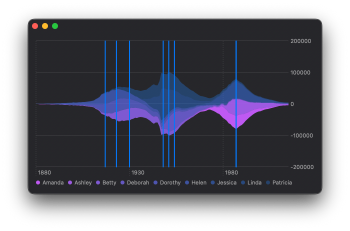
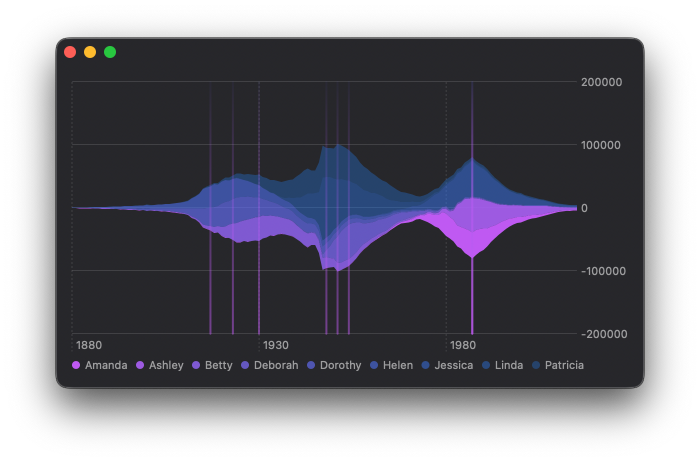
Before I look into adding annotations, I would like to make the ruler lines a little nicer. I feel that these lines by themselves add some value to the graph and help highlight the dates corresponding to the peak popularity points. I found using a LinearGradient from top to bottom creates a gradient fill based from the top to the bottom of the charts frame. Adding a blendMode() modifier with the value darken reduces the interference that these lines have on the main charts content.
struct SimpleBabyNameViews: View {

    // ...

    var body: some View {
        Chart {
            ForEach(data) { ... }
            ForEach(
                datesOfMaximumProportion, id: \.name
            ) { point in
                RuleMark(
                    x: .value(
                        "Date of highest popularity for \(point.name)",
                        point.date
                    )
                )
                .foregroundStyle(
                    LinearGradient(
                        gradient: Gradient (
                            colors: [
                                .indigo.opacity(0.05),
                                .purple.opacity(0.5)
                            ]
                        ),
                        startPoint: .top,
                        endPoint: .bottom
                    ).blendMode(.darken)
                )
            }
        }
        .chartForegroundStyleScale(...)
        .task(id: data.count) { ... }
    }
}
# Annotate the rulers on the chart
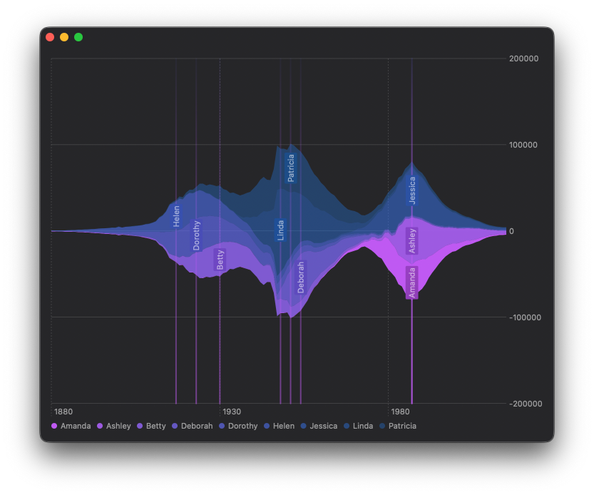
The chart is now looking beautiful but I did get sidetracked, I need to figure out how to position the text labels in the correct vertical spot in the middle of each of their corresponding sections.
I have already sorted my dataset by name to ensure the stacked area graph renders correctly. Now I can compute the top and bottom positions of the area for a given name on its most popular date.
I will extend the task block to get the positions within which I need to centre the labels.
struct SimpleBabyNameViews: View {
    let data: [BabyNamesDataPoint]

    @State var datesOfMaximumProportion: [
        (date: Date, name: String, yStart: Float, yEnd: Float)
    ] = []

    var body: some View {
        Chart { ... }
        .chartForegroundStyleScale( ... )

        .task(id: data.count) {
            // ... compute namesToMaxProportion as above ...

            self.datesOfMaximumProportion = namesToMaxProportion
                .map { (key: String, value) in
                    let name = key
                    var count = 0
                    var before = 0
                    var after = 0

                    // Loop over all the datapoints
                    for point in self.data {
                        // Only consider points of the same year

                        if point.year != value.date { continue }
                        if point.name == name {
                            count = point.count
                            continue
                        }

                        if count != 0 {
                            // These sections come after
                            after += point.count
                        } else {
                            // These sections come before
                            before += point.count
                        }
                    }

                    let total = count + after + before
                    // The height is centred about the x-axis
                    let lowestValue = -1 * Float(total) / 2.0
                    let yEnd = lowestValue + Float(before)
                    let yStart = yEnd  + Float(count)

                    return (value.date, key, yStart, yEnd)
                }
        }
    }
}
With this y-range I can now draw a much smaller (invisible) ruler at the date position from yStart to yEnd and place an annotation in its centre. I also rotated the text and placed a background behind it to make it nice and easy to read. I used the ultraThinMaterial, so that the background adopts the colour of the section it's labelling.
struct SimpleBabyNameViews: View {

   // ...

    var body: some View {
        Chart {
            ForEach(data) { point in ... }
            ForEach(
                datesOfMaximumProportion,
                id: \.name
            ) { point in ... }

            // Loop again to ensure labels are on top
            ForEach(
                datesOfMaximumProportion,
                id: \.name
            ) { point in

                // Create a ruler
                RuleMark(
                    x: .value(
                        "Date of highest popularity for \(point.name)",
                        point.date
                    ),
                    yStart: .value("", point.yStart),
                    yEnd: .value("", point.yEnd)
                )

                // Set the line width to 0 so as to make it invisible
                .lineStyle(StrokeStyle(lineWidth: 0))

                // Place an annotation in the centre of the ruler
                .annotation(
                    position: .overlay,
                    alignment: .center,
                    spacing: 4
                ){
                    // create the annotation
                    Text(point.name)
                        .font(.subheadline)
                        .padding(2)
                        .fixedSize()

                        // Provide a background pill
                        .background(
                            RoundedRectangle(cornerRadius: 2)
                                .fill(.ultraThinMaterial)
                        )
                        .foregroundColor(.secondary)

                        // Rotate the pill 90 degrees
                        .rotationEffect(
                            .degrees(-90),
                            anchor: .center
                        )
                        .fixedSize()
                }
            }
        }
        .chartForegroundStyleScale(...)
        .task(id: data.count) {...}
    }
}
You can find the code for this chart in our GitHub project, this includes the code to download and parse the CSV file.
Swift Charts are designed to work with SwiftUI, but you can still use them in a UIKit project. You can check out Natalia Panferova's recent book Integrating SwiftUI into UIKit Apps for ways to add SwiftUI views to an existing UIKit project to take full advantage of the new iOS 16 APIs.


