SwiftUI matched geometry effect in a custom segmented control
I'm working on a small macOS utility app and using it as an opportunity to experiment with some SwiftUI features. As part of this project, I decided to build a custom segmented control and looked for a simple, clean way to animate a capsule shape that highlights the selected option as it transitions between choices when the user interacts with the control. I found that using matchedGeometryEffect() was the most straightforward solution.
While many examples of the matchedGeometryEffect() modifier focus on hero animations, it can also be applied in other contexts, like my custom segmented control. Here, it's not used to transition geometry when one view disappears and another appears. Instead, it matches the geometry of a non-source view to that of the source view while both remain present in the view hierarchy simultaneously.
Let me show you how I set it up.
First, I defined the foundation of my segmented control: an HStack of buttons. Tapping a button updates the selection state. I also added a background around all the options to form the control. At this stage, tapping a button changes the selection, but there’s no visual indication of the currently selected option.
enum SegmentedControlState: String, CaseIterable, Identifiable {
    var id: Self { self }

    case option1 = "Option 1"
    case option2 = "Option 2"
    case option3 = "Option 3"
}

struct SegmentedControl: View {
    @State private var state: SegmentedControlState = .option1

    var body: some View {
        HStack {
            ForEach(SegmentedControlState.allCases) { state in
                Button {
                    self.state = state
                } label: {
                    Text(state.rawValue)
                        .padding(10)
                }
            }
        }

        .background(.indigo)
        .clipShape(
            Capsule()
        )
        .buttonStyle(.plain)
    }
}
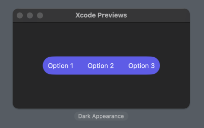
Next, I added another capsule in the background of the HStack containing the buttons. This capsule will eventually highlight the selected option once everything is set up. For now, however, it simply fills the entire available space within the control, minus some padding.
struct SegmentedControl: View {
    @State private var state: SegmentedControlState = .option1

    var body: some View {
        HStack {
            ...
        }

        .background(
            Capsule()
                .fill(.background.tertiary)
        )
        .padding(6)

        .background(.indigo)
        .clipShape(
            Capsule()
        )
        .buttonStyle(.plain)
    }
}
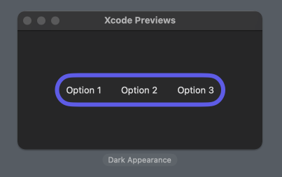
To make the inner capsule dynamically match the size and position of the selected option, I used the matchedGeometryEffect(). First, I defined a namespace with the @Namespace property wrapper. Then, I applied the matchedGeometryEffect() modifier to the inner capsule, linking it to the namespace and using the selection state as the identifier. This identifier ensures that the capsule matches the geometry of the source view with the same ID. Additionally, it’s important to set the capsule as a non-source view by specifying isSource: false.
struct SegmentedControl: View {
    @State private var state: SegmentedControlState = .option1
    @Namespace private var segmentedControl

    var body: some View {
        HStack {
            ...
        }

        .background(
            Capsule()
                .fill(.background.tertiary)
                .matchedGeometryEffect(
                    id: state,
                    in: segmentedControl,
                    isSource: false
                )
        )
        .padding(6)

        ...
    }
}
For now, nothing will visibly change since it's not specified which view should act as the source for the geometry. That’s the next step.
I applied the matchedGeometryEffect() modifier to each button in the HStack, assigning each button a unique ID corresponding to the state it represents. Note that I didn’t specify the isSource parameter for the buttons, as it defaults to true. This means the currently selected button automatically acts as the source for the matched geometry effect, allowing the capsule to align with the button whose ID matches the selection state.
struct SegmentedControl: View {
    @State private var state: SegmentedControlState = .option1
    @Namespace private var segmentedControl

    var body: some View {
        HStack {
            ForEach(SegmentedControlState.allCases) { state in
                Button {
                    self.state = state
                } label: {
                    Text(state.rawValue)
                        .padding(10)
                }
                .matchedGeometryEffect(
                    id: state,
                    in: segmentedControl
                )
            }
        }

        .background(
            Capsule()
                .fill(.background.tertiary)
                .matchedGeometryEffect(
                    id: state,
                    in: segmentedControl,
                    isSource: false
                )
        )
        .padding(6)

        ...
    }
}
If we check the preview now, we’ll see the capsule positioned just behind the selected option, matching its size and position. By default, the matched geometry effect aligns both size and position, but this behavior can be customized using the properties parameter. In this case, however, the default behavior works perfectly.
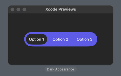
To animate the capsule when switching options, I wrapped the state change in a withAnimation block.
struct SegmentedControl: View {
    @State private var state: SegmentedControlState = .option1
    @Namespace private var segmentedControl

    var body: some View {
        HStack {
            ForEach(SegmentedControlState.allCases) { state in
                Button {
                    withAnimation {
                        self.state = state
                    }
                } label: {
                    Text(state.rawValue)
                        .padding(10)
                }
                .matchedGeometryEffect(
                    id: state,
                    in: segmentedControl
                )
            }
        }

        ...
    }
}
Now, the capsule slides smoothly between options as the selection changes.
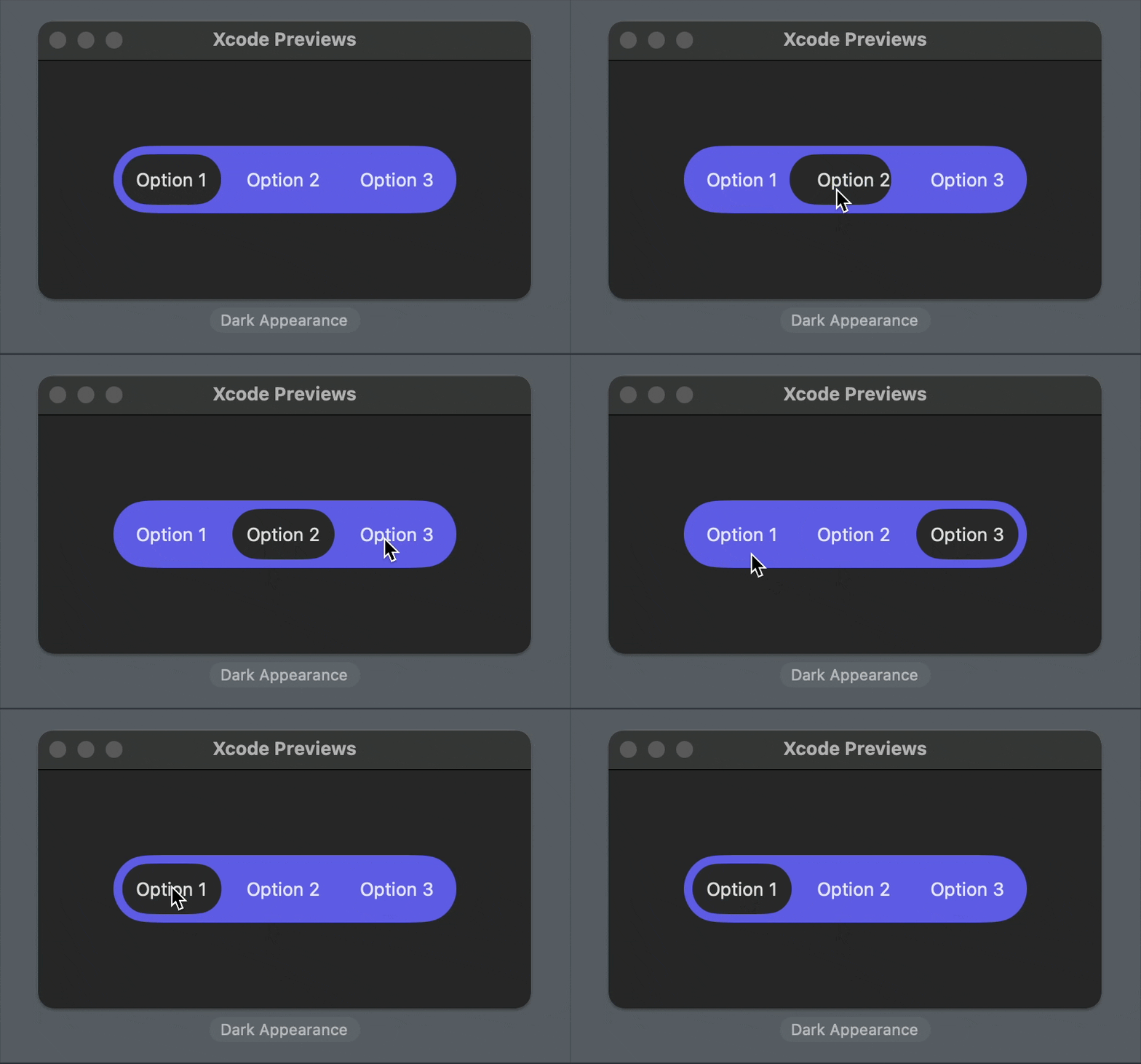
With just a few lines of code, I got a custom segmented control with a sliding animation. Using the matched geometry effect makes this approach much cleaner and simpler compared to alternative methods.
Keep in mind that when creating custom UI components, it's essential to test for accessibility features like Dynamic Type and VoiceOver. This example focuses on using the matched geometry effect for the background animation, so be sure to add any required accessibility functionality if you use it in your app. Here is a good accessibility solution using accessibilityRepresentation() from Bas Broek.
Since SwiftUI doesn’t yet allow custom styles for pickers, creating a custom segmented control like this requires building it as a separate component.
You can find the code example for this post on GitHub.
If you want to build a strong foundation in SwiftUI, my new book SwiftUI Fundamentals takes a deep dive into the framework’s core principles and APIs to help you understand how it works under the hood and how to use it effectively in your projects.
For more resources on Swift and SwiftUI, check out my other books and book bundles.


