

Customizing the appearance of symbol images in SwiftUI
Symbol images are vector-based icons from Apple's SF Symbols library, designed for use across Apple platforms. These scalable images adapt to different sizes and weights, ensuring consistent, high-quality icons throughout our apps. Using symbol images in SwiftUI is straightforward with the Image view and the system name of the desired symbol. Here's a quick example:
import SwiftUI

struct ContentView: View {
    var body: some View {
        Image(systemName: "star")
    }
}


There are various ways to customize the appearance of symbol images. Let's explore how to do that in SwiftUI.
# Size
Even though a symbol is placed inside an Image view, it should be treated more like text. To adjust the size of a symbol, we can apply the font() modifier, just like with a Text view. This allows us to align the size of the symbol with different text styles, ensuring visual consistency in our UI.
HStack {
    Image(systemName: "star")
        .font(.title)

    Image(systemName: "star")
        .font(.body)

    Image(systemName: "star")
        .font(.caption)
}


We can adjust the weight of the symbol using the fontWeight() modifier. This modifier changes the thickness of the symbol's strokes, allowing us to match or contrast the symbol with the surrounding text.
HStack {
    Image(systemName: "star")
        .fontWeight(.light)

    Image(systemName: "star")
        .fontWeight(.bold)

    Image(systemName: "star")
        .fontWeight(.black)
}


To scale the image relative to its font size, we should use the imageScale() modifier. There are three options small, medium, and large, which scale the symbol proportionally based on its font size. If the font is not set explicitly, the symbol will inherit the font from the current environment.
HStack {
    Image(systemName: "star")
        .imageScale(.small)

    Image(systemName: "star")
        .imageScale(.medium)

    Image(systemName: "star")
        .imageScale(.large)
}
.font(.headline)


It's not recommended to resize symbol images by applying the resizable() modifier and setting a frame, as we would with other images. When resizable() is used, the image stops being a symbol image, which can affect its layout and alignment with text.


Enhance older apps with SwiftUI!$40
A detailed guide on gradually adopting SwiftUI in UIKit projects
Updated for iOS 26 and Xcode 26!
Integrating SwiftUI into UIKit Apps
- Upgrade your apps with new features like Swift Charts and Widgets
- Support older iOS versions with effective backward-compatible strategies
- Seamlessly bridge state and data between UIKit and SwiftUI using the latest APIs
Enhance older apps with SwiftUI!
A detailed guide on gradually adopting SwiftUI in UIKit projects
Integrating SwiftUI
into UIKit Apps
Updated for iOS 26 and Xcode 26!
# Color
Customizing the color of symbol images in SwiftUI is straightforward using the foregroundStyle() view modifier. This modifier allows us to set the color of the symbol image directly.
Image(systemName: "star")
    .foregroundStyle(.orange)


The foregroundStyle() modifier can take any ShapeStyle, including gradients, which opens up a wide range of customization possibilities for our symbol images. In this example, the star symbol uses a LinearGradient with yellow and red colors, transitioning from the top to the bottom.
Image(systemName: "star")
    .foregroundStyle(
        LinearGradient(
            colors: [.yellow, .red],
            startPoint: .top,
            endPoint: .bottom
        )
    )


# Rendering mode
We can customize the appearance of symbol images further by using different rendering modes. SF Symbols have four different rendering modes that change the symbol’s colors and appearance. Some rendering modes keep the entire icon the same color, while others allow for multiple colors.
To set the preferred rendering mode for a symbol image in SwiftUI, we use the symbolRenderingMode() modifier.
# Monochrome
Monochrome is the default rendering mode. In this mode, each layer of the symbol is the same color.
Image(systemName: "thermometer.snowflake")
    .symbolRenderingMode(.monochrome)


# Hierarchical
Hierarchical mode renders symbols as multiple layers, with different opacities applied to the foreground style. The hierarchy of the layers and their opacities are predefined within each symbol, but we can still customize the color of the layers using the foregroundStyle() modifier.
HStack {
    Image(systemName: "thermometer.snowflake")
    Image(systemName: "thermometer.snowflake")
        .foregroundStyle(.indigo)
}
.symbolRenderingMode(.hierarchical)
The symbolRenderingMode() modifier can be applied either directly to an Image view or set in the environment by applying it to a parent view containing multiple symbol images. This way, all symbol images inside the parent will be affected.


# Palette
Palette mode allows symbols to be rendered with multiple layers, each layer having a different color. This mode is ideal for creating colorful, multi-layered icons.
Image(systemName: "thermometer.snowflake")
    .symbolRenderingMode(.palette)
    .foregroundStyle(.blue, .teal, .gray)
Interestingly, we don't need to explicitly specify the palette rendering mode. If we apply more than one style inside the foregroundStyle() modifier, palette mode will be activated automatically.
Image(systemName: "thermometer.snowflake")
    .foregroundStyle(.blue, .teal, .gray)


If we specify only two colors for a symbol that defines three levels of hierarchy, the secondary and tertiary layers will use the same color.
Image(systemName: "thermometer.snowflake")
    .foregroundStyle(.blue, .gray)


# Multicolor
Multicolor mode renders symbols with their inherent styles, using a fixed set of colors defined by Apple. When using multicolor rendering, we cannot customize the colors of the symbol, it will use the predefined colors, which we can preview in the SF Symbols app. Even if we set a foregroundStyle() while the multicolor rendering mode is activated, the foreground style customization will be ignored.
HStack {
    Image(systemName: "thermometer.snowflake")
    Image(systemName: "thermometer.sun.fill")

}
.symbolRenderingMode(.multicolor)


It's worth noting that since these colors are fixed, they don't adapt to light and dark mode. For example, our thermometer symbol has white outlines that will be invisible on a white background.
Not all symbols support every rendering mode. Symbols with fewer layers may look the same across modes, with hierarchical and palette modes appearing similar to monochrome.


Level up your Swift skills!$35
100+ tips to take your Swift code to the next level
Swift Gems
- Advanced Swift techniques for experienced developers bypassing basic tutorials
- Curated, actionable tips ready for immediate integration into any Swift project
- Strategies to improve code quality, structure, and performance across all platforms
Level up your Swift skills!
100+ tips to take your Swift code to the next level
Swift Gems
# Variable value
When displaying a symbol image in SwiftUI, we can provide an optional value between 0.0 and 1.0 that the rendered image can use to customize its appearance. If the symbol doesn’t support variable values, this parameter has no effect. We should check in the SF Symbols app to determine which symbols support variable values.
HStack {
    Image(systemName: "speaker.wave.3", variableValue: 0)
    Image(systemName: "speaker.wave.3", variableValue: 0.3)
    Image(systemName: "speaker.wave.3", variableValue: 0.6)
    Image(systemName: "speaker.wave.3", variableValue: 0.9)
}

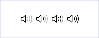
With variable values, we can represent a characteristic that can change over time, like capacity or strength. This allows the symbol's appearance to change dynamically based on the state of our application.
struct ContentView: View {
    @State private var value = 0.5

    var body: some View {
        VStack {
            Image(
                systemName: "speaker.wave.3",
                variableValue: value
            )
            Slider(value: $value, in: 0...1)
                .padding()
        }
        .padding()
    }
}
In this example, the symbol speaker.wave.3 changes its appearance based on the value provided by the Slider.


We should use variable values to communicate changes in status, such as volume, battery level, or signal strength, providing users with a clear visual representation of dynamic states. To convey depth and visual hierarchy, we should use the hierarchical rendering mode, which elevates certain layers and distinguishes foreground and background elements within a symbol.
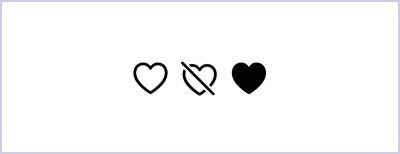
# Design variants
Symbols can come in different design variants, such as fill and slash, for example, to help communicate specific states and actions. The slash variant can indicate that an item or action is unavailable, while the fill variant can signify selection.
In SwiftUI, we can use the symbolVariant() modifier to apply these variants.
HStack {
    Image(systemName: "heart")

    Image(systemName: "heart")
        .symbolVariant(.slash)

    Image(systemName: "heart")
        .symbolVariant(.fill)
}

Additionally, some symbols can be enclosed within shapes such as circles, squares, or rectangles to enhance their visual context
HStack {
    Image(systemName: "heart")
        .symbolVariant(.circle)

    Image(systemName: "heart")
        .symbolVariant(.square)

    Image(systemName: "heart")
        .symbolVariant(.rectangle)
}

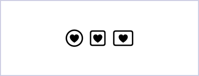
Different symbol variants serve various design purposes. The outline variant is effective in toolbars, navigation bars, and lists, where symbols are often displayed alongside text. Enclosing symbols in shapes like circles or squares can enhance legibility, especially at smaller sizes. The fill variant, with its solid areas, gives symbols more visual emphasis, making it suitable for iOS tab bars, swipe actions, and scenarios where an accent color indicates selection.
In many cases, the view displaying the symbol automatically chooses the appropriate variant. For example, an iOS tab bar typically uses the fill variant, while a navigation bar prefers the outline variant. This automatic selection ensures that symbols are used effectively in different contexts without needing explicit specification.
Enhancing symbol images in SwiftUI can significantly improve our app's look and feel. By adjusting size, color, rendering modes, variable values, and design variants, we can create icons that make our app more intuitive and visually appealing. SwiftUI makes these adjustments straightforward, enabling us to easily implement and refine these customizations for a better user experience.
If you are looking to build a strong foundation in SwiftUI, my book SwiftUI Fundamentals takes a deep dive into the framework's core principles and APIs to help you understand how it works under the hood and how to use it effectively in your projects. And my new book The SwiftUI Way helps you adopt recommended patterns, avoid common pitfalls, and use SwiftUI's native tools appropriately to work with the framework rather than against it.
For more resources on Swift and SwiftUI, check out my other books and book bundles.


Work with SwiftUI. Not against it.$35
A field guide to SwiftUI patterns and anti-patterns
The SwiftUI Way
- Avoid common SwiftUI pitfalls
- Build deeper intuition for the framework
- Gain insights from a former SwiftUI Engineer at Apple
Work with SwiftUI. Not against it.
A field guide to SwiftUI patterns and anti-patterns
The SwiftUI Way