

Large content viewer in SwiftUI
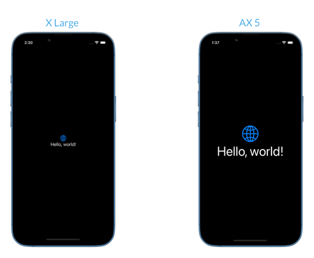
iPhone users can adjust preferred text sizes in their device settings. There are 7 text sizes available by default from extra small to extra-extra-extra large. Users can also enable Larger Text accessibility setting to get access to five larger accessibility sizes. People with low vision rely on accessibility text sizes to make app content readable for them. When we use system fonts and symbol images in our apps we get dynamic type size support automatically.
But not all UI scales with dynamic type size by default. Elements in toolbars, navigation bars and tab bars usually don't grow to leave as much space as possible for the main content in the app.
# Large content viewer in system components
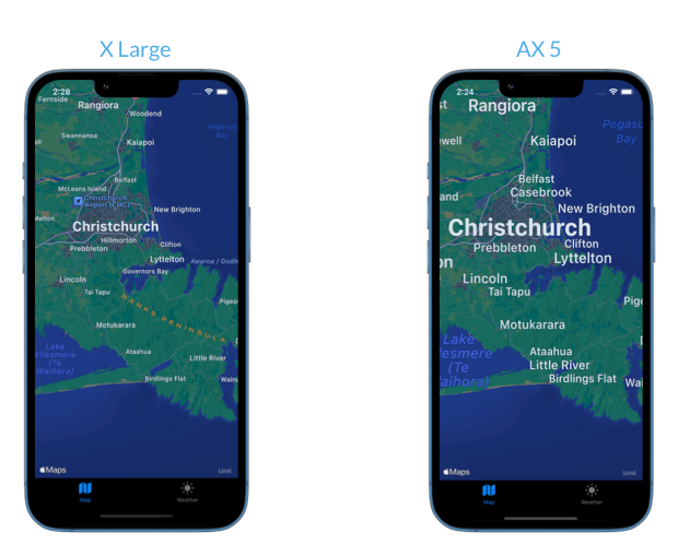
Let's look at an example app with a tab bar showing a map and the current weather in the user's location. We can see that only the text in the main area adjusts to match the size setting. The buttons in the tab bar keep their original size.
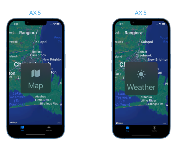
When we use the built-in SwiftUI TabView component, people with low vision can read the content in the bar by long pressing on the buttons. This feature is called large content viewer and it's automatically activated for system toolbars when one of the accessibility text sizes is set. The user can swipe on the bar to get to the next item, and when they let go the button is considered tapped.
# Large content viewer in custom components
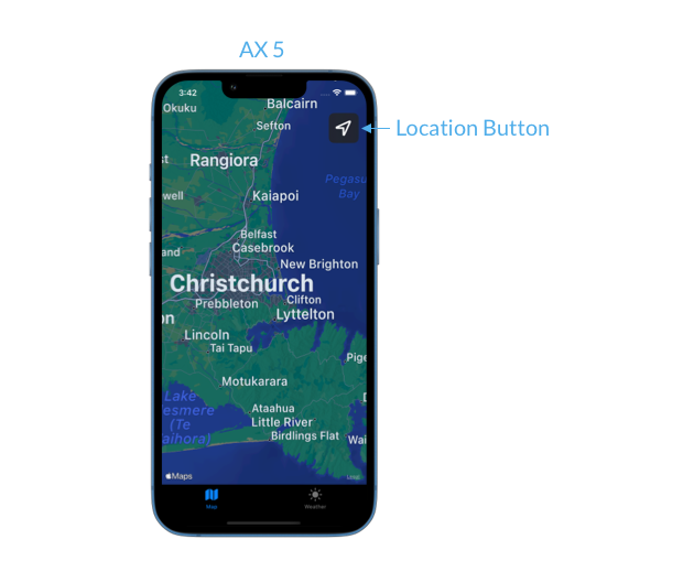
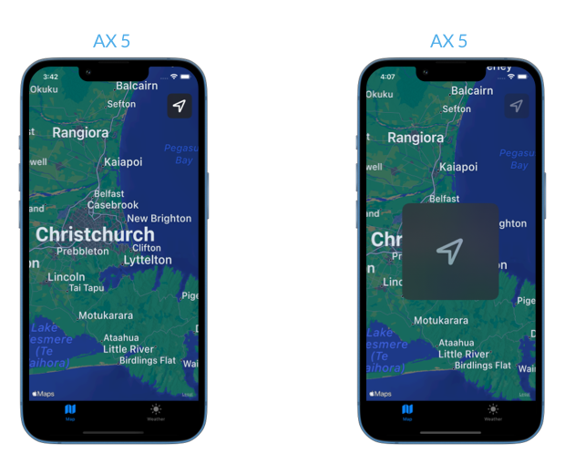
If we have custom toolbar style elements in the app that should not grow for larger accessibility text sizes, we have to do a bit of extra work. Imagine that we wanted to add a floating button that re-centers the map on the user's location. We don't want the button to grow too big and obscure the contents of the map, so we'll limit its dynamic type size to xxxLarge.
LocationButton()
    .dynamicTypeSize(...DynamicTypeSize.xxxLarge)
Now the button will scale up to the extra-extra-extra large size but won't grow any bigger when one of the accessibility sizes is activated. It's great for browsing the map but not great for users who struggle to see the smaller button when using accessibility text sizes.
Luckily, we can easily add support for large content viewer to our custom elements by applying the accessibilityShowsLargeContentViewer() modifier in SwiftUI.
LocationButton()
    .dynamicTypeSize(...DynamicTypeSize.xxxLarge)
    .accessibilityShowsLargeContentViewer()
When the user long presses on the button they will be able to preview it in the large content viewer if they have one of the larger accessibility text sizes turned on on their device.
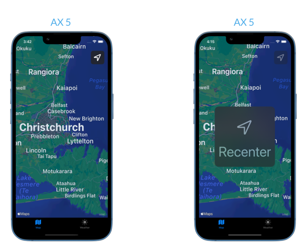
By default the large content viewer will present the button exactly how it appears on screen, in our case it's just the symbol image. We can customize what is shown in the viewer by providing a custom view to the accessibilityShowsLargeContentViewer(_:) modifier. For example, we might want to show an image and a text label instead.
LocationButton()
    .dynamicTypeSize(...DynamicTypeSize.xxxLarge)
    .accessibilityShowsLargeContentViewer {
        Label("Recenter", systemImage: "location")
    }

WWDC 2026 offer: 30% off!$35$25
100+ tips to take your Swift code to the next level
Swift Gems
- Advanced Swift techniques for experienced developers bypassing basic tutorials
- Curated, actionable tips ready for immediate integration into any Swift project
- Strategies to improve code quality, structure, and performance across all platforms
100+ tips to take your Swift code to the next level
Swift Gems
# Large content viewer and long press handler
We might have a custom control that is activated by a long press gesture but should also show the large content viewer in accessibility sizes. We have to ensure that users have access to both the preview and the regular long press action, so we have to modify the minimum duration of the long press when the large content viewer is enabled.
We can read the accessibilityLargeContentViewerEnabled setting from the environment in SwiftUI and base the gesture duration on the value.
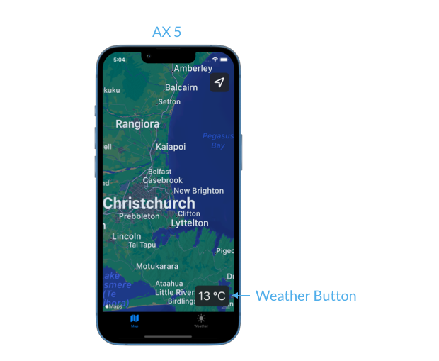
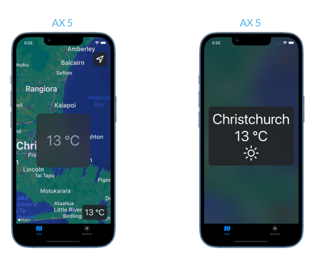
We'll add a quick weather preview to the map, similar to what the system Maps app has. When the user long presses on the button we'll show a weather overview in their location. We also don't want this button to grow too big to give as much space as possible to the map, so we'll limit the dynamic type support on the button label.
WeatherButtonLabel()
    .dynamicTypeSize(...DynamicTypeSize.xxxLarge)
In order to support both the large content viewer and the long press gesture on the button, we'll increase the minimum duration of the gesture if the large content viewer is enabled.
struct MapView: View {
    ...

    @Environment(\.accessibilityLargeContentViewerEnabled)
    var largeContentViewerEnabled

    var body: some View {
        Map(coordinateRegion: $region)
            .overlay(alignment: .bottomTrailing) {
                WeatherButtonLabel()
                    .dynamicTypeSize(...DynamicTypeSize.xxxLarge)
                    .accessibilityShowsLargeContentViewer()
                    .onLongPressGesture(
                        minimumDuration: largeContentViewerEnabled ? 2 : 0.5
                    ) {
                        showWeatherOverlay = true
                    }
            }
    }
}
With this setup the user with an accessibility text size preference will have 2 seconds to preview the button before the long press is activated and the weather overlay is shown.
While the large content viewer APIs are really useful for some of UI elements like we've seen in our examples, it's important to prioritize dynamic type support throughout the app and only fallback to the large content viewer when it's truly required by design.
You can find the code for the sample app shown in this post in our GitHub repository.
If you want to build a strong foundation in SwiftUI, my new book SwiftUI Fundamentals takes a deep dive into the framework’s core principles and APIs to help you understand how it works under the hood and how to use it effectively in your projects.
For more resources on Swift and SwiftUI, check out my other books and book bundles.
WWDC 2026 offer: 30% off!$35$25
The essential guide to SwiftUI core concepts and APIs
SwiftUI Fundamentals
- Explore the key APIs and design patterns that form the foundation of SwiftUI
- Develop a deep, practical understanding of how SwiftUI works under the hood
- Learn from a former Apple engineer who worked on widely used SwiftUI APIs
The essential guide to SwiftUI core concepts and APIs
SwiftUI Fundamentals