

Creating multi-step animations with PhaseAnimator in SwiftUI
Animations can help communicate changes in an interface, provide feedback for interactions and draw attention to important content. While many effects involve a single transition between two states, others are made up of multiple steps that need to happen in a particular order.
SwiftUI supports this kind of multi-step effect with phase animations. Using the phaseAnimator() modifier, we define a sequence of phases, where each phase describes the appearance of the view at one point in the animation. SwiftUI moves through the phases in order, animating the changes between them.
Phase animations are most suitable when the effect can be expressed as a series of discrete states and the affected properties can change together between them. For animations where individual properties need to follow separate timing sequences, SwiftUI provides keyframe animations instead.
For animations that fit the phase model, SwiftUI provides two ways to run the sequence: continuously while the view is visible, or in response to a change in a trigger value. In this post, we'll look at both variants and see how phase values and per-phase transitions control their behavior.
# Repeating phase animations
Repeating phase animations are useful for effects that should continue for as long as a view remains visible.
For instance, we can use a repeating phase animation to draw attention to a timer that has finished. The clock symbol lifts, tilts from side to side, settles and pauses before the sequence begins again. The animation continues until the timer is acknowledged.
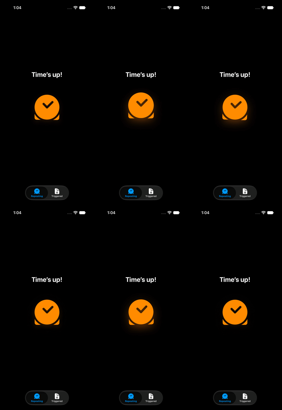
We can represent the individual states of the clock with an enum. Each case identifies one phase in the sequence, while computed properties provide the appearance values associated with that phase.
private enum TimerPhase: CaseIterable {
    case resting
    case lifted
    case tiltedLeft
    case tiltedRight
    case settled

    var scale: Double {
        switch self {
        case .lifted: 1.03
        case .resting, .tiltedLeft, .tiltedRight, .settled: 1
        }
    }

    var rotation: Angle {
        switch self {
        case .tiltedLeft: .degrees(-2)
        case .tiltedRight: .degrees(2)
        case .resting, .lifted, .settled: .zero
        }
    }

    var verticalOffset: Double {
        self == .lifted ? -8 : 0
    }

    // ... Shadow values for each phase ...
}
The phase values passed to a phase animator must conform to Equatable. An enum without associated values gains this conformance automatically. By also conforming TimerPhase to CaseIterable, we can use its allCases collection to provide the phases in declaration order. The first case, resting, defines the initial appearance of the clock.
Each phase describes the complete appearance of the view at that point in the sequence. The lifted phase increases the scale and applies a negative vertical offset, while the two tilted phases return the clock to its normal scale and position with rotation in opposite directions. Properties that remain unchanged still return their values for every phase.
To apply these values to the clock, we pass TimerPhase.allCases to the phaseAnimator(_:content:animation:) modifier. Its content closure receives a proxy for the modified view and the current phase.
private struct AnimatedClock: View {
    var body: some View {
        ClockSymbol()
            .phaseAnimator(TimerPhase.allCases) { clock, phase in
                clock
                    .scaleEffect(phase.scale)
                    .rotationEffect(phase.rotation)
                    .offset(y: phase.verticalOffset)
                    .shadow(
                        color: .orange.opacity(phase.shadowOpacity),
                        radius: phase.shadowRadius,
                        y: phase.shadowOffset
                    )
            }
    }
}
When AnimatedClock appears, SwiftUI renders the content using the first phase. It then animates the changes for lifted, waits for that transition to finish and advances to tiltedLeft. The process continues through the remaining phases, returning to resting after settled and beginning the sequence again. Without an explicit animation closure, SwiftUI uses the default animation for every transition.
We can provide a different Animation value for each transition. In this example, the clock uses spring animations for lifting and settling, shorter easing animations for the tilts, and a delayed smooth animation when it returns to rest.
private enum TimerPhase: CaseIterable {
    case resting
    case lifted
    case tiltedLeft
    case tiltedRight
    case settled

    // ... Appearance values for each phase ...

    var animation: Animation {
        switch self {
        case .resting:
            .smooth(duration: 0.35).delay(1.5)
        case .lifted:
            .spring(duration: 0.4, bounce: 0.25)
        case .tiltedLeft, .tiltedRight:
            .easeInOut(duration: 0.16)
        case .settled:
            .spring(duration: 0.5, bounce: 0.2)
        }
    }
}

private struct AnimatedClock: View {
    var body: some View {
        ClockSymbol()
            .phaseAnimator(TimerPhase.allCases) { clock, phase in
                clock
                    // ... Apply the appearance values for the phase ...
            } animation: { phase in
                phase.animation
            }
    }
}
The phase passed into the animation closure is the destination of the transition. This means that the animation associated with lifted controls how the clock moves from resting to lifted, while the one associated with settled controls the transition from tiltedRight to settled.
SwiftUI advances to the next phase only after the current animation completes, so the duration and delay of each transition also determine the timing of the complete sequence. The delay attached to the resting animation keeps the clock settled for 1.5 seconds before it lifts again.
The repeating phase animator does not take an activation value. To end the sequence when the timer is acknowledged, we can replace the animated clock with the static symbol. The same static presentation can be used when the system's Reduce Motion setting is enabled.
struct RepeatingTimerView: View {
    @Environment(\.accessibilityReduceMotion) private var reduceMotion
    @State private var isAcknowledged = false

    var body: some View {
        Button {
            isAcknowledged = true
        } label: {
            if reduceMotion || isAcknowledged {
                ClockSymbol()
            } else {
                AnimatedClock()
            }
        }
    }
}
The static symbol and the surrounding text continue to communicate that the timer has finished, so the animation draws attention to the alert without becoming the only way to convey its meaning.
# Event-driven phase animations
Some multi-step effects should run only when a particular event occurs. For these effects, we can associate the phase animation with a trigger value. Whenever the value changes, SwiftUI animates the view through the sequence of phases.
To illustrate this behavior, we'll look at an example where a phase animation provides feedback when a document is saved for offline use. After the button is pressed, the document lifts and then drops into the tray.
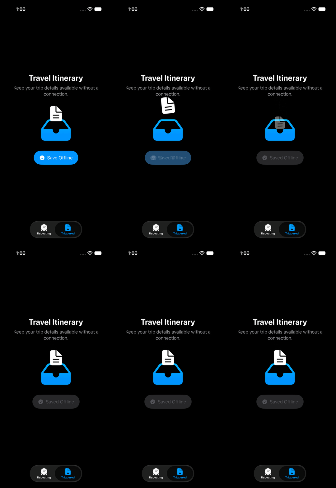
We can describe the states of the document with three phases. The ready phase defines its appearance before the action, lifted moves it above the tray with a slight rotation, and dropped moves it down while reducing its scale and opacity.
private enum OfflineSavePhase: CaseIterable {
    case ready
    case lifted
    case dropped

    var scale: Double {
        switch self {
        case .ready: 1
        case .lifted: 1.08
        case .dropped: 0.72
        }
    }

    var rotation: Angle {
        switch self {
        case .ready, .dropped: .zero
        case .lifted: .degrees(-6)
        }
    }

    var verticalOffset: Double {
        switch self {
        case .ready: 0
        case .lifted: -30
        case .dropped: 54
        }
    }

    var opacity: Double {
        switch self {
        case .ready, .lifted: 1
        case .dropped: 0.2
        }
    }

    // ... Animation for each phase ...
}
The first phase has the same role as it does in a repeating phase animation: it provides the initial appearance of the view. For the triggered variant, it also provides the appearance that the view returns to after the sequence finishes.
To run the sequence in response to an event, we use the phaseAnimator(_:trigger:content:animation:) modifier. In addition to the phases, this variant takes a trigger value that conforms to Equatable.
private struct AnimatedDocument: View {
    let trigger: Int

    var body: some View {
        DocumentSymbol()
            .phaseAnimator(
                OfflineSavePhase.allCases,
                trigger: trigger
            ) { document, phase in
                document
                    .scaleEffect(phase.scale)
                    .rotationEffect(phase.rotation)
                    .offset(y: phase.verticalOffset)
                    .opacity(phase.opacity)
            } animation: { phase in
                phase.animation
            }
    }
}
The trigger does not select a phase or provide values to the content closure. SwiftUI only compares it with its previous value. Whenever the value changes, the animator starts the complete sequence. In this case, the document moves from ready to lifted, then to dropped and finally back to ready.
The animation closure continues to receive the destination phase for each transition. The animation associated with lifted controls the initial upward movement, dropped controls the movement into the tray, and ready controls how the document returns to its initial appearance at the end.
For an event that can occur more than once, an integer counter makes a useful trigger. Incrementing it produces a new value for every occurrence, including when the rest of the interface returns to the same state between actions.
struct OfflineSaveView: View {
    @State private var saveCount = 0
    @State private var isSaved = false

    var body: some View {
        VStack {
            // ... Title and description ...

            OfflineDocumentAnimation(
                trigger: saveCount,
                isSaved: isSaved
            )

            Button {
                saveCount += 1
                isSaved = true
            } label: {
                if isSaved {
                    Label("Saved Offline", systemImage: "checkmark.circle")
                } else {
                    Label("Save Offline", systemImage: "arrow.down.circle")
                }
            }

            // ... The rest of the view ...
        }
    }
}
Here, saveCount represents the occurrence of the save action, while isSaved represents its lasting result in the interface. Keeping them separate means that the animation can run again if the view allows another save after resetting its saved state. The counter is updated directly in the button action; it does not need to be wrapped in withAnimation, because the phase animator provides the animations for the sequence.
As with the repeating example, the animated content can be replaced with its static appearance when Reduce Motion is enabled. The button label and the accessibility label for the document still communicate whether it was saved, while the phase animation provides additional visual feedback for the action.
Phase animations work well for effects that can be described as a sequence of complete view states. The repeating and triggered variants determine when the sequence runs, while the animation associated with each phase controls how the view moves into that state. Together, these pieces let us build multi-step effects without managing the progression between individual steps ourselves.
If you are looking to build a strong foundation in SwiftUI, my book SwiftUI Fundamentals takes a deep dive into the framework's core principles and APIs to help you understand how it works under the hood and how to use it effectively in your projects. And my more recent book The SwiftUI Way helps you adopt recommended patterns, avoid common pitfalls, and use SwiftUI's native tools appropriately to work with the framework rather than against it.
For more resources on Swift and SwiftUI, check out my other books and book bundles.
Work with SwiftUI. Not against it.$35
A field guide to SwiftUI patterns and anti-patterns
The SwiftUI Way
- Avoid common SwiftUI pitfalls
- Build deeper intuition for the framework
- Gain insights from a former SwiftUI Engineer at Apple
Work with SwiftUI. Not against it.
A field guide to SwiftUI patterns and anti-patterns
The SwiftUI Way