

Overview of resizable sheet APIs in SwiftUI
In iOS 16, SwiftUI introduced APIs for controlling the height of sheets on iPhone and in the compact horizontal size class on iPad. We can present half sheets, allow users to resize them between multiple detents, and define custom detents using fixed heights or fractional values. SwiftUI also provides APIs for programmatically setting the active detent, customizing the drag indicator, and managing resizable sheets across different device configurations. In this post, we’ll go over how these resizable sheet APIs work and when they apply.
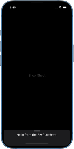
# Half-sheet
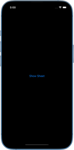
To present a sheet that takes approximately half of the screen on iPhone we need to apply the presentationDetents(_:) modifier inside the sheet content and pass it a single medium detent.
struct ContentView: View {
    @State private var showSheet = false

    var body: some View {
        Button("Show Sheet") {
            showSheet = true
        }
        .sheet(isPresented: $showSheet) {
            Text("Hello from the SwiftUI sheet!")
                .presentationDetents([.medium])
        }
    }
}
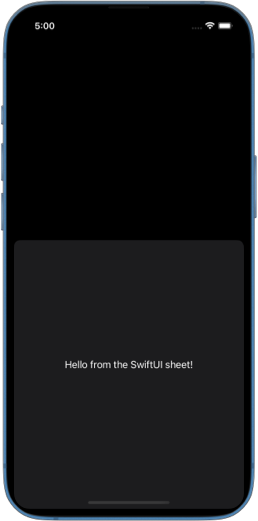
Since we are only passing one detent in the set of detents, this kind of sheet cannot be resized by the user.
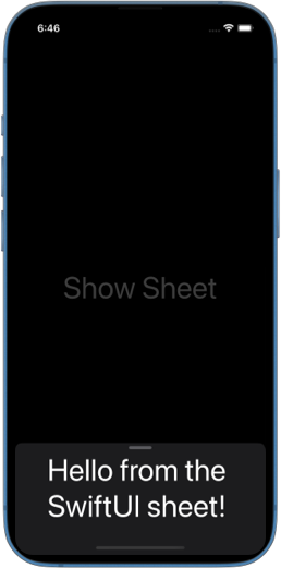
# Resizable half-sheet
To present a half-sheet that can be resized by the user, we can pass both medium and large system detents to the presentationDetents(_:) modifier.
struct ContentView: View {
    @State private var showSheet = false

    var body: some View {
        Button("Show Sheet") {
            showSheet = true
        }
        .sheet(isPresented: $showSheet) {
            Text("Hello from the SwiftUI sheet!")
                .presentationDetents([.medium, .large])
        }
    }
}
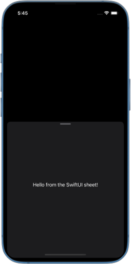
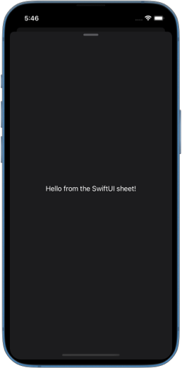
Notice how SwiftUI adds a drag indicator automatically when we provide more than one detent. It helps the user realize that the sheet can be dragged to resize it.
# Custom detents
Apart from the system detents such as medium and large, we can also provide custom detents where we define the size ourselves.
# Fraction and height
There are two convenience methods to create a custom detent in place. We can provide the height in fraction of the full height with the fraction(_:) method, or specify the height in points with the height(_:) method.
The following example creates a fractional detent that takes 20% of the full height of the sheet, a detent that is 600 points in height and the system large detent. Custom and system detents can be mixed together in the detents set. SwiftUI will figure out the order in which one detent should transition into another when the user drags the sheet.
struct ContentView: View {
    @State private var showSheet = false

    var body: some View {
        Button("Show Sheet") {
            showSheet = true
        }
        .sheet(isPresented: $showSheet) {
            Text("Hello from the SwiftUI sheet!")
                .presentationDetents([
                    .fraction(0.2),
                    .height(600),
                    .large
                ])
        }
    }
}
# Custom detent type
We can create custom detent types that can be reused across multiple sheets by conforming to the CustomPresentationDetent protocol and implementing the height(in:) method, which returns the calculated detent height.
Inside the height(in:) method we are provided a special context that includes SwiftUI environment. We can use that environment to calculate the size of the detent.
For example, we can define TinyDetent type that has the height of 60 points. If the user sets larger accessibility font on their device, we should adjust the height of the detent to be larger, so that our content doesn't get truncated or cut off.
Here is how we can do something like this:
struct TinyDetent: CustomPresentationDetent {
    static func height(in context: Context) -> CGFloat? {
        if context.dynamicTypeSize.isAccessibilitySize {
            return 140
        } else {
            return 60
        }
    }
}

struct ContentView: View {
    @State private var showSheet = false

    var body: some View {
        Button("Show Sheet") {
            showSheet = true
        }
        .sheet(isPresented: $showSheet) {
            Text("Hello from the SwiftUI sheet!")
                .presentationDetents([
                    .custom(TinyDetent.self),
                    .medium
                ])
        }
    }
}
# Programmatically set active detent
To programmatically set the detent the sheet is presented in, we need to pass a selection binding to the presentationDetents(_:selection:) modifier. We can store the current detent in a State variable, give it an initial value and later programmatically set a new value in response to some user action.
struct ContentView: View {
    @State private var showSheet = false
    @State private var selectedDetent = PresentationDetent.medium

    var detentButton: Button<Text> {
        if selectedDetent == .medium {
            return Button("Show more") {
                selectedDetent = .large
            }
        } else {
            return Button("Show less") {
                selectedDetent = .medium
            }
        }
    }

    var body: some View {
        Button("Show Sheet") {
            showSheet = true
        }
        .sheet(isPresented: $showSheet) {
            detentButton
                .presentationDetents(
                    [.medium, .large],
                    selection: $selectedDetent
                )
        }
    }
}
Note that selected detent has to be included in the set of detents provided to presentationDetents(_:selection:). If we attempt to set selection to a detent that is not in the set, SwiftUI will issue a warning saying Cannot set selected sheet detent if it is not included in supported sheet detents.


Enhance older apps with SwiftUI!$40
A detailed guide on gradually adopting SwiftUI in UIKit projects
Updated for iOS 18 and Xcode 16!
Integrating SwiftUI into UIKit Apps
- Upgrade your apps with new features like Swift Charts and Widgets
- Support older iOS versions with effective backward-compatible strategies
- Seamlessly bridge state and data between UIKit and SwiftUI using the latest APIs
Enhance older apps with SwiftUI!
A detailed guide on gradually adopting SwiftUI in UIKit projects
Integrating SwiftUI
into UIKit Apps
Updated for iOS 18 and Xcode 16!
To make it easier to refer to a custom detent type for programmatic control of active detent, we can define a static property on PresentationDetent.
extension PresentationDetent {
    static let tiny = Self.custom(TinyDetent.self)
    static let small =  Self.fraction(0.3)
}
Then we can use it exactly like a system detent.
selectedDetent = .tiny

// or

selectedDetent = .small
# Show and hide drag indicator
SwiftUI automatically adds a drag indicator to the sheet when we provide more than one detent to presentationDetents() modifier. But we can also manually control its visibility with presentationDragIndicator(_:).
For example, if our design requires to always show the indicator even with a single available detent, we can set presentation drag indicator to visible.
struct ContentView: View {
    @State private var showSheet = false

    var body: some View {
        Button("Show Sheet") {
            showSheet = true
        }
        .sheet(isPresented: $showSheet) {
            Text("Hello from the SwiftUI sheet!")
                .presentationDetents([.medium])
                .presentationDragIndicator(.visible)
        }
    }
}
# Resizable sheet and device configurations
Presentation detents apply when a sheet is presented on iPhone in portrait mode. However, if the device is rotated to landscape, the sheet transitions to a full-screen cover, and detents are ignored.
On iPad, detents are only respected when the sheet is edge-attached, this happens when the screen is split between multiple scenes, and the scene displaying the sheet is narrow.
If the sheet appears as a floating modal in the center of the iPad screen, detents are ignored.
On Mac, presentation detents are not supported.
# Resizable adaptive sheet
An adaptive sheet is presented when a popover transitions into a sheet on iPad in narrow scenes. On iPhone, popovers are always presented as sheets by default.
Adaptive sheets also respect detents, which can be set inside the content of a popover.
struct ContentView: View {
    @State private var showPopover = false

    var body: some View {
        Button("Show Popover") {
            showPopover = true
        }
        .popover(isPresented: $showPopover) {
            Text("Hello from the SwiftUI popover!")
                .presentationDetents([.medium, .large])
        }
    }
}
SwiftUI’s resizable sheet APIs provide flexible ways to control sheet height, whether using system detents, custom sizes, or programmatic adjustments. With built-in support for drag indicators and adaptive behavior across devices, these APIs make it easier to create sheets that feel natural and responsive. Understanding when and how detents apply ensures that our sheets work well across different configurations.
If you want to build a strong foundation in SwiftUI, my new book SwiftUI Fundamentals takes a deep dive into the framework’s core principles and APIs to help you understand how it works under the hood and how to use it effectively in your projects.
For more resources on Swift and SwiftUI, check out my other books and book bundles.
Deepen your understanding of SwiftUI!$35
The essential guide to SwiftUI core concepts and APIs
SwiftUI Fundamentals
- Explore the key APIs and design patterns that form the foundation of SwiftUI
- Develop a deep, practical understanding of how SwiftUI works under the hood
- Learn from a former Apple engineer who worked on widely used SwiftUI APIs
Deepen your understanding of SwiftUI!
The essential guide to SwiftUI core concepts and APIs
SwiftUI Fundamentals