

Scroll-driven effects in SwiftUI: phases, geometry and scroll state
SwiftUI provides several ways to tie the appearance of content to its position as the user scrolls. We can fade, scale or rotate views as they enter and leave the visible region, derive effects from a view's exact position in the scroll view, observe the scroll geometry and update other parts of the interface in response, or react to views becoming visible.
These approaches rely on different APIs, and they differ in what they can change. Effects applied with scrollTransition() and visualEffect() are limited to the view they're attached to and don't affect layout. onScrollGeometryChange() and onScrollVisibilityChange() let us update state, which can drive any part of the interface but adds work each time the values they report change. In this post, we'll look at the kinds of effects each of these APIs is suited for and what to consider when choosing between them.
# Effects on content entering and leaving the visible region
The scrollTransition(_:axis:transition:) modifier applies an effect to a view as it enters and leaves the visible region of a scroll view. The effect is defined in terms of the phases described by ScrollTransitionPhase: a view beyond the top edge of a vertical scroll view, or the leading edge of a horizontal one, is in the topLeading phase, a view beyond the opposite edge is in the bottomTrailing phase, and a view within the visible region is in the identity phase.
In the following example, photos in a vertical scroll view are scaled down and faded as they cross the edges of the visible region, and reach their full size and opacity once they're within it.
ScrollView {
    VStack(spacing: 16) {
        ForEach(landscapes, id: \.self) { photo in
            LandscapePhoto(photo)
                .scrollTransition { effect, phase in
                    effect
                        .scaleEffect(phase.isIdentity ? 1 : 0.85)
                        .opacity(phase.isIdentity ? 1 : 0.4)
                }
        }
    }
    .padding()
}
The transition closure receives the current phase together with an effect, and returns the effect with modifiers from the VisualEffect protocol applied, in this case scaleEffect() and opacity(). The phase's isIdentity property determines whether the photo uses its full size and opacity or the reduced values at the edges. SwiftUI evaluates the closure for each phase and interpolates between the resulting appearances as the photo moves from one phase to another.
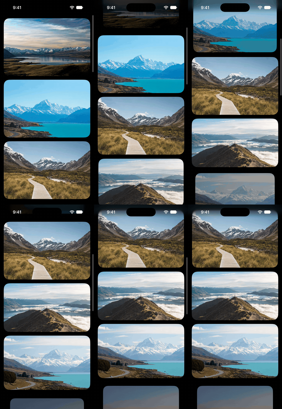
By default, the transition is interactive, so the interpolation follows the scroll position and completes when the view is fully within the visible region. We can also pass an explicit configuration to scrollTransition(_:axis:transition:) as its optional first argument, and setting it to animated makes the view switch between phases with an animation once it crosses a threshold.
Black Friday 2026 offer: 30% off!$35$25
The essential guide to SwiftUI core concepts and APIs
SwiftUI Fundamentals
- Explore the key APIs and design patterns that form the foundation of SwiftUI
- Develop a deep, practical understanding of how SwiftUI works under the hood
- Learn from a former Apple engineer who worked on widely used SwiftUI APIs
The essential guide to SwiftUI core concepts and APIs
SwiftUI Fundamentals
# Effects derived from position within the scroll view
Effects that follow the exact position of a view as it scrolls can be built with the visualEffect(_:) modifier, which passes a GeometryProxy for the view into its closure alongside the effect. The closure works with the same VisualEffect modifiers as a scroll transition, and SwiftUI applies its result again whenever the geometry of the view changes, so the effect can vary continuously as the view moves through the scroll view.
A horizontal carousel can use visualEffect() for a parallax effect, where each photo appears to move more slowly than the card that contains it.
ScrollView(.horizontal) {
    HStack(spacing: 16) {
        ForEach(landscapes, id: \.self) { photo in
            PhotoCard {
                Image(photo)
                    .resizable()
                    .scaledToFill()
                    .visualEffect { effect, geometry in
                        let frame = geometry.frame(in: .scrollView)
                        let width = geometry.bounds(of: .scrollView)?.width ?? 0
                        return effect.offset(x: (width / 2 - frame.midX) * 0.3)
                    }
            }
        }
    }
    .padding()
}
.scrollIndicators(.hidden)
The closure offsets the photo by a fraction of its distance from the center of the visible region, calculated from the frame of the photo returned by frame(in: .scrollView) and the bounds of the scroll view returned by bounds(of: .scrollView). Because the card clips the photo to its bounds, the offset shifts the visible portion of the photo as the card scrolls.

# Changes outside the scrolled content
To update other parts of the interface based on scrolling, we can use onScrollGeometryChange(for:of:action:) to derive a value from the scroll view's geometry and store it in state. Its transform closure receives a ScrollGeometry value, which includes the content offset, content size, container size and insets, and returns an Equatable value computed from them. SwiftUI calls the action only when that value changes, passing it the old and new values.
Since the geometry changes continuously during scrolling, the transformed value determines how often the action runs and how often the views that read the resulting state are updated. Reducing the geometry to the smallest value the interface depends on, such as a Boolean or an index, keeps these updates to the moments when something visible needs to change.
The following carousel reduces its horizontal content offset to the index of the current photo and shows a blurred version of that photo behind the scroll view.
struct LandscapeBackdrop: View {
    @State private var current = 0

    var body: some View {
        ScrollView(.horizontal) {
            HStack(spacing: 16) {
                ForEach(landscapes, id: \.self) { photo in
                    PhotoCard {
                        Image(photo)
                            .resizable()
                            .scaledToFill()
                    }
                }
            }
            .padding()
        }
        .scrollIndicators(.hidden)
        .frame(maxHeight: .infinity)
        .onScrollGeometryChange(for: Int.self) { geometry in
            let index = Int((geometry.contentOffset.x / cardStride).rounded())
            return min(max(index, 0), landscapes.count - 1)
        } action: { _, newIndex in
            withAnimation {
                current = newIndex
            }
        }
        .background {
            Image(landscapes[current])
                .resizable()
                .scaledToFill()
                .blur(radius: 60, opaque: true)
                .blendMode(.plusLighter)
                .ignoresSafeArea()
                .id(current)
                .transition(.opacity)
        }
    }
}
The content offset can extend beyond the content while the scroll view bounces at either end, so the index is clamped to the range of the array. Since the background image takes the index as its identity, each photo becomes a distinct view, and a change inside withAnimation crossfades from one to the next.

The plusLighter blend mode keeps the background from darkening while the two photos overlap during the crossfade.
Black Friday 2026 offer: 30% off!$35$25
A field guide to SwiftUI patterns and anti-patterns
The SwiftUI Way
- Avoid common SwiftUI pitfalls
- Build deeper intuition for the framework
- Gain insights from a former SwiftUI Engineer at Apple
A field guide to SwiftUI patterns and anti-patterns
The SwiftUI Way
# Actions on visibility changes
Some behavior depends only on whether a view is visible, such as starting an animation or loading content. The onScrollVisibilityChange(threshold:_:) modifier calls its action with a Boolean value when the view crosses a visibility threshold, which is the fraction of the view that has to be within the visible region of the scroll view and defaults to 0.5. The action also runs when the view first appears with the threshold already reached, allowing us to initialize visibility-dependent state correctly.
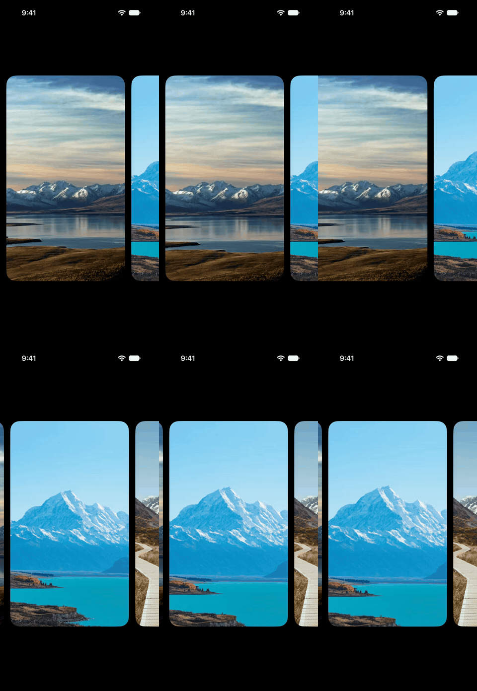
Here, each photo in a carousel slowly zooms in and out while it's visible, and stops when it scrolls away.
struct FocusedPhoto: View {
    let photo: String
    @State private var isVisible = false

    var body: some View {
        PhotoCard {
            Image(photo)
                .resizable()
                .scaledToFill()
                .scaleEffect(isVisible ? 1.15 : 1)
                .animation(
                    isVisible
                        ? .easeInOut(duration: 5).repeatForever()
                        : .default,
                    value: isVisible
                )
        }
        .onScrollVisibilityChange(threshold: 0.9) { isVisible = $0 }
    }
}
A threshold of 0.9 counts a photo as visible only when it's almost entirely within the visible region, so the photos partially shown at the edges stay still. The animation also depends on visibility: when a photo stops being visible, its scale returns to 1 with the default animation, since the repeating animation would otherwise keep it zooming after it drops below the threshold.
To track the visibility of many views together, onScrollTargetVisibilityChange(idType:threshold:_:) can be applied to the scroll view instead. It works with the views in a layout marked with the scrollTargetLayout(isEnabled:) modifier and passes its action the identifiers of all currently visible views, so a single piece of state describes the visible content of the whole scroll view.
The same effect can often be built with more than one of these APIs, and the narrowest one that covers it usually does the least work during scrolling. Storing the content offset in state with onScrollGeometryChange() to drive a scaleEffect() or offset() re-evaluates the view throughout scrolling, while scrollTransition() or visualEffect() produces the same result without any state. Similarly, actions tied to visibility alone are better handled by onScrollVisibilityChange() than by deriving visibility from the scroll geometry with onScrollGeometryChange(), since its action runs only when the view crosses the threshold.
If you'd like to explore SwiftUI in more depth, my books SwiftUI Fundamentals and The SwiftUI Way cover the framework's core principles, recommended patterns, and common pitfalls. And if you use coding agents, our Mac app SwiftFairy can help review the SwiftUI code they generate, with guidance on proper SwiftUI patterns, state management, and adaptive layouts.
We are currently running a Black Friday promotion with 30% off SwiftFairy, our Swift and SwiftUI books and bundles, and Unlimited plans for our EPUB and PDF reader Whio. Visit the Black Friday page to learn more.
Black Friday 2026 offer: 30% off!
On-device Swift and SwiftUI reviews with fix guidance
 Proper SwiftUI
 SwiftUI Layout & Resizability
 Performant Swift Charts
 Modern Swift