

The role of layout priority in SwiftUI containers
SwiftUI layout containers can take the layout priority of their subviews into account when determining how to size and arrange them. The layoutPriority(_:) modifier sets this priority on a view, but its effect depends on the container the view is placed in, as each container applies its own policy. In this post, we'll look at how layout priority behaves in SwiftUI's containers and where its effect differs.
# Space allocation in stacks
HStack and VStack use layout priority to allocate space along their primary axis. Each subview's priority is a Double value that defaults to 0, and the stack processes its subviews in groups, from the highest priority to the lowest. For each group, it subtracts the spacing and sets aside the minimum sizes of all lower-priority subviews, then offers the remaining space to the views in that group. Any space they leave unused becomes available to the next group.
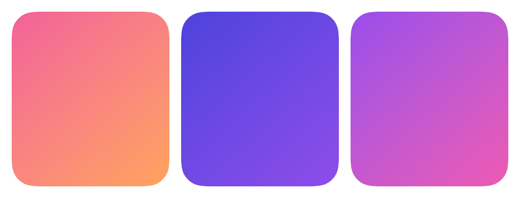
The following stack contains three flexible shapes with the same minimum width. They all have the default priority, so they divide the available width equally.
HStack {
    GradientBlock(.dusk)
        .frame(minWidth: 60)

    GradientBlock(.twilight)
        .frame(minWidth: 60)

    GradientBlock(.sunset)
        .frame(minWidth: 60)
}
.frame(width: 340, height: 120)
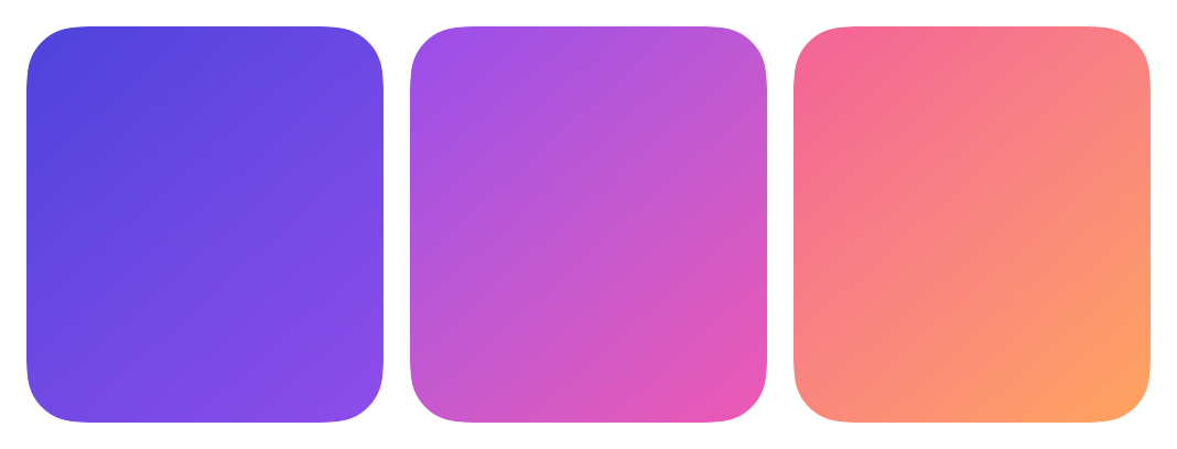
When we raise the priority of the middle shape, the stack sets aside the minimum widths of the other two and offers the remaining width to the prioritized shape. The shape accepts all of it, leaving the others at exactly their minimum.
HStack {
    GradientBlock(.dusk)
        .frame(minWidth: 60)

    GradientBlock(.twilight)
        .frame(minWidth: 60)
        .layoutPriority(1)

    GradientBlock(.sunset)
        .frame(minWidth: 60)
}
.frame(width: 340, height: 120)
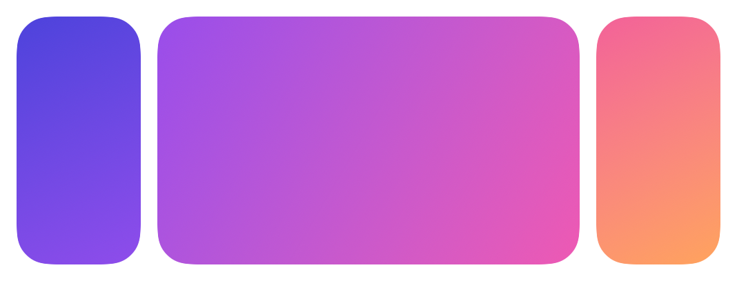
Only the relative order of the priorities affects the allocation, so values of 1 and 100 produce the same layout here. Negative values are also valid and cause a view to receive space after those with the default priority.
Views that aren't flexible respond differently, because they stop growing once they reach their preferred size. Text that fits keeps that size regardless of its priority, and any remaining space stays unallocated or passes to the next group.
Work with SwiftUI. Not against it.$35
A field guide to SwiftUI patterns and anti-patterns
The SwiftUI Way
- Avoid common SwiftUI pitfalls
- Build deeper intuition for the framework
- Gain insights from a former SwiftUI Engineer at Apple
Work with SwiftUI. Not against it.
A field guide to SwiftUI patterns and anti-patterns
The SwiftUI Way
# ZStack sizing
ZStack uses layout priority to determine its own size. Rather than allocating space among its subviews, it calculates its size from the subviews with the highest priority, then proposes that size to the rest.
When all subviews share the same priority, they all contribute to the size of the stack. A flexible shape accepts all of the space offered to it, so the following stack fills the available area, with the text centered on top.
ZStack {
    GradientBlock(.sunset)

    Text("Hello, world!")
        .font(.title2.bold())
        .foregroundStyle(.white)
        .padding()
}
.frame(width: 340, height: 120)

Raising the priority of the text means that only the text determines the size of the stack. The shape is then proposed the resulting size, so it fits tightly around the text.
ZStack {
    GradientBlock(.sunset)

    Text("Hello, world!")
        .font(.title2.bold())
        .foregroundStyle(.white)
        .padding()
        .layoutPriority(1)
}
.frame(width: 340, height: 120)

The same behavior applies to the implicit stack used when multiple views are passed to overlay(alignment:content:) or background(alignment:content:). Priority determines how those views are sized relative to each other, while the modified view keeps its own size.
# Priority in custom layouts
Custom layouts that conform to the Layout protocol can read the layout priority of each subview through the priority property of LayoutSubview. SwiftUI doesn't apply any behavior to this value on its own behalf, so the layout decides what priority means for its arrangement.
The following layout divides its width equally among its subviews and places them in order of priority, keeping the declaration order for subviews with the same value.
struct PriorityOrderedRow: Layout {
    var spacing: CGFloat = 8

    func sizeThatFits(
        proposal: ProposedViewSize,
        subviews: Subviews,
        cache: inout ()
    ) -> CGSize {
        proposal.replacingUnspecifiedDimensions()
    }

    func placeSubviews(
        in bounds: CGRect,
        proposal: ProposedViewSize,
        subviews: Subviews,
        cache: inout ()
    ) {
        let count = CGFloat(subviews.count)
        let width = (bounds.width - spacing * (count - 1)) / count
        var x = bounds.minX

        for subview in subviews.sorted(by: { $0.priority > $1.priority }) {
            subview.place(
                at: CGPoint(x: x, y: bounds.minY),
                proposal: ProposedViewSize(width: width, height: bounds.height)
            )
            x += width + spacing
        }
    }
}
Raising the priority of the last shape moves it to the start of the row, while the other two keep their relative order.
PriorityOrderedRow {
    GradientBlock(.dusk)
    GradientBlock(.twilight)
    GradientBlock(.sunset)
        .layoutPriority(1)
}
.frame(width: 340, height: 120)
Containers that don't divide limited space among their subviews have no visible use for layout priority. Lazy stacks propose an unlimited size along their scrolling axis, so each subview takes its ideal size, rows in a List or Form are sized independently, and ViewThatFits selects a child in declaration order rather than by priority. Priority is most useful in stacks and their implicit counterparts, where it decides which views keep their size when space is limited, and in custom layouts, where we can define what it means for our own arrangement.
If you are looking to understand how SwiftUI sizes and positions views, my book SwiftUI Fundamentals takes a deep dive into the framework's layout system and other core principles to help you understand how it works under the hood and how to use it effectively in your projects. And if you are working with a coding agent, our Mac app SwiftFairy can review the layout code it writes. Its SwiftUI Layout & Resizability guidance checks how views are sized and how layouts adapt, right on your Mac.
For more resources on Swift and SwiftUI, check out my other books and book bundles.
Our Swift expertise, on call for your agent
On-device Swift and SwiftUI reviews with fix guidance
 Proper SwiftUI
 SwiftUI Layout & Resizability
 Performant Swift Charts
 Modern Swift