

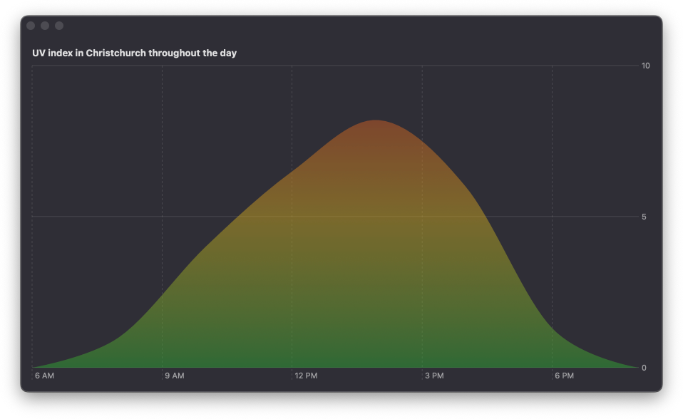
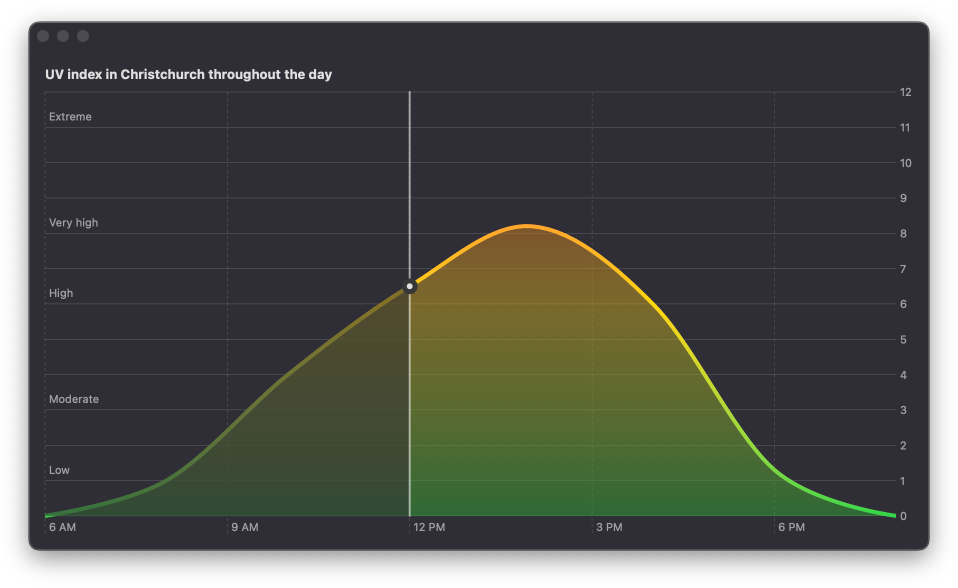
Area chart with a dimming layer up to the current point in time
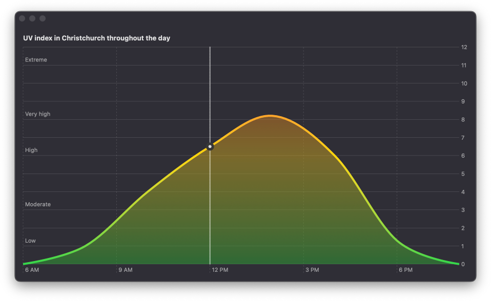
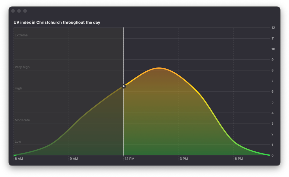
In this post we are going to see how to build an area chart that shows UV index throughout the day inspired by the UV index chart in the system iOS Weather app. The chart will also have a line mark filled with a linear gradient to emphasize UV index values, a rule mark with a point mark to show the current time of the day and a dimming layer on the chart area for the time that already passed. Here is what the final result will look like.

# Prepare chart data
To create the chart we'll be using a small demo data set of UV index values recorded in Christchurch on a specific day. We'll have dates on the x-axis and UV index on the y-axis, so we'll map our data to an array of tuples with dates and UV index values. We'll also hardcode the current date to midday. In a real app, the UV index data and the current date would be dynamic.
extension Calendar {
    static func date(bySettingHour hour: Int, of date: Date) -> Date? {
        Calendar.current.date(
            bySettingHour: hour,
            minute: 0,
            second: 0,
            of: date
        )
    }
}

struct ContentView: View {
    let currentDate = Calendar.date(bySettingHour: 12, of: Date())!

    let uvData = [
        (hour: 6, uv: 0), (hour: 8, uv: 1),
        (hour: 10, uv: 4), (hour: 12, uv: 6.5),
        (hour: 14, uv: 8.2), (hour: 16, uv: 6),
        (hour: 18, uv: 1.3), (hour: 20, uv: 0)
    ]

    var currentUVData: [(date: Date, uv: Double)] {
        uvData.map {
            (
                date: Calendar.date(
                    bySettingHour: $0.hour, of: currentDate
                )!,
                uv: $0.uv
            )
        }
    }

    var body: some View {
        ...
    }
}

Level up your Swift skills!$35
100+ tips to take your Swift code to the next level
Swift Gems
- Advanced Swift techniques for experienced developers bypassing basic tutorials
- Curated, actionable tips ready for immediate integration into any Swift project
- Strategies to improve code quality, structure, and performance across all platforms
Level up your Swift skills!
100+ tips to take your Swift code to the next level
Swift Gems
# Build area chart with a line mark
We'll start by looping over our data set and adding an AreaMark to the chart. We'll set the interpolation method to cardinal to get smooth curves and fill the area with a linear gradient to emphasize the UV index value from low to high.
Chart {
    ForEach(currentUVData, id: \.date) { dataPoint in
        AreaMark(
            x: .value("Time of day", dataPoint.date),
            y: .value("UV index", dataPoint.uv)
        )
        .interpolationMethod(.cardinal)
        .foregroundStyle(
            .linearGradient(
                colors: [.green, .yellow, .red],
                startPoint: .bottom, endPoint: .top
            )
            .opacity(0.5)
        )
        .alignsMarkStylesWithPlotArea()
    }
}
Notice that I'm using the alignsMarkStylesWithPlotArea() modifier to make sure that the gradient uses the entire plot area for its start and end points, rather than just following the mark. I talk more about this technique in my previous post Fill bar marks with gradient in Swift Charts.
At this point we'll have an area with a slightly transparent fill that starts with green color for low values and ends with red for the highest ones.
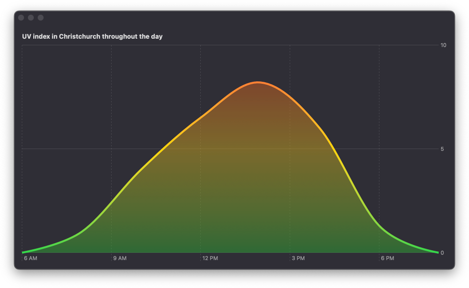
Now we'll add a brighter outline to the chart with a LineMark for the same data. The line mark will also be filled with a linear gradient but without any transparency. While it creates a nice visual effect, Voice Over users don't need to hear the repeated chart data, so we'll hide the area mark from accessibility and only keep the line mark exposed.
Chart {
    ForEach(currentUVData, id: \.date) { dataPoint in
        AreaMark(...)
            .accessibilityHidden(true)

        LineMark(
            x: .value("Time of day", dataPoint.date),
            y: .value("UV index", dataPoint.uv)
        )
        .interpolationMethod(.cardinal)
        .foregroundStyle(
            .linearGradient(
                colors: [.green, .yellow, .red],
                startPoint: .bottom, endPoint: .top
            )
        )
        .lineStyle(StrokeStyle(lineWidth: 4))
        .alignsMarkStylesWithPlotArea()
    }
}
# Configure axis marks
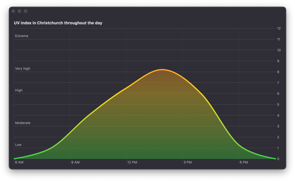
By default the chart only has some mark annotations on the y-axis. I think it would be nicer to show all of the possible values that UV index can take. We'll define our custom axis marks with the desired range.
struct ContentView: View {
    ...

    var body: some View {
        Chart {...}
            .chartYAxis {
                AxisMarks(
                    format: .number,
                    preset: .aligned,
                    values: Array(0...12)
                )
            }
    }
}
Another great thing to add would be the description of the values, so that users know whether the UV index is currently low, moderate, high or extreme. These descriptions will be positioned on the leading edge of the chart and will be inset inside the plot area.
struct ContentView: View {
    ...

    var body: some View {
        Chart {...}
        .chartYAxis {
            AxisMarks(...)

            AxisMarks(
                preset: .inset,
                position: .leading,
                values: [1, 3, 6, 8, 11]
            ) { value in
                AxisValueLabel(
                    descriptionForUVIndex(value.as(Double.self)!)
                )
            }
        }
    }

    func descriptionForUVIndex(_ index: Double) -> String {
        switch index {
        case 0...2: return "Low"
        case 3...5: return "Moderate"
        case 6...7: return "High"
        case 8...10: return "Very high"
        default: return "Extreme"
        }
    }
}
Deepen your understanding of SwiftUI!$35
The essential guide to SwiftUI core concepts and APIs
SwiftUI Fundamentals
- Explore the key APIs and design patterns that form the foundation of SwiftUI
- Develop a deep, practical understanding of how SwiftUI works under the hood
- Learn from a former Apple engineer who worked on widely used SwiftUI APIs
Deepen your understanding of SwiftUI!
The essential guide to SwiftUI core concepts and APIs
SwiftUI Fundamentals
# Add a rule mark and a point mark to indicate the current time
To draw the user's attention to the current time and UV index value, we are going to add a RuleMark at the nearest data point to the current time that we have. Since we only need one mark for the entire plot, we'll add it outside of the ForEach but still inside the Chart. We are hiding the rule mark from accessibility because it's present just for visual distinction.
Chart {
    ForEach(currentUVData, id: \.date) { dataPoint in
        ...
    }

    if let dataPoint = closestDataPoint(for: currentDate) {
        RuleMark(x: .value("Now", dataPoint.date))
            .foregroundStyle(Color.secondary)
            .accessibilityHidden(true)
    }
}
We'll also add a PointMark to indicate the UV index value for the current time in the day. The point mark will go on top of the rule mark and will have a material background border around it. To get the border, we'll stack two marks on top of each other, but will only expose the top one to accessibility technologies.
Chart {
    ForEach(currentUVData, id: \.date) { dataPoint in
        ...
    }

    if let dataPoint = closestDataPoint(for: currentDate) {
        RuleMark(...)

        PointMark(
            x: .value("Time of day", dataPoint.date),
            y: .value("UV index", dataPoint.uv)
        )
        .symbolSize(CGSize(width: 16, height: 16))
        .foregroundStyle(.regularMaterial)
        .accessibilityHidden(true)

        PointMark(
            x: .value("Time of day", dataPoint.date),
            y: .value("UV index", dataPoint.uv)
        )
        .symbolSize(CGSize(width: 6, height: 6))
        .foregroundStyle(Color.primary)
        .accessibilityLabel("Now")
    }
}
# Dim the area showing past dates
The final step to complete the chart is to add a dimming layer that covers the area up to the current time. The Weather app chart that we are using for inspiration has dimming that goes over the whole plot, including the axis annotations on the leading edge. I thought it would be better to just cover the area mark and keep annotations prominent independent on where we are in the day.
To achieve the dimming effect, we'll be using a RectangleMark with a material fill and a mask to fit the dimming just on top of the area mark. Let's first add the rectangle. We'll place it below the rule mark and it will span from the start of the area to the current time.
Chart {
    ForEach(currentUVData, id: \.date) { dataPoint in
        ...
    }

    if let dataPoint = closestDataPoint(for: currentDate) {
        if let firstDataPoint = currentUVData.first {
            RectangleMark(
                xStart: .value("", firstDataPoint.date),
                xEnd: .value("", dataPoint.date)
            )

            .foregroundStyle(.thickMaterial)
            .opacity(0.6)
            .accessibilityHidden(true)
        }

        RuleMark(...)
        PointMark(...)
        PointMark(...)
    }
}
Right now we can see that the rectangle covers everything including annotations.
To make it cover just the outlined area mark and keep the rest of the plot area including annotations intact, we'll add a mask in the shape of the marks we already have. Since this time the marks are just used to mask the rectangle and are not actually visible, they don't need any special foreground style. It's important to indicate the series of the marks and set the area mark as unstacked for the chart to be displayed correctly.
RectangleMark(
    xStart: .value("", firstDataPoint.date),
    xEnd: .value("", dataPoint.date)
)

.foregroundStyle(.thickMaterial)
.opacity(0.6)
.accessibilityHidden(true)

.mask {
    ForEach(currentUVData, id: \.date) { dataPoint in
        AreaMark(
            x: .value("Time of day", dataPoint.date),
            y: .value("UV index", dataPoint.uv),
            series: .value("", "mask"),
            stacking: .unstacked
        )
        .interpolationMethod(.cardinal)

        LineMark(
            x: .value("Time of day", dataPoint.date),
            y: .value("UV index", dataPoint.uv),
            series: .value("", "mask")
        )
        .interpolationMethod(.cardinal)
        .lineStyle(StrokeStyle(lineWidth: 4))
    }
}
We are almost done. To polish the final look of the chart, we'll slightly increase the padding of the plot area, so that the dimming layer covers the small bit of the outline that is drawn below 0 on the y-axis.
Chart {...}
    .chartYScale(range: .plotDimension(padding: 2))

You can get the complete code example for this article from our GitHub repository.
Swift Charts are designed to work seamlessly with SwiftUI, but they can also be integrated into a UIKit project. For detailed guidance on incorporating SwiftUI views into your existing UIKit app, check out my book Integrating SwiftUI into UIKit Apps.
If you are looking to build a strong foundation in SwiftUI, my book SwiftUI Fundamentals takes a deep dive into the framework's core principles and APIs to help you understand how it works under the hood and how to use it effectively in your projects. And my new book The SwiftUI Way helps you adopt recommended patterns, avoid common pitfalls, and use SwiftUI's native tools appropriately to work with the framework rather than against it.
For more resources on Swift and SwiftUI, check out my other books and book bundles.

Work with SwiftUI. Not against it.$35
A field guide to SwiftUI patterns and anti-patterns
The SwiftUI Way
- Avoid common SwiftUI pitfalls
- Build deeper intuition for the framework
- Gain insights from a former SwiftUI Engineer at Apple
Work with SwiftUI. Not against it.
A field guide to SwiftUI patterns and anti-patterns
The SwiftUI Way