

Fill bar marks with gradient in Swift Charts
With the new Swift Charts framework it's really easy to create basic charts to visualize data in our apps. The framework also provides a lot of customization options to make our charts stand out. In this post we are going to see how to build a bar chart to visualize daily mean temperature in Christchurch for each month of the year. We will also fill the bar marks with a linear gradient to emphasize cold and warm temperatures. The important point is to make the gradient stretch from top to bottom of the whole plot area rather then fill each bar mark individually to achieve the desired effect. Here is what our final chart will look like.
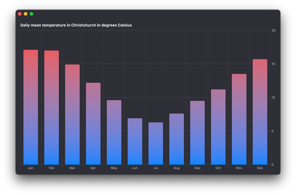
We'll start by creating a basic bar chart to plot the following data. The temperatures are indicated in degrees Celsius.
let data = [
    (month: "January", temp: 17.1),
    (month: "February", temp: 17.0),
    (month: "March", temp: 14.9),
    (month: "April", temp: 12.2),
    (month: "May", temp: 9.6),
    (month: "June", temp: 6.9),
    (month: "July", temp: 6.3),
    (month: "August", temp: 7.6),
    (month: "September", temp: 9.5),
    (month: "October", temp: 11.2),
    (month: "November", temp: 13.5),
    (month: "December", temp: 15.7)
]
I'm using strings for months of the year and doubles for temperature for simplicity here. In a real app you might want to store the temperature values using the Measurement type. You can find out how to plot values of type Measurement in one of my previous posts Using Measurements from Foundation for values in Swift Charts.
Our basic chart will have the month of the year on the x-axis and the mean temperature value on the y-axis. We'll show the abbreviated month string on the chart but provide the full string for Voice Over users with the accessibilityLabel() modifier applied to each BarMark.
Chart {
    ForEach(data, id: \.month) {
        BarMark(
            x: .value("Month", String($0.month.prefix(3))),
            y: .value("Temperature", $0.temp)
        )
        .accessibilityLabel("\($0.month)")
    }
}
The result is already good enough even with this very simple code, but there is more we can do.
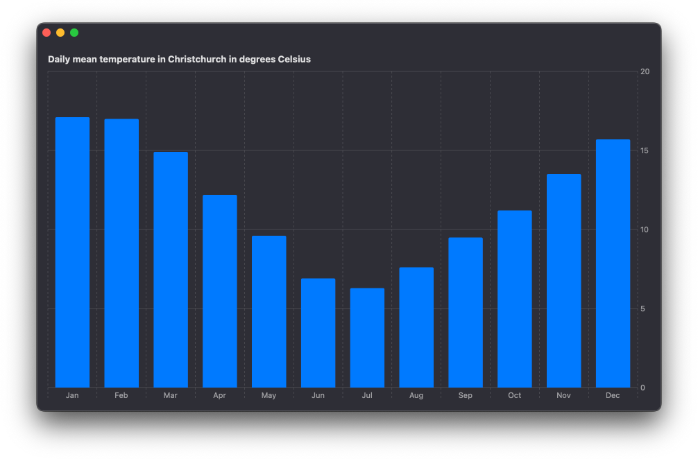
We can customize the appearance of the chart by applying a specific foreground style. In this case we will add a linear gradient going from blue color to red to visualize the cold and warm temperatures better.
Chart {
    ForEach(data, id: \.month) {
        BarMark(
            x: .value("Month", String($0.month.prefix(3))),
            y: .value("Temperature", $0.temp)
        )
        .accessibilityLabel("\($0.month)")
    }
    .foregroundStyle(
        .linearGradient(
            colors: [.blue, .red],
            startPoint: .bottom,
            endPoint: .top
        )
    )
}
If we check the result now, we'll see that by default the gradient is applied from the bottom to the top of each individual bar. This is not what we want, since it doesn't correlate with the temperature values correctly. The warmest temperatures throughout the year should have more red tint than colder temperatures.
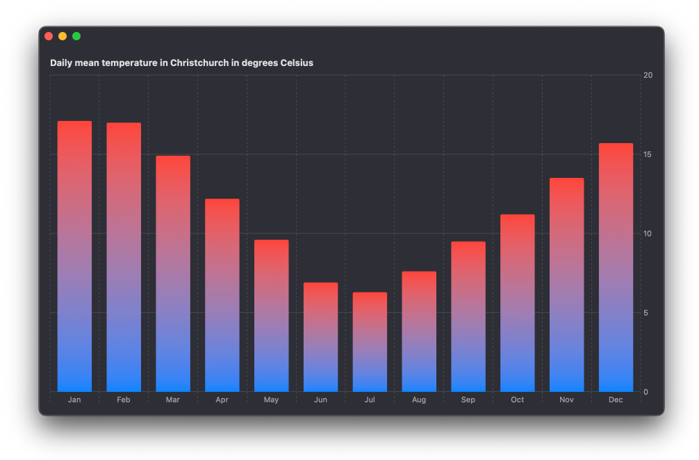
To fix it we can apply the alignsMarkStylesWithPlotArea() modifier to the style. This will ensure that the start and the end points of the gradient are marked within the plot area’s bounds rather then each individual BarMark.
Chart {
    ForEach(data, id: \.month) {
        BarMark(
            x: .value("Month", String($0.month.prefix(3))),
            y: .value("Temperature", $0.temp)
        )
        .accessibilityLabel("\($0.month)")
    }
    .foregroundStyle(
        .linearGradient(
            colors: [.blue, .red],
            startPoint: .bottom,
            endPoint: .top
        )
    )
    .alignsMarkStylesWithPlotArea()
}
We can see now that the coldest months have very little red tint while the warmest ones have more.
You can get the complete code example for this article from our GitHub repository.
If you are looking to deepen your understanding of Swift Charts and learn how to reason about your data and turn it into beautiful, performant, and accessible charts, take a look at our new book Swift Charts Beyond the Basics. It is a rich, practical reference for building advanced data visualizations with the framework.
For more resources on Swift and SwiftUI, check out our other books and book bundles.
Turn app data into insight$35
Build clear, beautiful, and interactive visualizations with Swift Charts
Swift Charts Beyond the Basics
- Reveal patterns and relationships in complex app data
- Create custom charts that stay responsive and accessible
Turn app data into insight
Build clear, beautiful, and interactive visualizations with Swift Charts
Swift Charts Beyond the Basics