

ArrangementView in SwiftUI: split and overlay layouts for iPhone Duo
SwiftUI's system components do much of the work of adapting an app to iPhone Duo. As I covered in my posts on toolbars and sheets, bars move to the edge of the display and sheets shift away from the fold without any changes to our code. The content we lay out ourselves on a screen doesn't get the same treatment. When a screen shows two pieces of content together, it's up to us to decide whether they sit side by side or one above the other, and to keep both clear of the fold when the device is partially folded.
iOS 27.1 adds a new SwiftUI view for this, ArrangementView. We give it two views, a primary and a secondary one, and SwiftUI decides where to put them depending on the available space and the position of the fold. The same code can stack the two views on the outer display, show them side by side on the inner display, and move each one to its own side of the fold in the partially folded position.
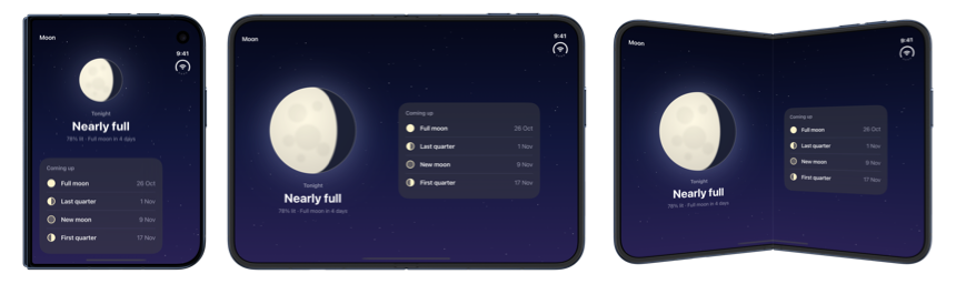
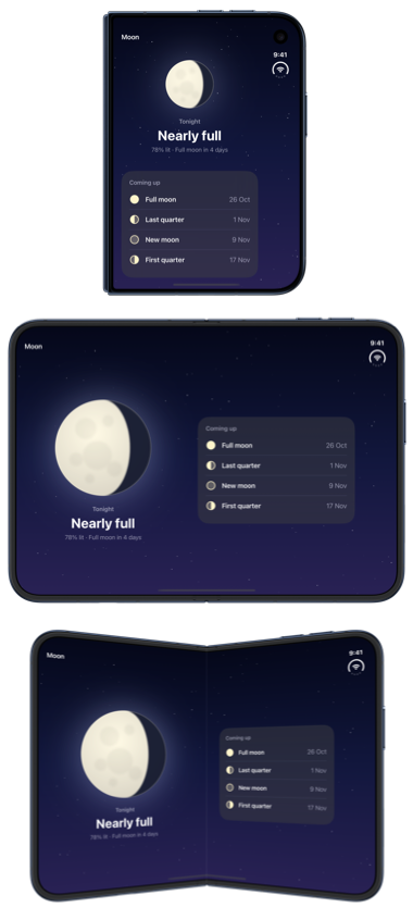
By default the two views share the space between them, but we can also layer one over the other, and adjust how much room each view gets and how its content adapts. In this post, we'll look at both arrangement styles, split and overlay, and the options we have for configuring them, using the iPhone Duo simulator in Xcode 27.1.
# Arranging two views with ArrangementView
An arrangement view is created with two view builders. The first provides the primary content and the secondary closure provides the content that accompanies it. ArrangementView is responsible for layout only and doesn't provide any navigation. If the screen needs a title, a toolbar or a navigation stack, we place the arrangement view inside a NavigationStack or a column of a NavigationSplitView ourselves, the same way we would with any other content view. Apple recommends against placing navigation containers inside an arrangement view, or placing the arrangement view itself inside a List or ScrollView.
To see the default behavior, we'll use a moon phase app that shows tonight's moon as its primary content and a list of upcoming phases as its secondary content:
struct MoonView: View {
    var body: some View {
        NavigationStack {
            ArrangementView {
                TonightView()
            } secondary: {
                UpcomingPhasesList()
            }
            .navigationTitle("Moon")
        }
    }
}
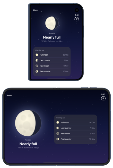
Without any further configuration, an arrangement view uses the automatic style, which resolves to a split arrangement. On the outer display of iPhone Duo in portrait, where the available space is taller than it is wide, the primary view is placed above the secondary view. On the open inner display the space is wider than it is tall, so the two views appear side by side and each receives half of the width.
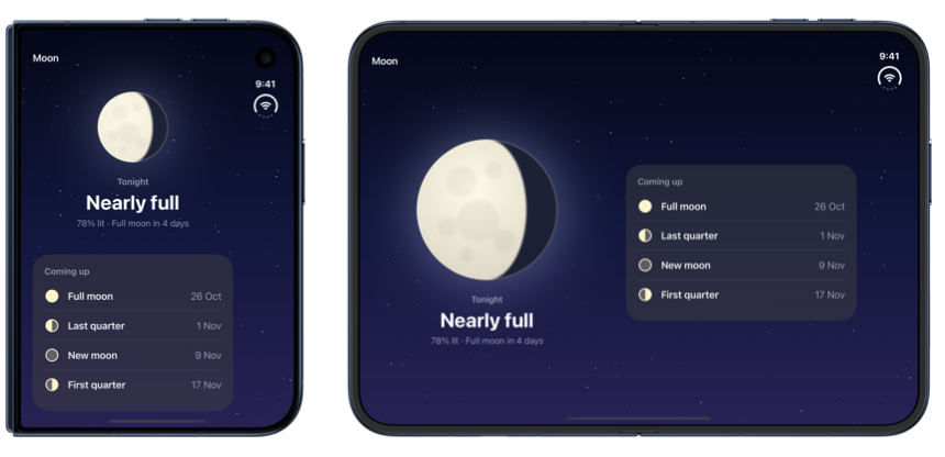
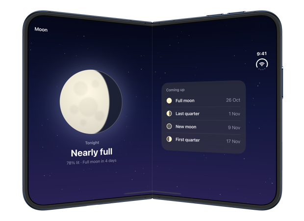
When the device is partially folded, the views stay side by side, but each one is now sized to the region on its side of the fold, so no content sits across it:
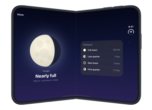
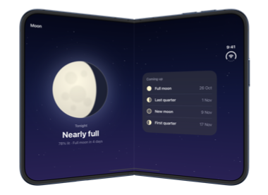
The same declaration produces all three layouts. We don't need to read size classes, measure geometry or observe the hinge to choose between them, and the arrangement updates as the device moves from one configuration to another.
# Dividing space with the split style
The layouts above come from the split arrangement, which we can also request explicitly by passing split to the arrangementViewStyle(_:) modifier. A split arrangement gives each view its own part of the available space and never lets one cover the other, which suits content where both views need to stay readable.
If only one of those layouts suits our content, we can limit the split to specific axes with the axes(_:) method on the style. When the arrangement can't split along a permitted axis, it shows the primary view alone. In our moon phase app, the list of upcoming phases is useful beside the moon but takes up half of the smaller outer display when stacked below it. Restricting the split to the horizontal axis leaves the outer display to the primary view:
ArrangementView {
    TonightView()
} secondary: {
    UpcomingPhasesList()
}
.arrangementViewStyle(.split.axes(.horizontal))
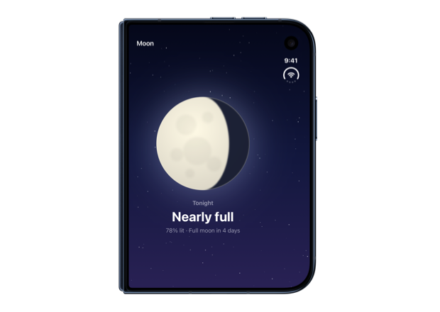
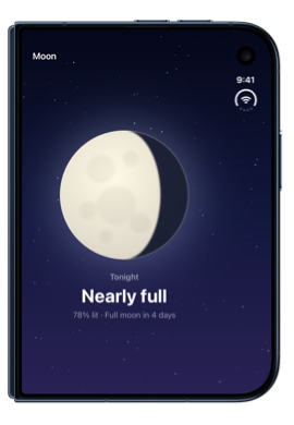
The inner display isn't affected by this change and still shows the two views side by side.
Hiding the secondary view in this way is only appropriate when its content is optional on the outer display, because Apple recommends keeping an app's functionality available in every configuration. When the content should remain on screen, we can adapt it to the smaller space instead of removing it, which we'll do with the split axis later in this post.
Work with SwiftUI. Not against it.$35
A field guide to SwiftUI patterns and anti-patterns
The SwiftUI Way
- Avoid common SwiftUI pitfalls
- Build deeper intuition for the framework
- Gain insights from a former SwiftUI Engineer at Apple
Work with SwiftUI. Not against it.
A field guide to SwiftUI patterns and anti-patterns
The SwiftUI Way
# Adjusting the split proportions
By default, a split arrangement gives each view half of the available space. To change this, we can apply the splitArrangementLayoutRatio(_:) modifier to one of the views and pass the fraction of the space it should take. For example, we can give the list of upcoming phases 40 percent of the width, leaving more room for the moon:
ArrangementView {
    TonightView()
} secondary: {
    UpcomingPhasesList()
        .splitArrangementLayoutRatio(0.4)
}
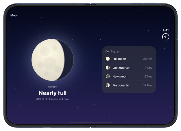
The same ratio is used for horizontal and vertical splits. If a view needs a different share in each case, we can use another overload of the modifier that accepts minimum, ideal and maximum ratios for each axis. In the following example, the list still takes 40 percent of the width beside the moon, but 55 percent of the height when it's stacked below it, which is enough to show all four rows on the outer display:
ArrangementView {
    TonightView()
} secondary: {
    UpcomingPhasesList()
        .splitArrangementLayoutRatio(
            minHorizontal: 0.35,
            idealHorizontal: 0.4,
            maxHorizontal: 0.5,
            idealVertical: 0.55
        )
}
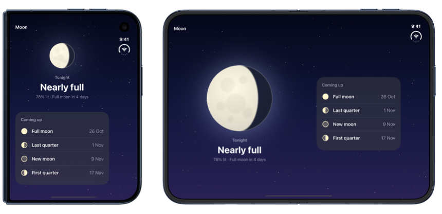
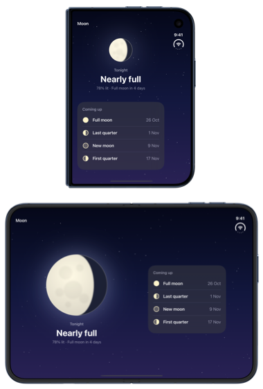
When a size in points suits a view better than a share of the space, we can use the splitArrangementLayoutSize(minWidth:idealWidth:maxWidth:minHeight:idealHeight:maxHeight:) modifier instead. Its width values apply to horizontal splits and its height values to vertical ones.
And if a view should simply take the size of its content, we can apply splitArrangementFixedLayoutSize(horizontal:vertical:). For example, a compact strip of upcoming phases can keep its own width while the moon gets the rest of the space. The flexible frame centers the strip in the space it receives:
ArrangementView {
    TonightView()
} secondary: {
    UpcomingPhasesStrip()
        .frame(maxWidth: .infinity, maxHeight: .infinity)
        .splitArrangementFixedLayoutSize()
}
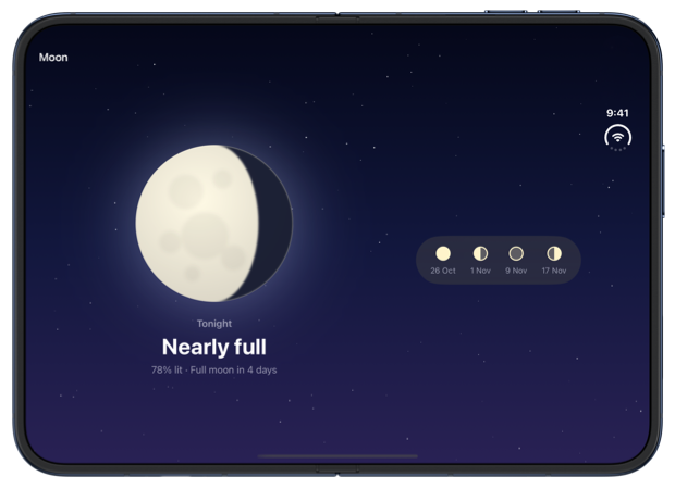
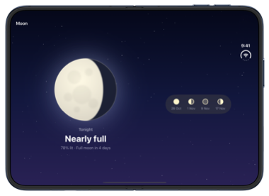
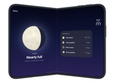
It's worth noting that these modifiers set preferences, and SwiftUI doesn't always follow them exactly. A view isn't made smaller than its content requires, so the list keeps its full height on the outer display even if we ask for 40 percent. And when the device is partially folded, the split follows the fold, regardless of the ratio or size we set. Here is our 40 percent split on the partially folded device:
# Adapting content to the split axis
A view that works well beside another view isn't always the best fit below it. Inside a split arrangement, the splitArrangementAxis environment value reports whether the views are currently split horizontally or vertically, so an arranged view can present its content differently in each case. The value is nil for a view that isn't inside a split arrangement.
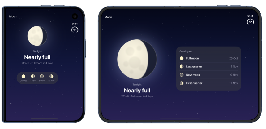
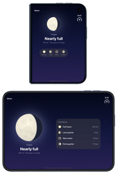
For example, we can show the upcoming phases as a full list when they sit beside the moon and as a compact strip when they are stacked below it. A small view reads the axis from the environment and chooses between the two:
struct AdaptivePhases: View {
    @Environment(\.splitArrangementAxis) private var splitAxis

    var body: some View {
        if splitAxis == .vertical {
            UpcomingPhasesStrip()
                .frame(maxWidth: .infinity, maxHeight: .infinity, alignment: .top)
        } else {
            UpcomingPhasesList()
        }
    }
}
When we add this view to the arrangement, we need to wrap it in a stack. In my testing with Xcode 27.1, a view that read splitArrangementAxis directly inside the arrangement's closure received nil and wasn't updated when the layout changed. The documentation doesn't mention this, so it may not be needed in later releases. With the view inside a ZStack, it follows the axis correctly:
ArrangementView {
    TonightView()
} secondary: {
    ZStack {
        AdaptivePhases()
    }
}
# Layering content with the overlay style
When one view can be shown on top of the other, such as a small panel of controls over a map or an image, we can use the overlay style instead of dividing the space between them. We apply it by passing overlay to the arrangementViewStyle(_:) modifier. An overlay arrangement layers the primary view over the secondary view, and when the device folds it can move the two apart so that each has its own side of the fold.
It's important to note that the view in front is the primary one. In the following example, a large moon is the secondary view in the background, and a card with tonight's details is layered over it as the primary view:
ArrangementView {
    TonightCard()
        .frame(maxWidth: .infinity, maxHeight: .infinity, alignment: .bottom)
} secondary: {
    MoonBackdrop()
}
.arrangementViewStyle(.overlay)
While the views are layered, both of them receive the arrangement's whole area, and a view that doesn't fill it is placed in the top leading corner. We use a flexible frame to move the card to the bottom edge instead. On the outer display and on the open inner display, the card covers the lower part of the moon:
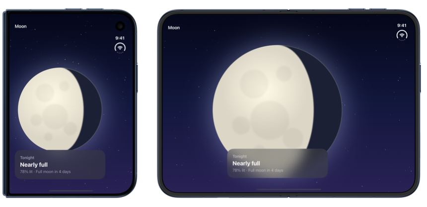
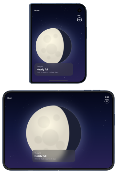
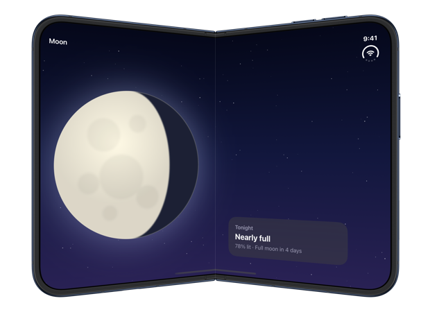
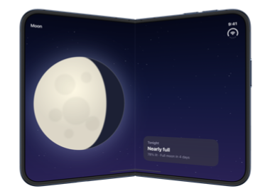
When the device is partially folded, the overlay arrangement separates the views, moving the secondary view to the leading side of the fold and the primary view to the trailing side:
The direction of the separation follows the fold. When the device is rotated so that the fold runs horizontally, the views separate vertically instead, with the secondary view above the fold and the primary view below it:
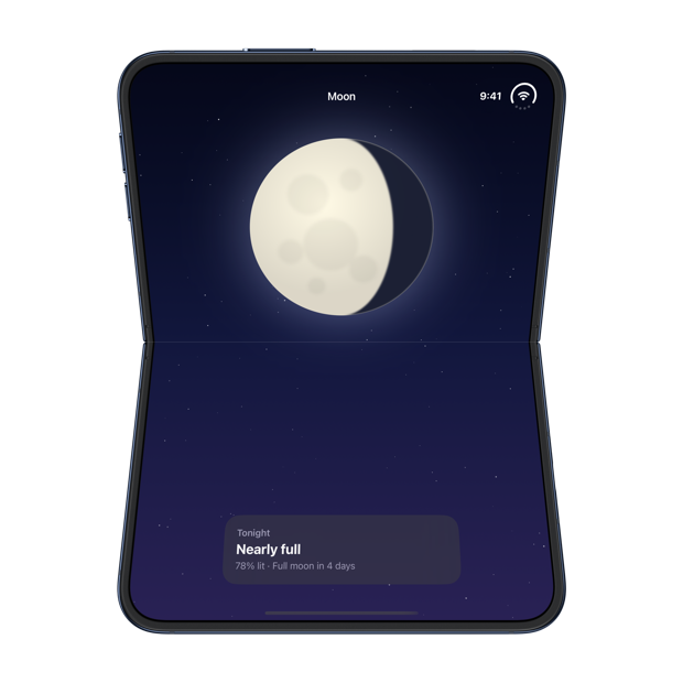
The overlay style has an axes(_:) method too, which limits the directions in which the views can separate. An overlay limited to the vertical axis, for example, can't move its views to the two sides of a vertical fold:
ArrangementView {
    TonightCard()
        .frame(maxWidth: .infinity, maxHeight: .infinity, alignment: .bottom)
} secondary: {
    MoonBackdrop()
}
.arrangementViewStyle(.overlay.axes(.vertical))
With this configuration, the views stay layered on a partially folded device, and both of them end up across the fold:
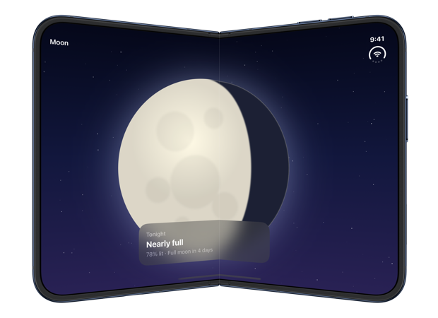
Restricting the axes of an overlay is only appropriate for content that still works across the fold, because the arrangement no longer moves it out of the way.
Deepen your understanding of SwiftUI!$35
The essential guide to SwiftUI core concepts and APIs
SwiftUI Fundamentals
- Explore the key APIs and design patterns that form the foundation of SwiftUI
- Develop a deep, practical understanding of how SwiftUI works under the hood
- Learn from a former Apple engineer who worked on widely used SwiftUI APIs
Deepen your understanding of SwiftUI!
The essential guide to SwiftUI core concepts and APIs
SwiftUI Fundamentals
# Choosing the overlay edge
If the default sides don't suit our content, we can choose where each view goes when the arrangement separates with the overlayArrangementEdge(_:) modifier, which we apply to the views inside the arrangement. It accepts a horizontal edge for layouts where the views end up side by side and a vertical edge for layouts where one ends up above the other.
To bring the card to the leading side and move the moon to the trailing side, we can give each view its edge:
ArrangementView {
    TonightCard()
        .frame(maxWidth: .infinity, maxHeight: .infinity, alignment: .bottom)
        .overlayArrangementEdge(.leading)
} secondary: {
    MoonBackdrop()
        .overlayArrangementEdge(.trailing)
}
.arrangementViewStyle(.overlay)
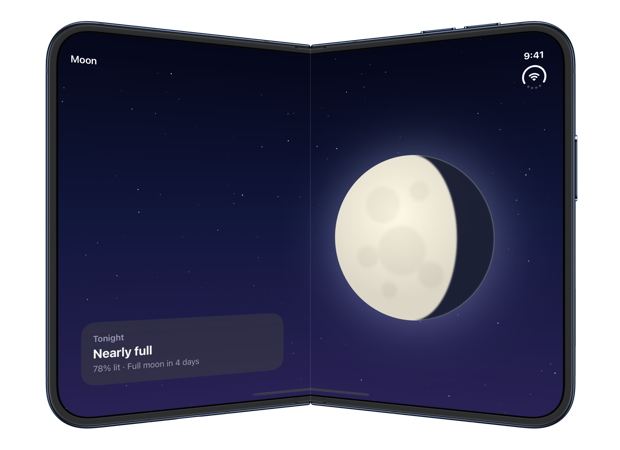
I set an edge on both views because setting only one didn't always work in my testing. Applying .leading to the primary view alone swapped the two sides as expected, but applying .trailing to only one of the views left both of them on the trailing side, one over the other. The vertical edges behaved the same way with a horizontal fold. When each view had its own edge, the layout always matched the edges I had asked for.
# Adapting content to its overlay position
A view that is layered over another one usually needs to be compact, but it can look sparse once the arrangement gives it half of the display. The overlayArrangementZIndex environment value lets a view find out which of these situations it is in. Views with a higher index are drawn in front of views with a lower one. In the layered layout, the primary view reads 1 and the secondary view reads 0, and once the arrangement has separated them, both read 0.
In our moon phase app, the card can stay compact while it is in front of the moon and expand to include the upcoming phases once it has room. We check the index in a separate view to decide which one to show:
struct TonightPanel: View {
    @Environment(\.overlayArrangementZIndex) private var zIndex

    var body: some View {
        if zIndex > 0 {
            TonightCard()
                .frame(maxWidth: .infinity, maxHeight: .infinity, alignment: .bottom)
        } else {
            TonightDetails()
        }
    }
}
As the primary view of the overlay, TonightPanel also goes inside a ZStack. Placed directly in the closure, it kept reading an index of 0 in my testing, even while it was layered in front of the moon, so it showed the expanded details over the moon instead of the compact card:
ArrangementView {
    ZStack {
        TonightPanel()
    }
} secondary: {
    MoonBackdrop()
}
.arrangementViewStyle(.overlay)
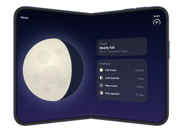
While the device is closed or fully open, the compact card is layered over the moon. Once it is partially folded, the card expands to include the upcoming phases:
# Creating a custom arrangement style
The split and overlay styles are both types that conform to the ArrangementViewStyle protocol, and we can write our own conforming types in the same way as we would for a button or a label. The protocol has a single requirement, makeBody(configuration:), and the configuration it receives provides the arrangement's primary and secondary views.
The most direct use for a custom style is to give a configured arrangement a name, so that several screens can share it. ArrangementView has an initializer that accepts a configuration, which lets a style pass the two views on to one of the built-in styles. Here is a sideBySide style for a split that only places its views side by side:
struct SideBySideArrangementViewStyle: ArrangementViewStyle {
    func makeBody(configuration: Configuration) -> some View {
        ArrangementView(configuration)
            .arrangementViewStyle(.split.axes(.horizontal))
    }
}

extension ArrangementViewStyle where Self == SideBySideArrangementViewStyle {
    static var sideBySide: SideBySideArrangementViewStyle { .init() }
}
With the static member in place, we can apply the style in the same way as the built-in ones:
ArrangementView {
    TonightView()
} secondary: {
    UpcomingPhasesList()
}
.arrangementViewStyle(.sideBySide)
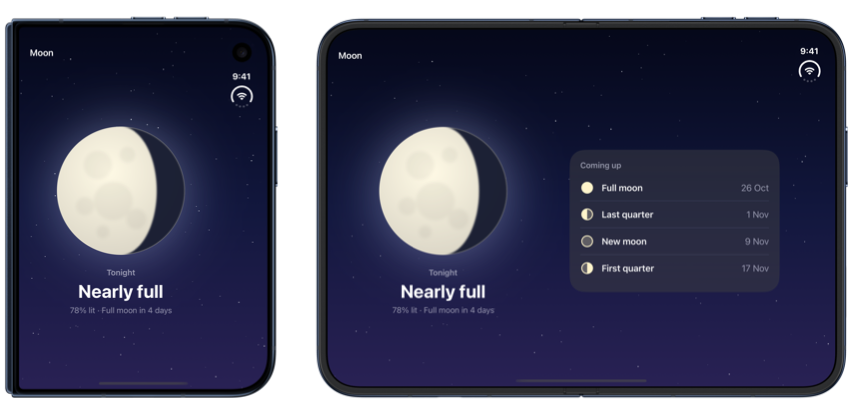
An arrangement with this style behaves exactly like the restricted split it wraps, showing the primary view alone on the outer display and the two views side by side on the inner one:
A style can also lay out configuration.primary and configuration.secondary itself, in a stack or any other container. However, this gives up what the built-in styles provide. A style that places the two views in a VStack, for example, doesn't respond to the fold, and splitArrangementAxis is nil inside it.
Handling the fold for us is what distinguishes ArrangementView from stacks and ViewThatFits, which respond only to the available size, and from NavigationSplitView, which is intended for the structure of an app's navigation rather than the layout of a single screen. For layouts that involve more than two views, iOS 27.1 also provides reserved regions, which let our own layout code move content away from the fold.
If you are looking to understand how SwiftUI sizes and positions views, my book SwiftUI Fundamentals takes a deep dive into the framework's layout system and other core principles to help you understand how it works under the hood and how to use it effectively in your projects. And if you are working with a coding agent, our Mac app SwiftFairy reviews the layout code it writes locally, using its SwiftUI Layout & Resizability guidance to flag views that won't adapt as the device folds, the screen rotates, or the content changes size.
For more resources on Swift and SwiftUI, check out my other books and book bundles.
Our Swift expertise, on call for your agent
On-device Swift and SwiftUI reviews with fix guidance
 Proper SwiftUI
 SwiftUI Layout & Resizability
 Performant Swift Charts
 Modern Swift