

Configuring SwiftUI toolbars on iPhone Duo
On iPhone Duo, navigation controls, toolbar actions, and tabs can move into a shared vertical bar along the edge of the display, leaving more vertical space for content. Apps built with the iOS 27.1 SDK get this adaptation through standard containers such as NavigationStack, NavigationSplitView, and TabView. We continue to declare toolbar actions in their usual placements, and SwiftUI determines how to present them in the current context.
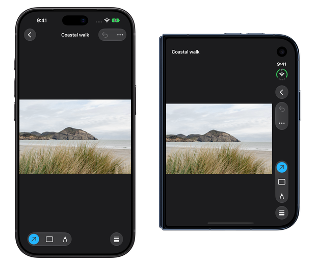
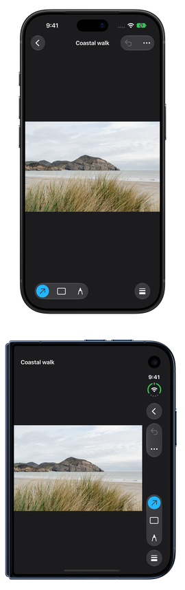
iOS 27.1 also introduces APIs for refining that presentation. We can control which items participate in the vertical bar, adapt custom content to its placement, and express which controls should remain visible when space becomes limited. We can also disable vertical bars for interfaces that benefit from a horizontal arrangement. In this post, we'll look at these additions and when to use them.
# Controlling an item's axis with axisBehavior(_:)
SwiftUI uses an item's content to decide whether it can move into a vertical bar. Standard controls with symbols can participate automatically, while text-only items and more complex custom content remain horizontal by default. The new axisBehavior(_:) modifier lets us override this choice for individual toolbar items.
For example, we can create a menu with a custom label that combines a shape and text. With the default automatic axis behavior, SwiftUI places this menu in the horizontal bar:
ToolbarItem(placement: .bottomBar) {
    Menu {
        // Actions for choosing the line width
    } label: {
        VStack {
            Capsule()
                .frame(width: 24, height: width)
            Text("\(width, format: .number) pt")
        }
    }
}
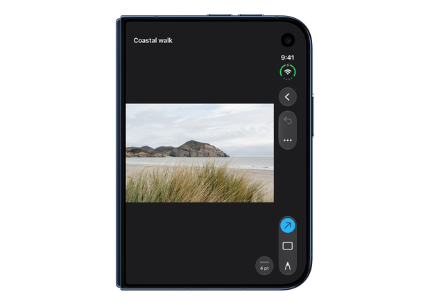

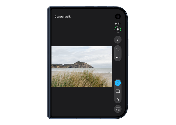
If our custom toolbar button label is small enough to fit in the vertical bar, we can apply .axisBehavior(.verticalPreferred) to the enclosing ToolbarItem:
ToolbarItem(placement: .bottomBar) {
    // ... Menu with the custom label shown above ...
}
.axisBehavior(.verticalPreferred)
The menu now joins the other controls along the right edge, leaving no toolbar item at the bottom of the content area.

For custom content that needs more horizontal space, we can use the horizontalOnly option to keep the item in a horizontal bar. For example, a slider already stays horizontal with automatic, but applying horizontalOnly makes that constraint explicit:
ToolbarItem(placement: .bottomBar) {
    Slider(value: $width, in: 2...6, step: 2) {
        Text("Line width")
    }
    .frame(width: 180)
}
.axisBehavior(.horizontalOnly)
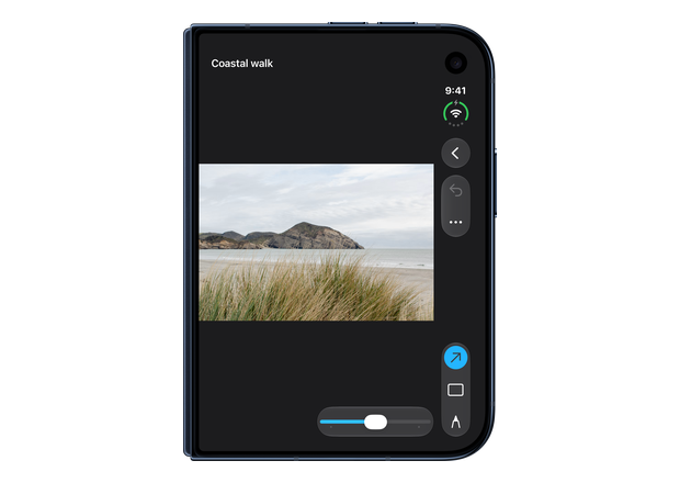

The horizontalOnly option is also useful when an item's content changes and we want its axis to remain stable across those changes.
# Reading the vertical bar's preferred edge with toolbarVerticalEdge
We can also adapt the layout of custom toolbar content using the new toolbarVerticalEdge environment value. It indicates whether the system prefers the leading or trailing edge of the interface for the vertical bar. When the system doesn't use vertical bars in the current context, the value is nil, allowing us to choose a horizontal layout for our custom content instead.
For example, we can adapt a custom toolbar button label for an item whose axisBehavior(_:) modifier is set to verticalPreferred. We arrange its shape and text horizontally when toolbarVerticalEdge is nil, and vertically otherwise:
struct AdaptiveToolbarLabel: View {
    @Environment(\.toolbarVerticalEdge) private var verticalEdge

    let width: CGFloat

    var body: some View {
        let layout = verticalEdge == nil
            ? AnyLayout(HStackLayout())
            : AnyLayout(VStackLayout())

        layout {
            Capsule()
                .frame(width: 24, height: width)
            Text("\(width, format: .number) pt")
        }
    }
}
The shape and text now appear side by side in a horizontal toolbar, and one above the other in a vertical bar.
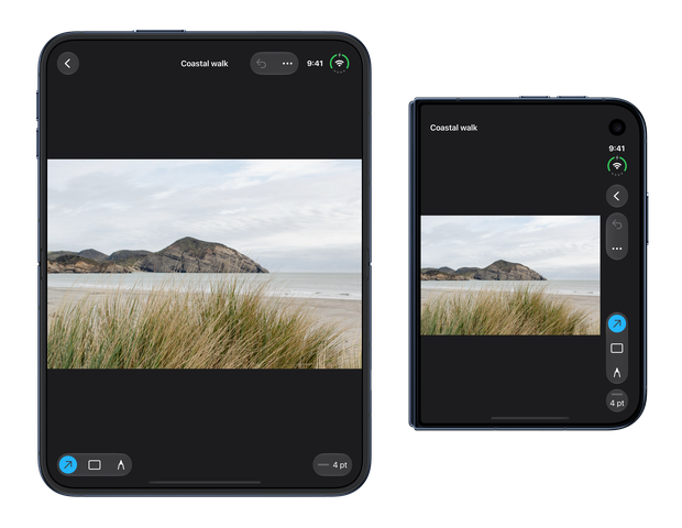
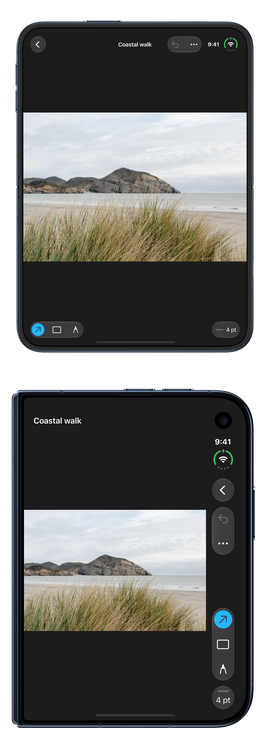
If we set a toolbar item's axisBehavior(_:) modifier to horizontalOnly, we should keep its label's horizontal layout even when toolbarVerticalEdge has a value.
# Prioritizing actions or tabs with toolbarVerticalCompressionBehavior(_:)
When tabs and toolbar items share a vertical bar, there may not be enough space to show all of them. SwiftUI can make room by moving toolbar items into overflow or collapsing the tabs into a single control for switching between them. The new toolbarVerticalCompressionBehavior(_:) modifier lets us choose which happens first.
The default automatic behavior favors the tab bar on iOS, so toolbar items move into overflow before the tabs collapse. We can also request this behavior explicitly with prefersTabBar.
For example, we can give the tab bar priority over the toolbar actions provided by a view in a navigation stack:
TabView {
    Tab("Library", systemImage: "photo.on.rectangle") {
        NavigationStack {
            PhotoEditor()
                .toolbarVerticalCompressionBehavior(.prefersTabBar)
        }
    }

    // Other tabs
}
When space is limited, SwiftUI keeps the tabs visible and moves some of the editor's toolbar items into overflow. In this case, the arrow tool stays in the bar, while the remaining editing controls move into the overflow menu.
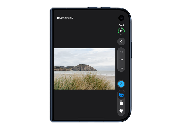

When toolbar actions should take priority over tab navigation, we can set the toolbarVerticalCompressionBehavior(_:) modifier to prefersToolbarItems:
PhotoEditor()
    .toolbarVerticalCompressionBehavior(.prefersToolbarItems)
The editor's toolbar items now remain in the bar, while the tabs collapse into a single control for switching between them.
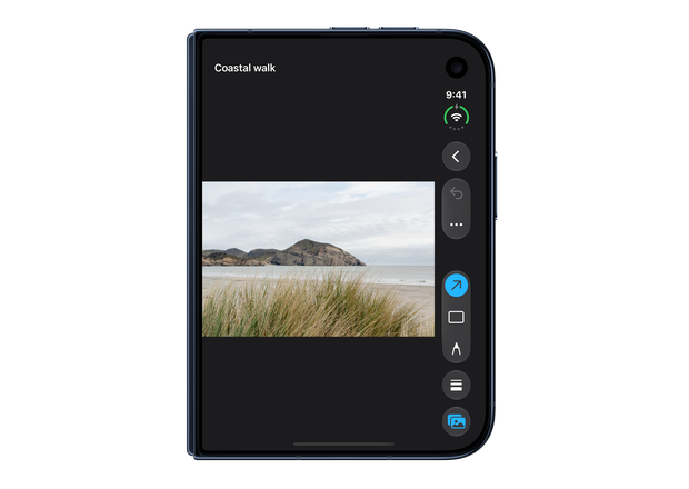

The compression behavior sets the priority between tabs and toolbar items. To control which individual toolbar items remain visible when the toolbar compresses, we can use the visibilityPriority(_:) modifier covered in Adaptive SwiftUI toolbars in iOS 27.
# Disabling vertical bars with toolbarVerticalBehavior(_:)
For interfaces that benefit from more horizontal space, we can opt out of vertical bars with the new toolbarVerticalBehavior(_:) modifier. Setting it to disabled returns bar content to the standard horizontal top and bottom bars and restores the status bar's horizontal arrangement.
For example, in a sheet where the only toolbar action is a close button, the vertical bar leaves less width for the content:
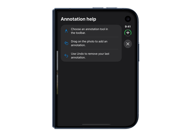
To disable vertical bars for a window or presentation, we can apply the toolbarVerticalBehavior(_:) modifier with the disabled option to a view within it:
.sheet(isPresented: $showsHelp) {
    AnnotationHelp()
        .toolbarVerticalBehavior(.disabled)
}
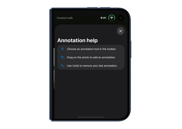
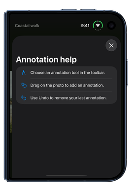
When we apply the modifier inside a sheet, it controls the sheet's bars independently of the presenting view. Within a window, SwiftUI uses the bar behavior specified by the topmost view in a NavigationStack, the selected tab in a TabView, or the trailingmost column in a NavigationSplitView.
Setting different bar behaviors on views in the same navigation stack can make the bars switch between horizontal and vertical as we navigate. Apple recommends keeping the behavior consistent rather than changing it frequently during navigation or in response to temporary view state.
If you are looking to build a strong foundation in SwiftUI, my book SwiftUI Fundamentals takes a deep dive into the framework's core principles and APIs to help you understand how it works under the hood and how to use it effectively in your projects. And my more recent book The SwiftUI Way helps you adopt recommended patterns, avoid common pitfalls, and use SwiftUI's native tools appropriately to work with the framework rather than against it.
For more resources on Swift and SwiftUI, check out my other books and book bundles.
Work with SwiftUI. Not against it.$35
A field guide to SwiftUI patterns and anti-patterns
The SwiftUI Way
- Avoid common SwiftUI pitfalls
- Build deeper intuition for the framework
- Gain insights from a former SwiftUI Engineer at Apple
Work with SwiftUI. Not against it.
A field guide to SwiftUI patterns and anti-patterns
The SwiftUI Way