

Blend modes in SwiftUI
SwiftUI's blendMode(_:) modifier controls how a view is combined with content that has already been rendered behind it. It takes a BlendMode value, whose 21 cases either calculate new colors for the overlapping area or use transparency to determine which parts of the two views remain visible.
In this post, we'll look at how every BlendMode value works, where each one can be useful and how to control which views participate in the operation with compositingGroup().
# Normal blend mode
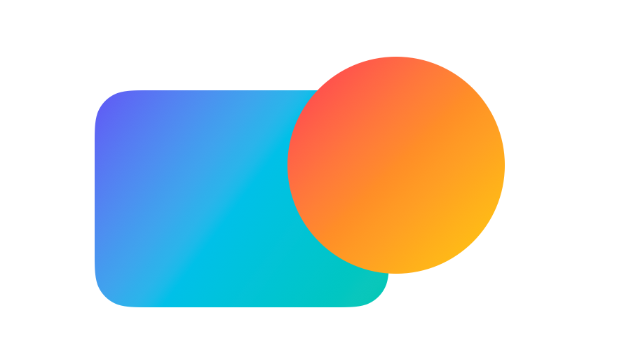
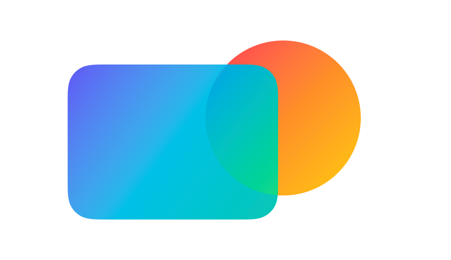
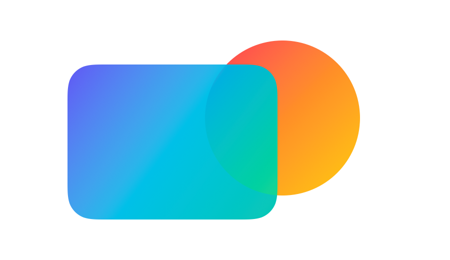
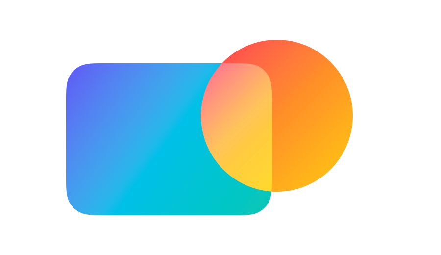
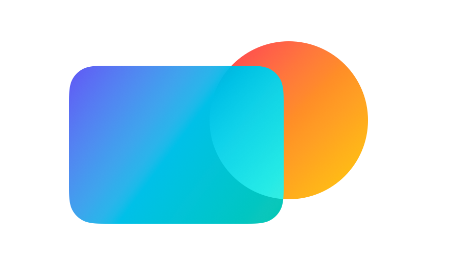
BlendMode.normal uses standard alpha compositing, which is SwiftUI's default behavior. An opaque pixel in the top view covers the content underneath, while a transparent pixel leaves it unchanged. A partially transparent pixel combines with the content underneath according to their alpha values.
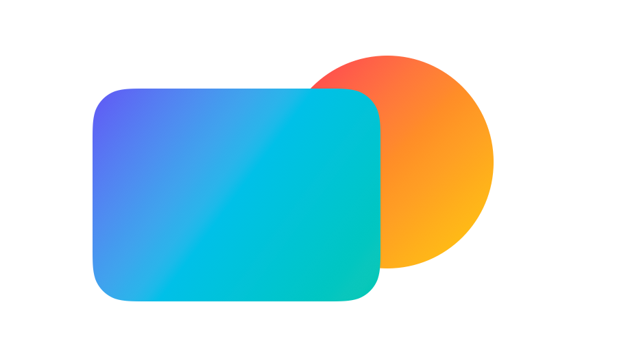
In the following example, an opaque circle placed over an opaque rounded rectangle covers the overlapping part of the rectangle with the normal blend mode value.
ZStack {
    RoundedRectangle(cornerRadius: 52)
        .fill(rectangleGradient)

    Circle()
        .fill(circleGradient)
        .blendMode(.normal)
}
# Darkening blend modes
Most BlendMode values are color blend modes, which calculate a new color for each pixel where two views overlap. Four of them, multiply, darken, colorBurn and plusDarker, make those colors darker. Although all four prevent an overlap between opaque views from becoming lighter than the content underneath, each one arrives at the darker result in a different way.
# Multiply
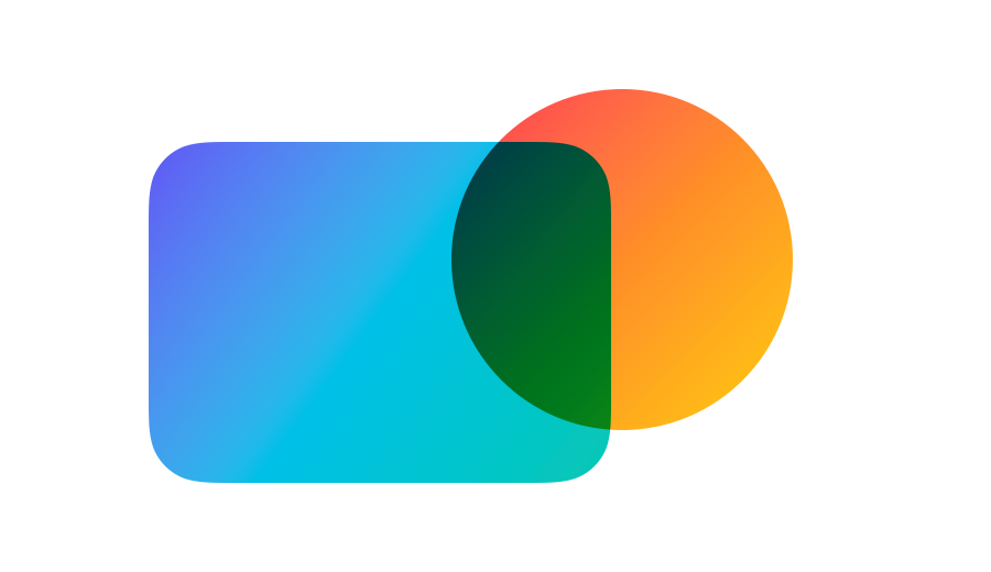
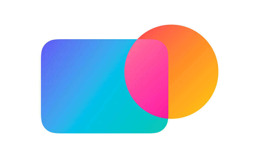
BlendMode.multiply multiplies each red, green and blue value from the top view by the corresponding value underneath. The result cannot be lighter than either color. A white pixel in the top view leaves the color underneath unchanged, while a black pixel in the top view makes the result black.
Circle()
    .fill(circleGradient)
    .blendMode(.multiply)
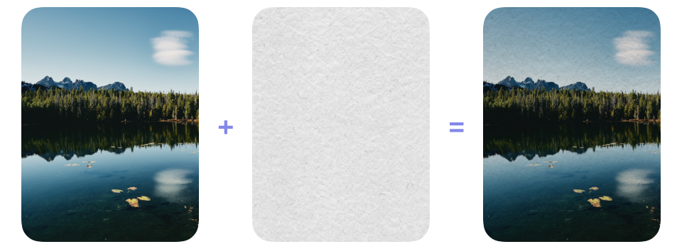
One practical use for multiply is placing a scanned, white-backed paper texture over a photograph. White areas leave the photograph unchanged, while gray fibers and grain darken it, so the texture can be applied without first removing its white background.
ZStack {
    NaturePhoto()
    PaperTexture()
        .blendMode(.multiply)
}
# Darken
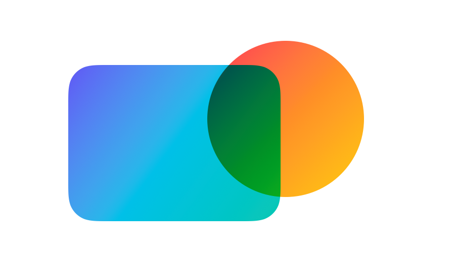
BlendMode.darken compares the corresponding red, green and blue values from both views and uses the smaller value for each color component. Unlike multiply, it selects between the input values rather than combining them.
Circle()
    .fill(circleGradient)
    .blendMode(.darken)
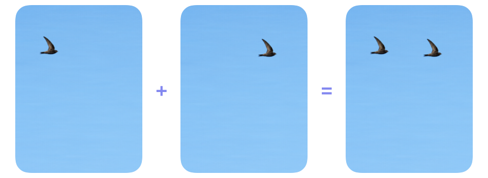
A useful application of darken is combining aligned photographs of a dark subject moving across a bright, unchanged background. In this example, the two source photographs place the bird in different positions against the same sky. darken retains the darker bird from each photograph while leaving matching sky pixels unchanged. Using multiply would also retain both birds, but it would darken the sky because it combines the color values from the two photographs.
ZStack {
    BirdFrameOne()
    BirdFrameTwo()
        .blendMode(.darken)
}
# Color burn
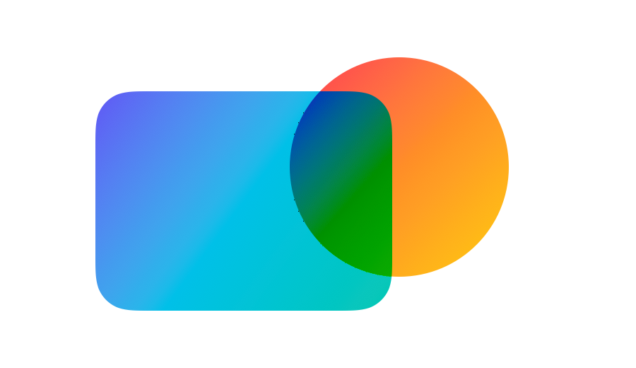
BlendMode.colorBurn calculates each red, green and blue component as 1 - (1 - underneath) / top, with results below zero clamped to zero. White in the top view has a value of one and leaves the color underneath unchanged, while smaller values make the result darker. Black produces black directly.
Circle()
    .fill(circleGradient)
    .blendMode(.colorBurn)
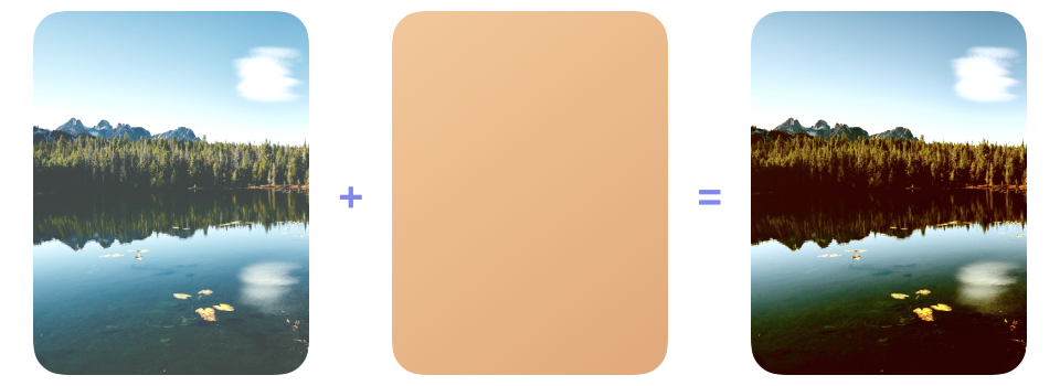
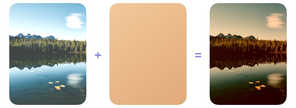
Placing a warm color layer above a photograph and applying colorBurn to the color layer can give the photograph richer color and stronger contrast. Unlike multiply, which would darken the photograph more evenly, colorBurn intensifies the color while pushing its darker areas towards black, producing a bolder result.
ZStack {
    NaturePhoto()
        .brightness(0.20)
    WarmColorLayer()
        .blendMode(.colorBurn)
}
# Plus darker
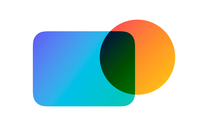
With BlendMode.plusDarker, SwiftUI adds the corresponding red, green and blue values from both views and subtracts one from each sum, clamping results below zero to zero. White in the top view leaves the color underneath unchanged, while progressively darker values push the result towards black more quickly than multiply. This operation is also known as linear burn.
Circle()
    .fill(circleGradient)
    .blendMode(.plusDarker)
Applying plusDarker to the same photograph and warm color layer used in the previous example makes the difference between the two calculations visible. Rather than increasing contrast through division as colorBurn does, plusDarker subtracts a fixed amount from each color component, leaving the sky and water noticeably darker and spreading the warm shift more evenly across the photograph. Components with low starting values can still reach zero and become black.
ZStack {
    NaturePhoto()
        .brightness(0.20)
    WarmColorLayer()
        .blendMode(.plusDarker)
}
# Lightening blend modes
The next group moves colors in the opposite direction, making them lighter where views overlap, and consists of screen, lighten, colorDodge and plusLighter. With opaque inputs, each mode produces red, green and blue values no lower than the corresponding values in the content underneath, although they arrive at the lighter result in different ways.
# Screen
BlendMode.screen is the lighter counterpart to multiply. It inverts both colors, multiplies them and then inverts the result, so black leaves the color underneath unchanged, white produces white and the result cannot be darker than either color.
Circle()
    .fill(circleGradient)
    .blendMode(.screen)
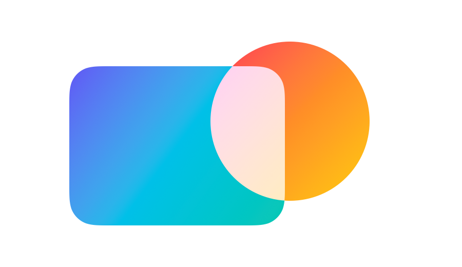
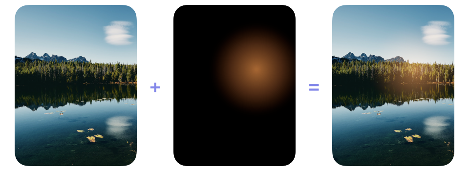
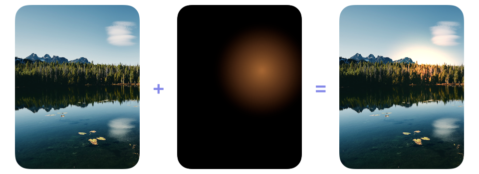
Some practical uses for screen involve adding lens flares, fire, sparks or other light effects supplied on a black background to a photograph. Black in the source layer leaves the photograph unchanged, so only the light appears and the asset does not need a transparent background.
ZStack {
    NaturePhoto()
    LightEffectOnBlack()
        .blendMode(.screen)
}
# Lighten
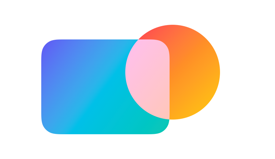
Instead of combining the input values, BlendMode.lighten compares the red, green and blue values from both views and keeps the higher value for each component. Black in the top view leaves the color underneath unchanged, while white produces white, and the result cannot be darker than either input.
Circle()
    .fill(circleGradient)
    .blendMode(.lighten)
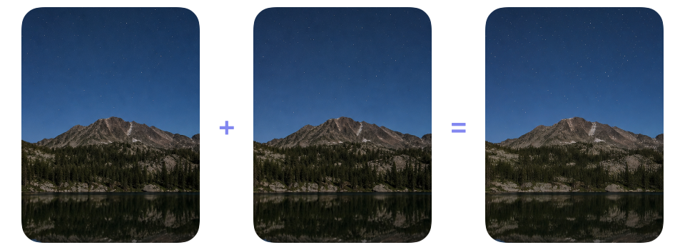
One use for lighten is combining aligned night-sky photographs in which stars appear in different positions. The brighter stars from both frames remain visible, while matching dark sky pixels stay unchanged because the mode selects values instead of combining them. Using screen would brighten the sky as well as the stars.
ZStack {
    NightSkyFrameOne()
    NightSkyFrameTwo()
        .blendMode(.lighten)
}
# Color dodge
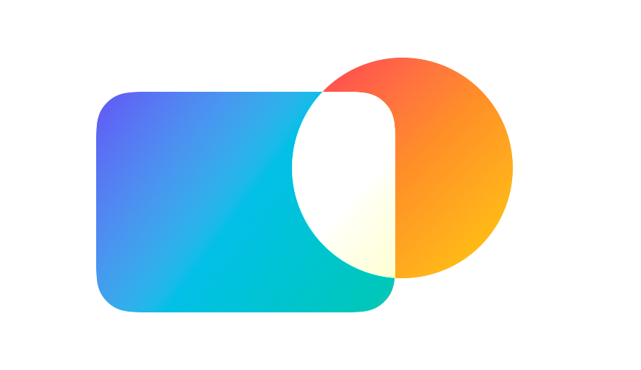
The more aggressive BlendMode.colorDodge divides each red, green and blue value underneath by one minus the corresponding value in the top view, clamping results above one to one. Black in the top view therefore leaves the color underneath unchanged, while brighter values make the divisor smaller and push the result towards white. White produces white directly.
Circle()
    .fill(circleGradient)
    .blendMode(.colorDodge)
Applying colorDodge to the same black-backed light effect used for screen produces a more intense result. While screen creates a softer glow, colorDodge pushes the illuminated area towards white more quickly and increases the contrast around it. Lowering the source opacity can make the adjustment more controlled.
ZStack {
    NaturePhoto()
    LightEffectOnBlack()
        .blendMode(.colorDodge)
}
# Plus lighter
The calculation for BlendMode.plusLighter adds the corresponding red, green and blue values from both views, clamping each sum at the maximum value represented by white. Bright colors therefore accumulate rapidly where the views overlap.
Circle()
    .fill(circleGradient)
    .blendMode(.plusLighter)
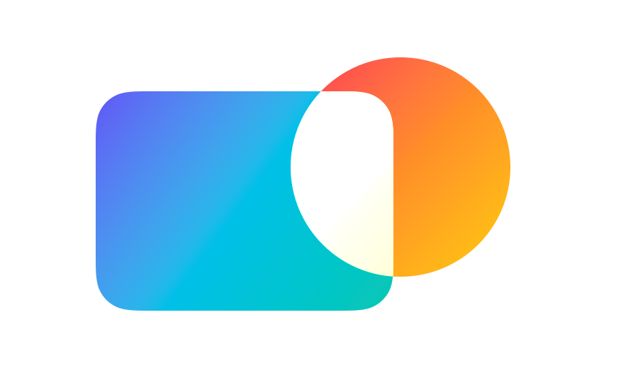
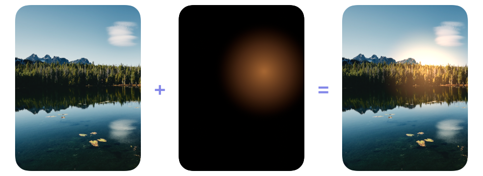
Rendered light effects are often composited additively. Applying plusLighter to the same black-backed flare used in the earlier examples adds its red, green and blue values directly to the photograph. Compared with the softer result from screen, the flare becomes brighter and reaches white more quickly, which suits an effect intended to look like emitted light.
ZStack {
    NaturePhoto()
    LightEffectOnBlack()
        .blendMode(.plusLighter)
}
# Contrast blend modes
Another group of blend modes can increase contrast by making shadows darker and highlights brighter within the same overlapping area. It consists of overlay, softLight and hardLight. Middle gray in the view on top leaves the content underneath unchanged, while darker values darken it and lighter values lighten it. Each mode applies this change differently, ranging from the gentler effect of softLight to the stronger contrast produced by overlay and hardLight.
# Overlay
BlendMode.overlay looks at the content underneath to decide how each red, green and blue component should be combined. It uses a multiply calculation for components below the midpoint and a screen calculation for those above it. Dark areas therefore remain dark and light areas remain light, while the view on top changes their color and contrast.
Circle()
    .fill(circleGradient)
    .blendMode(.overlay)
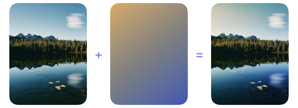
This makes overlay useful for changing the overall color treatment without flattening the contrast already present. In this example, a warm-to-cool gradient changes the color across the landscape, but the photograph's existing pattern of shadows and highlights remains prominent.
ZStack {
    NaturePhoto()
    LightingGradient()
        .blendMode(.overlay)
}
# Soft light
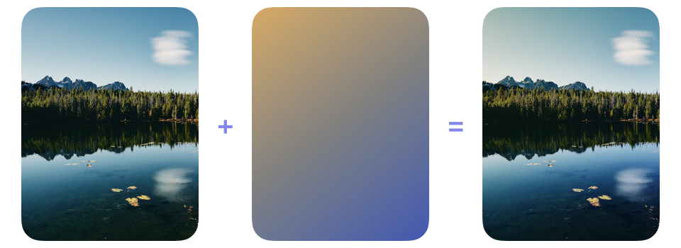
For a gentler effect, BlendMode.softLight uses the view on top to darken or lighten the content underneath. Black darkens it, white lightens it and middle gray leaves it unchanged, with a softer transition between these effects than overlay produces.
Circle()
    .fill(circleGradient)
    .blendMode(.softLight)
Placing the warm-to-cool gradient over the photograph and applying softLight to the gradient produces a restrained change in color and contrast. The warmer and cooler areas remain visible, but the result is gentler than the treatment produced by overlay.
ZStack {
    NaturePhoto()
    LightingGradient()
        .blendMode(.softLight)
}
# Hard light
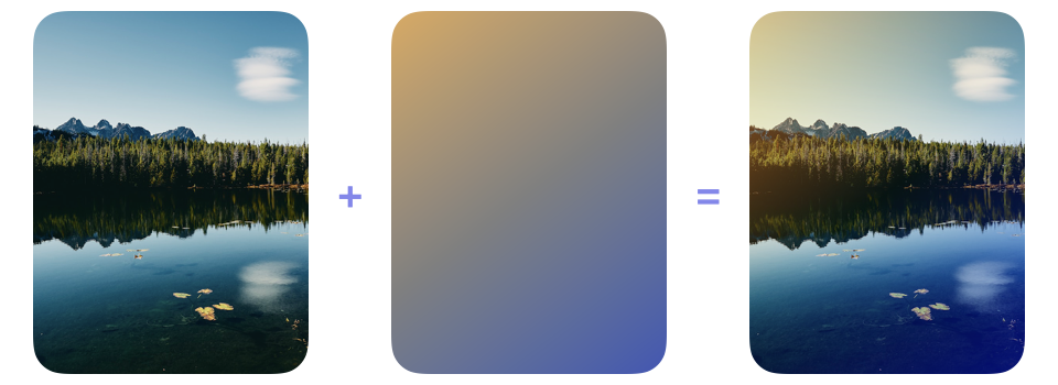
BlendMode.hardLight uses the view on top to choose between multiply and screen. For each red, green and blue component, a value below the midpoint uses multiply and a value above the midpoint uses screen. overlay, by comparison, makes this choice using the corresponding component in the content underneath.
Circle()
    .fill(circleGradient)
    .blendMode(.hardLight)
Placing the warm-to-cool gradient over the photograph and applying hardLight to the gradient makes its colors directly control which areas are multiplied and which are screened. The result is a more abrupt, stylized change in color and contrast than either overlay or softLight produces.
ZStack {
    NaturePhoto()
    LightingGradient()
        .blendMode(.hardLight)
}
# Difference blend modes
Rather than using a midpoint to choose between darkening and lightening, difference and exclusion produce inversion-like results from the relationship between the red, green and blue values in the overlapping views. Both modes leave one color unchanged when the other is black and invert it when the other is white, but they handle values between black and white differently.
# Difference
For each red, green and blue component, BlendMode.difference subtracts the lower of the two input values from the higher one. The distance between the values becomes the result, so matching colors become black and larger differences become brighter.
Circle()
    .fill(circleGradient)
    .blendMode(.difference)
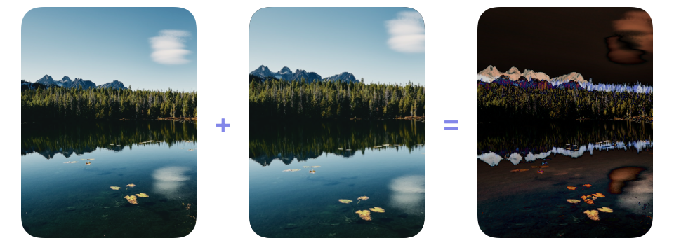
This behavior makes difference useful for comparing two versions of the same image. Placing one version over the other and applying difference to the view on top turns matching pixels black, while changes and alignment errors remain visible. In this example, the second copy is zoomed within the same frame, and the bright outlines reveal where it no longer aligns with the original.
ZStack {
    NaturePhoto()
    NaturePhoto()
        .scaleEffect(1.2)
        .blendMode(.difference)
}
.clipShape(.rect(cornerRadius: 28))
# Exclusion
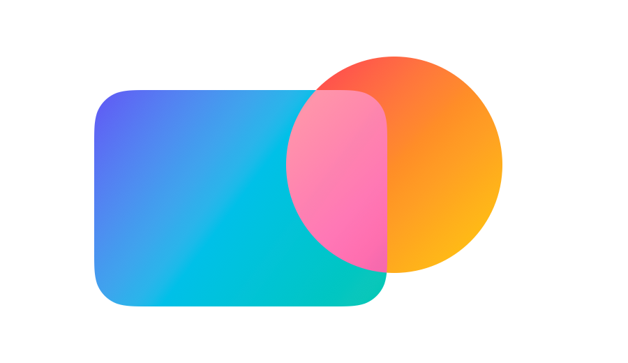
BlendMode.exclusion responds to black and white in the same way as difference, but produces lower contrast when either view contains midtone values. These middle values move the result towards gray instead of creating the deeper blacks and brighter colors that difference can produce.
Circle()
    .fill(circleGradient)
    .blendMode(.exclusion)
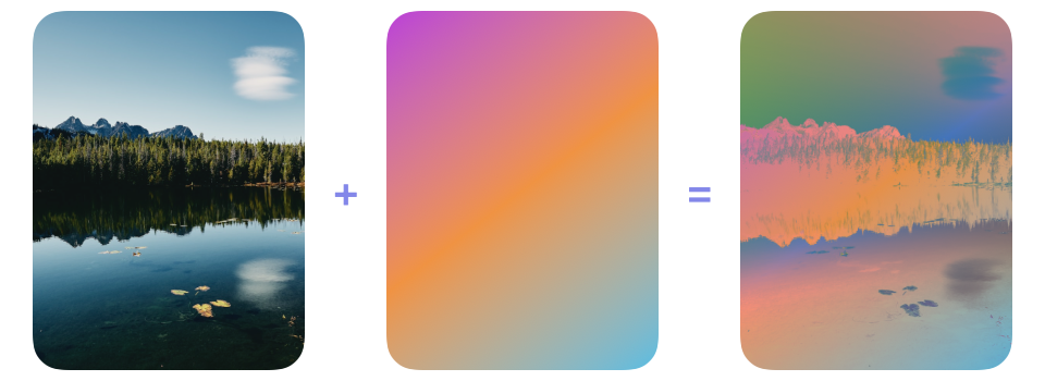
The response to middle values makes exclusion useful for creating bold, inversion-like color treatments without pushing as much of the result towards black. Here, a purple, orange and cyan gradient placed over the photograph dramatically shifts its colors, while many of the resulting values remain in the midtones.
ZStack {
    NaturePhoto()
    LinearGradient(colors: [.purple, .orange, .cyan],
                   startPoint: .topLeading,
                   endPoint: .bottomTrailing)
        .blendMode(.exclusion)
}
# Component blend modes
Colors can also be described by their hue, saturation and luminosity rather than by separate red, green and blue values. These three properties are the components referred to by the name component blend modes. Hue identifies the family of a color, saturation describes its intensity and luminosity describes how light or dark it is. The hue, saturation, color and luminosity modes take one or more of these components from the view on top and preserve the remaining components from the content underneath.
# Hue
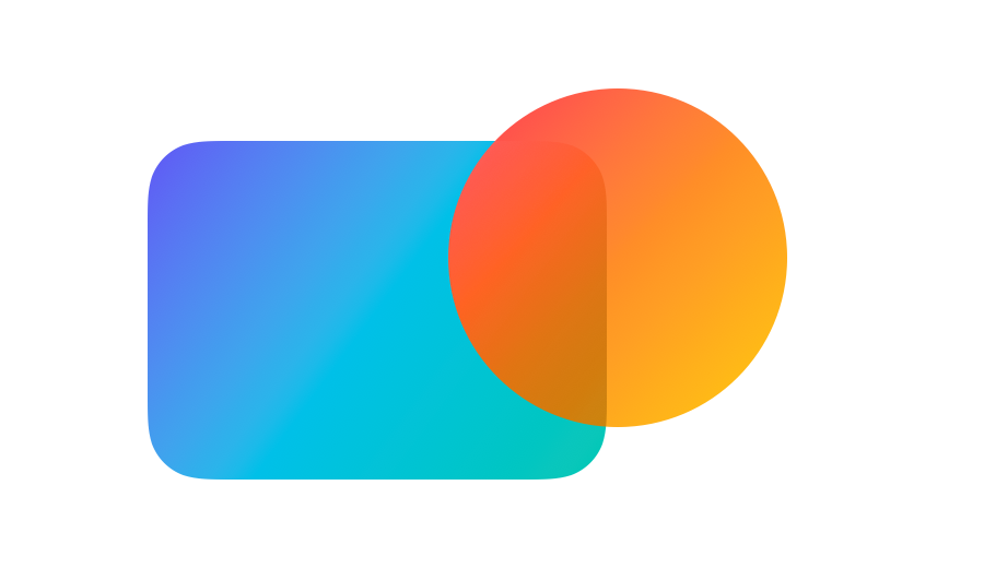
BlendMode.hue takes hue from the view on top while retaining saturation and luminosity from the content underneath. It therefore changes the family of the underlying colors without replacing the differences in their intensity or brightness.
Circle()
    .fill(circleGradient)
    .blendMode(.hue)
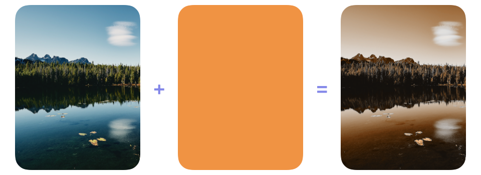
Typical uses for hue include offering alternative color treatments for photographs, illustrations and other artwork whose existing intensity and shading should remain intact. In this example, placing an orange layer over the photograph and applying hue to that layer shifts the landscape towards orange. The sky, trees and water retain their differences in color intensity and brightness because their saturation and luminosity still come from the photograph.
ZStack {
    NaturePhoto()
    Color.orange
        .blendMode(.hue)
}
# Saturation
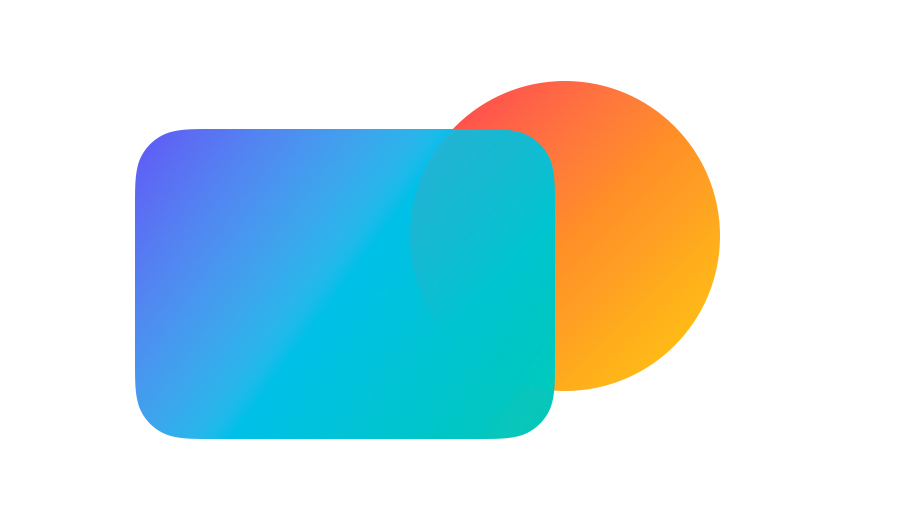
Color intensity can be adjusted independently with BlendMode.saturation, which takes saturation from the view on top while preserving hue and luminosity from the content underneath. The underlying colors and their pattern of light and dark areas therefore remain the same.
Circle()
    .fill(circleGradient)
    .blendMode(.saturation)
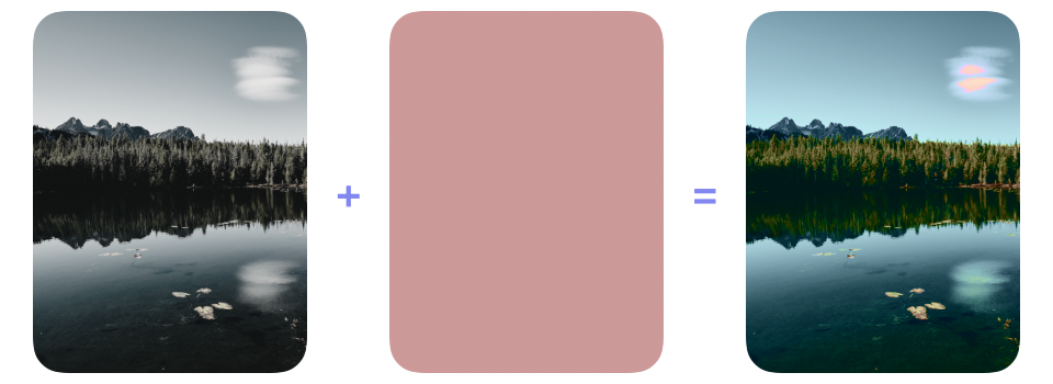
Practical uses for saturation include strengthening or muting color in photographs and matching the color intensity of artwork combined from different sources. The example below begins with a desaturated photograph and uses a muted pink layer to strengthen its colors. The landscape does not turn pink because its hue still comes from the photograph.
ZStack {
    NaturePhoto()
        .saturation(0.2)
    Color(hue: 0, saturation: 0.25, brightness: 0.8)
        .blendMode(.saturation)
}
# Color
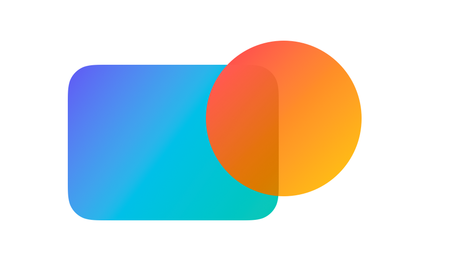
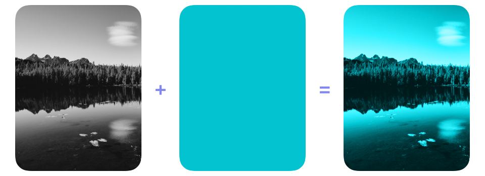
Hue and saturation can be transferred together from the view on top with BlendMode.color. The content underneath contributes only its luminosity, allowing its colors to be replaced without losing the light and dark variation that defines their shapes.
Circle()
    .fill(circleGradient)
    .blendMode(.color)
This combination is useful for colorizing grayscale content. Placing a teal layer over a grayscale version of the photograph gives it teal hue and saturation, while the photograph's luminosity continues to define the mountains, trees and reflections.
ZStack {
    NaturePhoto()
        .grayscale(1)
    Color.teal
        .blendMode(.color)
}
# Luminosity
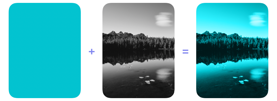
BlendMode.luminosity reverses the combination used by color: it takes luminosity from the view on top while preserving hue and saturation from the content underneath.
Circle()
    .fill(circleGradient)
    .blendMode(.luminosity)
Reversing the layers from the color example demonstrates this relationship directly. A teal layer drawn first supplies hue and saturation, while the grayscale photograph placed on top supplies luminosity. The result is a teal colorization with the photograph's full pattern of highlights, shadows and detail.
ZStack {
    Color.teal
    NaturePhoto()
        .grayscale(1)
        .blendMode(.luminosity)
}
# Porter-Duff compositing modes
The final three BlendMode cases do not calculate a new color from the two inputs. Instead, they use opacity to determine which parts of each view remain visible. This alpha-based approach is known as Porter-Duff compositing. In the names sourceAtop, destinationOver and destinationOut, source refers to the view with blendMode(_:) attached, while destination refers to the content already rendered underneath it.
# Source atop
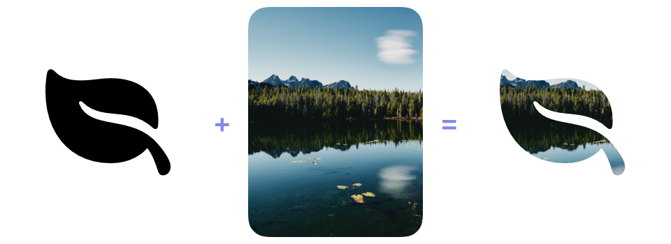
BlendMode.sourceAtop draws the source only where the destination has opacity. Within that area, the source appears on top. Any part of the source extending beyond the destination disappears, while parts of the destination not covered by the source remain visible.
Circle()
    .fill(circleGradient)
    .blendMode(.sourceAtop)

This operation is useful for filling existing shapes, symbols or lettering with an image while preserving their shape and the transparency around them. In the example below, the black leaf is drawn first as the destination and the photograph is the source. sourceAtop confines the photograph to the opaque leaf shape, producing a result similar to a mask.
ZStack {
    Image(systemName: "leaf.fill")
        .foregroundStyle(.black)
    NaturePhoto()
        .blendMode(.sourceAtop)
}
# Destination over
BlendMode.destinationOver reverses the usual drawing order by placing the source behind the destination. The destination remains in front even though the source is declared after it, and the source shows through its transparent or partially transparent areas.
Circle()
    .fill(circleGradient)
    .blendMode(.destinationOver)
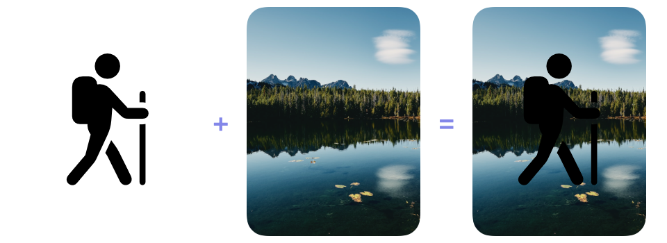
This reversed order is useful in drawing and compositing code that needs to add a background after foreground content has already been rendered. In the example below, the black hiker is drawn first. Although the photograph is declared after it, destinationOver places the photograph behind the hiker.
ZStack {
    Image(systemName: "figure.hiking")
        .foregroundStyle(.black)
    NaturePhoto()
        .blendMode(.destinationOver)
}
# Destination out
BlendMode.destinationOut removes the destination wherever the source has opacity. The source itself is not drawn, so its shape acts as an eraser. An opaque area removes the destination completely, a partially transparent area removes it partially and a transparent area removes nothing.
Circle()
    .fill(.black)
    .blendMode(.destinationOut)

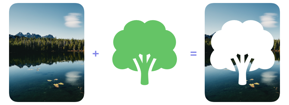
Typical uses for destinationOut include erasing strokes from a drawing, cutting shapes out of artwork and creating transparent openings in overlays. Here, a filled tree symbol removes the corresponding area from the photograph and leaves a tree-shaped hole. Although the tree is green, destinationOut uses only its opacity, so any opaque color would create the same cutout.
ZStack {
    NaturePhoto()
    Image(systemName: "tree.fill")
        .foregroundStyle(.green)
        .blendMode(.destinationOut)
}
# Controlling the compositing boundary
A blend mode can interact with more rendered content than the views beside it in a container. When an operation should remain confined to a particular set of views, those views need a compositing boundary that separates them from the surrounding hierarchy.
Containers such as ZStack arrange views, but they do not necessarily turn their contents into a separate rendered layer. Nesting the views involved in a blend operation therefore does not guarantee that content outside the container will be excluded.
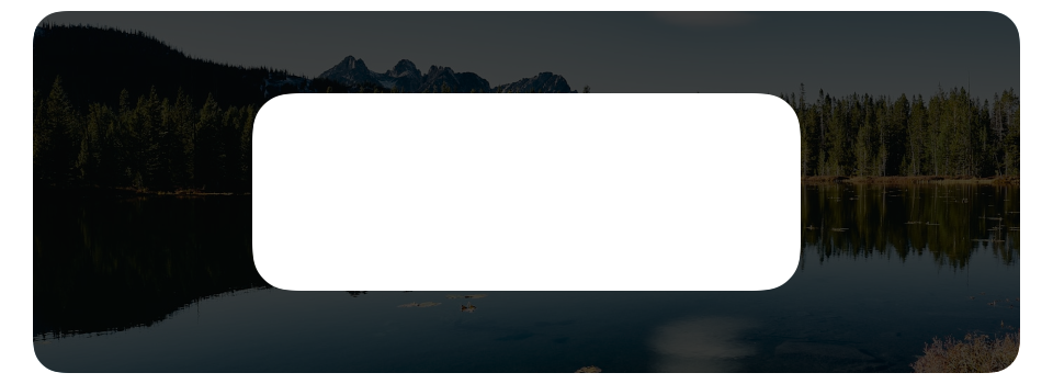
The example below attempts to leave a clear rounded rectangular area in an otherwise dimmed photograph. It places the photograph, the dimming layer and the opaque HighlightRect() in the same stack.
ZStack {
    NaturePhoto()
    DimmingLayer()
    HighlightRect()
        .blendMode(.destinationOut)
}
Because the stack has no compositing boundary, destinationOut can act on both views rendered before HighlightRect(). It removes the photograph along with the dimming layer, leaving a transparent opening rather than a clear view of the photograph.
To keep the photograph outside the operation, the dimming layer and highlight can be placed in their own stack and isolated with compositingGroup().
ZStack {
    NaturePhoto()

    ZStack {
        DimmingLayer()
        HighlightRect()
            .blendMode(.destinationOut)
    }
    .compositingGroup()
}
The highlight now removes only the dimming layer. SwiftUI places the grouped result over the untouched photograph, which remains visible through the centered opening.
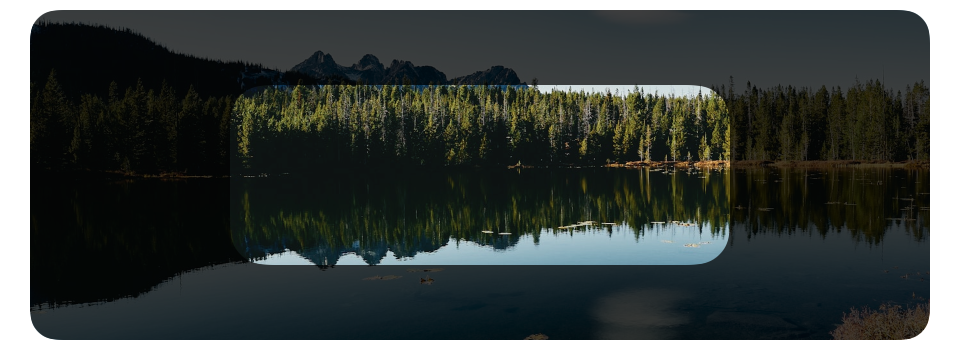
Although this example uses destinationOut, a compositing boundary can isolate any of the earlier blend modes in the same way by combining selected views before their result interacts with the surrounding hierarchy.
Even with that boundary established, the result still depends on the colors and opacity of both inputs, their drawing order and the content rendered behind them. These factors can change between light and dark appearances or when a view moves over a different background, so each supported appearance needs to be checked. Blending should not be relied on to provide enough contrast for essential text and controls.
If you are looking to build a strong foundation in SwiftUI, my book SwiftUI Fundamentals takes a deep dive into the framework's core principles and APIs to help you understand how it works under the hood and how to use it effectively in your projects. And my more recent book The SwiftUI Way helps you adopt recommended patterns, avoid common pitfalls, and use SwiftUI's native tools appropriately to work with the framework rather than against it.
For more resources on Swift and SwiftUI, check out my other books and book bundles.
Work with SwiftUI. Not against it.$35
A field guide to SwiftUI patterns and anti-patterns
The SwiftUI Way
- Avoid common SwiftUI pitfalls
- Build deeper intuition for the framework
- Gain insights from a former SwiftUI Engineer at Apple
Work with SwiftUI. Not against it.
A field guide to SwiftUI patterns and anti-patterns
The SwiftUI Way