

Building an accessible calendar chart with Swift Charts
A calendar layout makes it possible to show how a value changes from day to day while preserving the familiar structure of weeks and months. In this post, we will build a calendar in Swift Charts that displays daily step counts, using colour to represent the value recorded on each day.
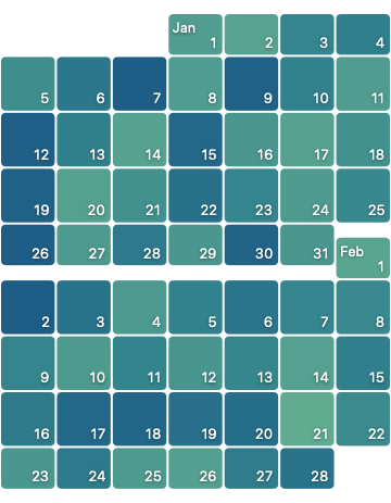
The finished chart arranges the days into square tiles and labels dates and month boundaries directly in the plot.
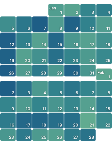
We begin building the calendar with one week of data in a Chart. Each daily step count becomes a RectangleMark. We provide its date to both axes and pass the step count to foregroundStyle(by:) to encode the value with colour.
Chart(dailyStepCounts) { dailyStepCount in
    RectangleMark(
        x: .value(
            "Date",
            dailyStepCount.date,
            unit: .weekday
        ),
        y: .value(
            "Week of year",
            dailyStepCount.date,
            unit: .weekOfYear
        )
    )
    .foregroundStyle(
        by: .value("Step count", dailyStepCount.stepCount)
    )
}
The value(_:_:unit:calendar:) method accepts a unit argument that specifies the calendar interval represented by a date on an axis. We pass .weekday on the x-axis to place each rectangle within a one-day interval, and .weekOfYear on the y-axis to place it within a one-week interval. Since all seven dates belong to the same week, their rectangles share the same vertical position and form a single row.
For now, we can hide the automatically generated axes and legend.
Chart(dailyStepCounts) { dailyStepCount in
    /* ... Existing rectangle mark ... */
}
.chartXAxis(.hidden)
.chartYAxis(.hidden)
.chartLegend(.hidden)


Because we provide one x and one y position, each with a calendar unit, every tile has a natural width and height. Swift Charts uses 70% of those dimensions by default, leaving space between the tiles. We could instead define the tile's exact bounds with xStart, xEnd, yStart, and yEnd, but the bounds-based initializer does not let us inset the resulting width and height. Keeping the position-based encoding lets us apply the same fixed inset(_:) on every edge, producing a uniform screen-space gap.
RectangleMark(
    /* ... Existing x and y values ... */
    width: .inset(1),
    height: .inset(1)
)
/* ... Existing style modifiers ... */
Applying .inset(1) removes one point from each edge of a tile along both dimensions. Neighbouring tiles are therefore separated by a two-point gap in screen space, both horizontally and vertically. This is a visual adjustment to the rendered mark and does not change the x and y values used to represent the data.


The result is a row of seven tiles separated by a consistent two-point gap. We can then extend the same chart to three weeks of data and see how Swift Charts arranges the additional dates.


The three rows form a staircase rather than seven aligned weekday columns. Although .weekday gives each mark a one-day interval, the x value still contains the observation's full date, so dates in later weeks continue further along the time scale. For the x-axis, we need to derive a second date that places every observation's weekday within a single reference week. This preserves the original date for its vertical position while making matching weekdays share the same horizontal position.
extension DailyStepCount {
    var normalizedWeekday: Date {
        let referenceDate = Date(timeIntervalSinceReferenceDate: 0)
        let calendar = Calendar.current

        var normalizedComponents = calendar.dateComponents(
            [.weekday, .hour, .minute, .second],
            from: date
        )

        let referenceWeekComponents = calendar.dateComponents(
            [.yearForWeekOfYear, .weekOfYear],
            from: referenceDate
        )

        normalizedComponents.yearForWeekOfYear =
            referenceWeekComponents.yearForWeekOfYear
        normalizedComponents.weekOfYear =
            referenceWeekComponents.weekOfYear

        return calendar.date(from: normalizedComponents) ?? referenceDate
    }
}
The computed property combines the source date's weekday and time with the reference date's week and week-based year, creating an equivalent date within that single week. This normalized date can then be used as the x value when plotting each mark.
RectangleMark(
    x: .value(
        "Day of week",
        dailyStepCount.normalizedWeekday,
        unit: .weekday
    ),
    /* ... Existing y, width and height arguments ... */
)
/* ... Existing mark modifiers ... */
This lightweight transformation can be performed as each mark is created, so we do not need a separate preprocessing step. Only the x value uses the normalized date, while the original date remains available for y-axis positioning. As a result, matching weekdays now align in the same column.
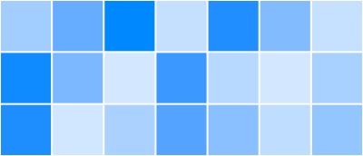

The original dates keep each week in a separate row. Together, the aligned weekday columns and week rows give us the calendar grid we need, so we can expand the chart to show a full month of data.
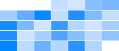

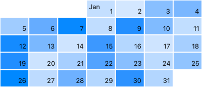
The grid now has the correct calendar structure, but the individual tiles do not yet identify their dates visually. We can use annotation(position:alignment:spacing:content:) with position: .overlay to place labels inside each rectangle: the day of the month at the bottom-trailing edge and, for the first day of a month, the abbreviated month at the top-leading edge.
RectangleMark(
    /* ... Existing position and sizing arguments ... */
)
/* ... Existing style modifiers ... */
.annotation(position: .overlay, alignment: .topLeading, spacing: 4) {
    if dailyStepCount.isFirstDayOfMonth {
        Text(
            dailyStepCount.date,
            format: .dateTime.month(.abbreviated)
        )
    }
}
.annotation(
    position: .overlay,
    alignment: .bottomTrailing,
    spacing: 4
) {
    Text(
        dailyStepCount.date,
        format: .dateTime.day()
    )
}
Setting spacing to 4 provides a four-point margin between each label and the corresponding edges of its rectangle, keeping the text from touching the tile boundaries.
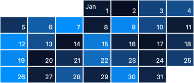
With the calendar structure and labels in place, we can start styling the chart. Until now, Swift Charts has used an automatic gradient to map step counts to tile colours. We can pass a custom Gradient directly to chartForegroundStyleScale(range:) to replace that default range.
Chart(dailyStepCounts) { dailyStepCount in
    /* ... Existing rectangle marks ... */
}
.chartForegroundStyleScale(
    range: Gradient(colors: [
        Color(red: 0.379, green: 0.669, blue: 0.566),
        Color(red: 0.201, green: 0.521, blue: 0.553),
        Color(red: 0.116, green: 0.366, blue: 0.527)
    ])
)
The custom gradient gives the tiles the intended colour range. We can round their corners by applying cornerRadius(_:style:) directly to each RectangleMark.
RectangleMark(
    /* ... Existing position and sizing arguments ... */
)
/* ... Existing style modifiers ... */
.cornerRadius(4)
To keep the date labels legible across the gradient, we give them a fixed white foreground style, apply the rounded design with fontDesign(_:) and add a subtle shadow(color:radius:x:y:).
Text(
    dailyStepCount.date,
    format: .dateTime.day()
)
.fontDesign(.rounded)
.foregroundStyle(.white)
.shadow(color: .black.opacity(0.5), radius: 1)
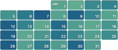
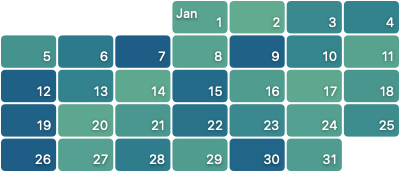
The styled result makes one remaining layout issue clear: the tiles are wider than they are tall. A calendar has seven weekday columns, so a chart spanning a given number of weeks needs a width-to-height ratio of 7 / weekCount for every tile to be square. We begin by calculating the number of week rows.
private enum StepCalendarLayout {
    static func aspectRatio(
        for dailyStepCounts: [DailyStepCount]
    ) -> CGFloat {
        guard let first = dailyStepCounts.first,
              let last = dailyStepCounts.last,
              let firstWeek = first.calendar.dateInterval(
                  of: .weekOfYear,
                  for: first.date
              ),
              let lastWeek = first.calendar.dateInterval(
                  of: .weekOfYear,
                  for: last.date
              ) else {
            return 7
        }

        let weeksBetween = first.calendar.dateComponents(
            [.weekOfYear],
            from: firstWeek.start,
            to: lastWeek.start
        ).weekOfYear ?? 0

        return 7 / CGFloat(weeksBetween + 1)
    }
}
The helper counts from the start of the first week to the start of the last, then adds one because both endpoint weeks appear in the chart. Dividing the seven weekday columns by this inclusive row count gives us the required ratio.
We pass the calculated value to aspectRatio(_:contentMode:), using .fit to preserve the ratio while keeping the chart within its available space.
Chart(dailyStepCounts) { dailyStepCount in
    /* ... Existing rectangle marks ... */
}
/* ... Existing chart modifiers ... */
.aspectRatio(
    StepCalendarLayout.aspectRatio(for: dailyStepCounts),
    contentMode: .fit
)
After applying the aspect ratio, the chart's height responds to its width, keeping each tile square as the number of week rows changes.
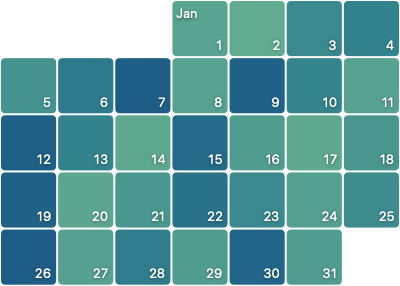
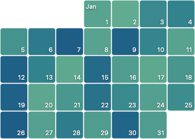
For many apps, displaying a single month is enough. When we need to show a longer date range, we can extend the same layout to cover multiple months.
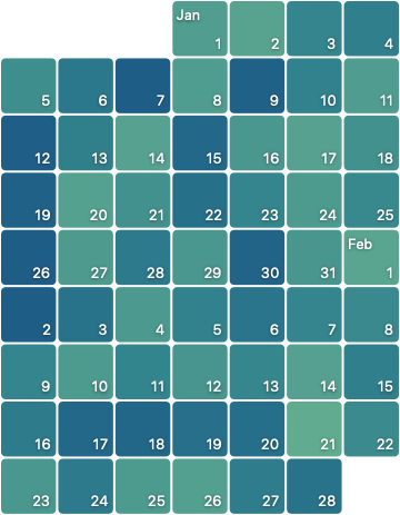
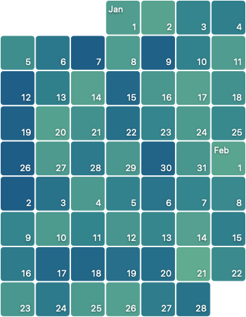
The weeks continue without interruption, so the transition from one month to the next is difficult to see. We can make each boundary visible by shortening the tiles in the last week of one month and the first week of the next, then moving each shortened tile towards the interior of its month. This is a visual adjustment only: the marks keep their original week positions and continue to represent the same dates and values.
We first map each tile's position within its month to the inset and offset needed for this adjustment.
private enum CalendarTileLayout {
    static func heightInset(
        for position: PositionWithinMonth
    ) -> CGFloat {
        switch position {
        case .firstWeek, .lastWeek:
            13
        case .interior:
            1
        }
    }

    static func verticalOffset(
        for position: PositionWithinMonth
    ) -> CGFloat {
        switch position {
        case .firstWeek:
            12
        case .interior:
            0
        case .lastWeek:
            -12
        }
    }
}
The two helpers leave interior rectangles unchanged while adjusting the first and last weeks of each month. Their height inset grows from 1 to 13 points, while a 12-point offset moves the first- and last-week rectangles in opposite directions. With both values calculated, we can use them when constructing each mark.
RectangleMark(
    /* ... Existing x, y and width arguments ... */
    height: .inset(
        CalendarTileLayout.heightInset(
            for: dailyStepCount.positionWithinMonth
        )
    )
)
/* ... Existing mark modifiers ... */
.offset(
    y: CalendarTileLayout.verticalOffset(
        for: dailyStepCount.positionWithinMonth
    )
)
Each adjusted rectangle remains within the vertical band for its original week. It only becomes shorter and shifts towards the interior of its month, away from the month boundary.
Testing the finished chart with VoiceOver reveals a problem. On iOS, Swift Charts can combine marks that share the same x-axis value into a single description. Because every occurrence of a weekday uses the same normalized x value, VoiceOver groups an entire weekday column together instead of letting people navigate through the data one day at a time.
To replace these groups with one element for each day, we can use accessibilityChildren(children:). The modifier's content-building closure supplies the replacement accessibility children.
SwiftUI hides the views produced by this closure and uses them only to generate synthetic accessibility elements. Our chart already follows a regular grid of square day tiles, so we can construct a matching accessibility grid with one child for every daily step count.
To align the synthetic elements precisely with their corresponding tiles, we apply the modifier to the plot-area content inside chartPlotStyle(content:). This replaces the plot area's accessibility children directly and gives the synthetic grid the same bounds as the rendered marks.
Chart(dailyStepCounts) { dailyStepCount in
    /* ... Existing rectangle marks ... */
}
/* ... Existing chart modifiers ... */
.chartPlotStyle { chartContent in
    chartContent.accessibilityChildren {
        StepCalendarAccessibilityContent(
            dailyStepCounts: dailyStepCounts
        )
    }
}
StepCalendarAccessibilityContent defines the replacement accessibility hierarchy as a SwiftUI view. It arranges the daily values into week rows so the hierarchy follows the same seven-column grid as the plot.
import Algorithms

private struct StepCalendarAccessibilityContent: View {
    let dailyStepCounts: [DailyStepCount]

    var body: some View {
        VStack(spacing: 0) {
            ForEach(
                paddedDays.chunks(ofCount: 7),
                id: \.startIndex
            ) { week in
                StepCalendarAccessibilityWeekRow(days: week)
            }
        }
    }

    private var paddedDays: [DailyStepCount?] {
        guard let firstDate = dailyStepCounts.first?.date else {
            return []
        }

        let calendar = Calendar.current
        let weekday = calendar.component(.weekday, from: firstDate)
        let leadingDayCount =
            (weekday - calendar.firstWeekday + 7) % 7

        var days = Array(
            repeating: DailyStepCount?.none,
            count: leadingDayCount
        )
        days.append(contentsOf: dailyStepCounts.map(Optional.some))

        let trailingDayCount = (7 - days.count % 7) % 7
        days.append(
            contentsOf: repeatElement(
                DailyStepCount?.none,
                count: trailingDayCount
            )
        )

        return days
    }
}
The paddedDays array begins with enough nil entries to place the first date in its correct weekday column. After appending the daily values, it adds trailing entries until the array's count is a multiple of seven. This lets chunks(ofCount:) produce complete week rows without shifting any real dates. Each seven-day chunk then becomes a horizontal row of accessibility elements.
private struct StepCalendarAccessibilityWeekRow: View {
    let days: ArraySlice<DailyStepCount?>

    var body: some View {
        HStack(spacing: 0) {
            ForEach(days.indices, id: \.self) { index in
                let day = days[index]

                RoundedRectangle(cornerRadius: 4)
                    .aspectRatio(1, contentMode: .fit)
                    .accessibilityLabel(
                        day?.accessibilityDate ?? Text("")
                    )
                    .accessibilityValue(
                        day?.accessibilityStepCount ?? Text("")
                    )
                    .accessibilityHidden(day == nil)
            }
        }
    }
}
The aspectRatio(1, contentMode: .fit) modifier keeps every accessibility element square, matching the geometry of the corresponding chart tile. Each element representing a date uses that date as its accessibility label and its step count as the value. Placeholder elements still occupy their columns, but accessibilityHidden(_:) removes them from the accessibility hierarchy so people navigate only through actual dates. We keep the formatted accessibility label and value on DailyStepCount, leaving the row view focused on layout and accessibility structure.
extension DailyStepCount {
    var accessibilityDate: Text {
        Text(
            date,
            format: .dateTime.weekday(.wide).day().month(.wide)
        )
    }

    var accessibilityStepCount: Text {
        Text("^[\(stepCount) step](inflect: true)")
    }
}
Day-by-day navigation is now possible, but moving through a long calendar one date at a time is slow. We can use accessibilityAddTraits(_:) to add the .isHeader trait to the accessibility element for the first day of each month. Heading navigation then gives VoiceOver users a quicker way to move from one month to the next.
RoundedRectangle(cornerRadius: 4)
    /* ... Existing accessibility modifiers ... */
    .accessibilityAddTraits(
        day?.isFirstDayOfMonth == true ? .isHeader : []
    )
The synthetic grid gives VoiceOver users day-by-day navigation and headings for moving between months, while the chart keeps its two-axis time representation. That representation can also support future scrolling and selection. If we later make the chart vertically scrollable, its scroll position can remain a date and its visible y-domain can be expressed as a TimeInterval. For selections, rounding the selected y-axis date to the start of its week and applying the weekday and time components from the selected x-axis date lets us identify the precise moment where the person interacted with the chart.
You can find the sample code for this post on GitHub.
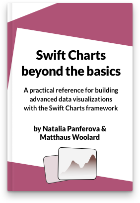
If you are looking to deepen your understanding of Swift Charts and learn how to reason about your data and turn it into beautiful, performant, and accessible charts, take a look at our new book Swift Charts Beyond the Basics. It is a rich, practical reference for building advanced data visualizations with the framework.
For more resources on Swift and SwiftUI, check out our other books and book bundles.
Turn app data into insight$35
Build clear, beautiful, and interactive visualizations with Swift Charts
Swift Charts Beyond the Basics
- Reveal patterns and relationships in complex app data
- Create custom charts that stay responsive and accessible
Turn app data into insight
Build clear, beautiful, and interactive visualizations with Swift Charts
Swift Charts Beyond the Basics