

Adjust SwiftUI controls for the Button Shapes accessibility setting
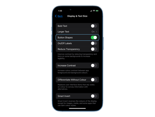
Some iPhone users prefer to see clear edges and borders of buttons, so that they stand out more among regular labels in the UI. They can enable the "Button Shapes" toggle in the Accessibility settings on their device, so that the system can change the appearance of controls to suit the user's needs.
In many cases SwiftUI automatically adjusts the appearance of our controls to match the user settings, for example, when we use Button views with built-in styles or framework provided NavigationLink and Link controls.
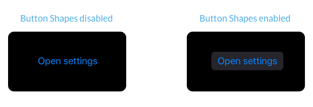
A button in SwiftUI with an automatic style will get resolved into a bordered one on devices where the "Button Shapes" setting is enabled.
Button("Open settings") {
    // open settings
}
.buttonStyle(.automatic)
But sometimes we need to adjust the appearance of our controls manually to respond to the accessibility setting. This can be necessary when we are defining custom button styles or embed links inside Text views. To know whether "Button Shapes" setting is enabled, we can read the accessibilityShowButtonShapes environment value.
struct ContentView: View {
    @Environment(\.accessibilityShowButtonShapes)
    private var accessibilityShowButtonShapes

    var body: some View {
        ...
    }
}

Level up your Swift skills!$35
100+ tips to take your Swift code to the next level
Swift Gems
- Advanced Swift techniques for experienced developers bypassing basic tutorials
- Curated, actionable tips ready for immediate integration into any Swift project
- Strategies to improve code quality, structure, and performance across all platforms
Level up your Swift skills!
100+ tips to take your Swift code to the next level
Swift Gems
# Adjust custom button styles
When creating custom button styles that don't give a stand-out shape to the button, we should consider adding a background, a border or an underline to the button when accessibilityShowButtonShapes is set to true.
struct ScalingButtonStyle: ButtonStyle {
    @Environment(\.accessibilityShowButtonShapes)
    private var accessibilityShowButtonShapes

    func makeBody(configuration: Configuration) -> some View {
        configuration.label
            .foregroundColor(.blue)
            .padding()
            .border(
                .blue,
                width: accessibilityShowButtonShapes ? 1 : 0
            )
            .scaleEffect(configuration.isPressed ? 1.5 : 1)
            .animation(.default, value: configuration.isPressed)
    }
}
# Underline links inside text
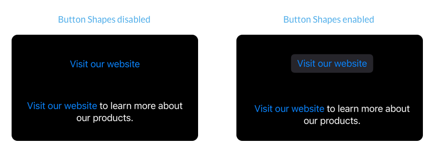
Standalone Link views and NavigationLinks get automatically adjusted to respond to the "Button Shapes" setting. But links embedded inside Text views using Markdown or AttributedString don't change their appearance.
VStack(spacing: 60) {
    Link(
        "Visit our website",
        destination: URL(
            string: "https://example.com"
        )!
    )

    Text("""
    [Visit our website](https://example.com) \
    to learn more about our products.
    """)
}
.multilineTextAlignment(.center)
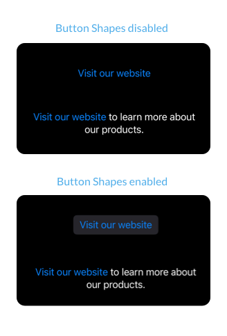
We can make the link inside text more prominent by adding an underline when the accessibilityShowButtonShapes is set to true. We can do that by wrapping it in a separate Text view and make use of the LocalizedStringKey.StringInterpolation.
struct ContentView: View {
    @Environment(\.accessibilityShowButtonShapes)
    private var accessibilityShowButtonShapes

    var body: some View {
        Text("""
        \(
            Text("[Visit our website](https://example.com)")
                .underline(accessibilityShowButtonShapes)
        ) to learn more about our products.
        """)
        .multilineTextAlignment(.center)
    }
}