

Show chart annotations on hover in Swift Charts
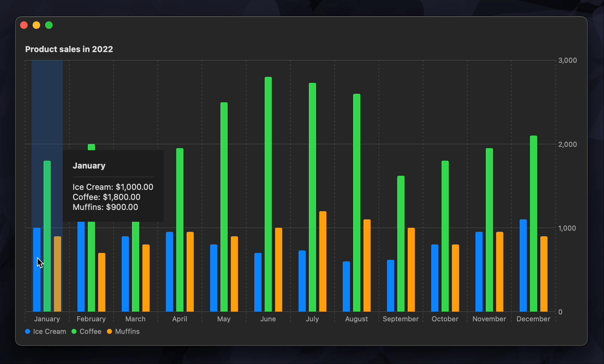
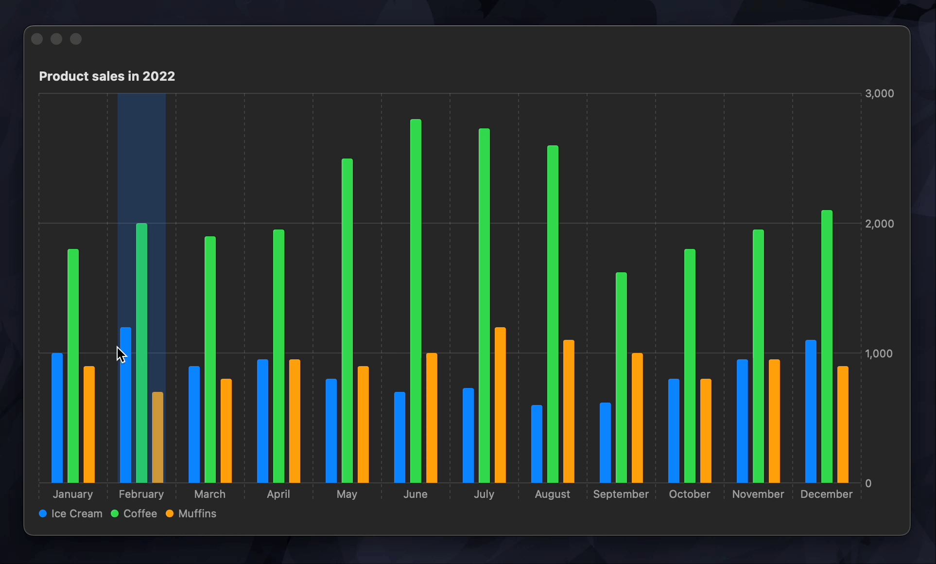
In this post we are going to see how to create an interactive bar chart that shows chart annotations when the user is hovering over bar marks. The bar marks will reflect sales data for three different products over the year grouped by month. The annotations will provide the exact sales numbers for each product for a specific month. Here is how the final result will look.
We are adding the annotations on hover, so this post is focusing on macOS and iPadOS platforms where users can place a pointer over views using a mouse or a trackpad. But the solution described here can be adapted to work on the phone if the hover interaction is replaced with a tap or a drag.

Level up your Swift skills!$35
100+ tips to take your Swift code to the next level
Swift Gems
- Advanced Swift techniques for experienced developers bypassing basic tutorials
- Curated, actionable tips ready for immediate integration into any Swift project
- Strategies to improve code quality, structure, and performance across all platforms
Level up your Swift skills!
100+ tips to take your Swift code to the next level
Swift Gems
# Prepare chart data
For this example we are going to define a very simple data model for Product. It will contain an id, a name, and sales data stored in an array of doubles. We are also going to define a computed variable that provides sales data for all of the months as an array of tuples, so that the data is easier to chart.
struct Product: Identifiable {
    let id = UUID()
    let name: String
    let salesData: [Double]

    var salesDataByMonth: [(month: String, sales: Double)] {
        salesData.enumerated().map { (offset, sales) in
            return (
                month: Calendar.current.monthSymbols[offset],
                sales: sales
            )
        }
    }
}
Then we are going to create some example data to work with. The chart will contain sales data for three different products over the year: ice cream, coffee and muffins.
struct ContentView: View {
    let products = [
        Product(
            name: "Ice Cream",
            salesData: [
                1000, 1200, 900, 950, 800, 700,
                730, 600, 620, 800, 950, 1100
            ]
        ),
        Product(
            name: "Coffee",
            salesData: [
                1800, 2000, 1900, 1950, 2500, 2800,
                2730, 2600, 1620, 1800, 1950, 2100
            ]
        ),
        Product(
            name: "Muffins",
            salesData: [
                900, 700, 800, 950, 900, 1000,
                1200, 1100, 1000, 800, 950, 900
            ]
        )
    ]

    var body: some View {
        ...
    }
}
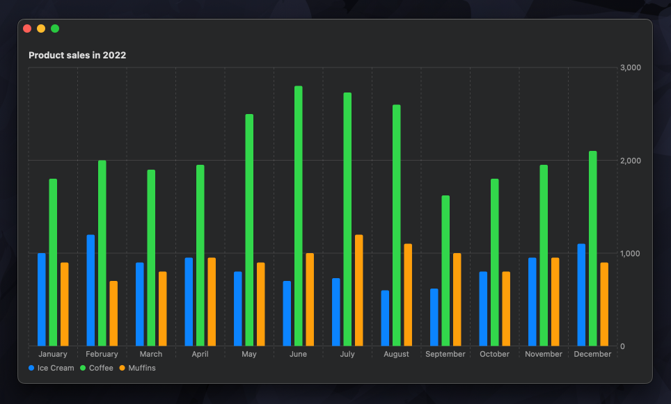
# Create a bar chart
Now we can display our example data in a simple bar chart. We'll loop over the products first and then over the sales data for each product to create bar marks.
struct ContentView: View {
    let products = [ ... ]

    var body: some View {
        VStack(alignment: .leading) {
            Text("Product sales in 2022")
                .font(.headline)

            Chart {
                ForEach(products) { product in
                    ForEach(product.salesDataByMonth, id: \.month) { salesData in
                        BarMark(
                            x: .value("Month", salesData.0),
                            y: .value("Sales", salesData.sales)
                        )
                        .position(by: .value("Product", product.name))
                        .foregroundStyle(by: .value("Product", product.name))
                    }
                }
            }
        }
        .padding()
    }
}
To make sure that the marks for each product are displayed next to each other rather then being stacked, we add the position() modifier. And to differentiate products by color, we use the foregroundStyle() API.
The chart already looks great but it's not interactive yet.
# Add interactivity on hover
To know when the user is hovering over the chart view and to get the exact location of the pointer, we'll add an overlay to the chart and attach an onContinuousHover() modifier to it. The chartOverlay() API provides us with a ChartProxy that is useful for translating view coordinates into chart values.
When the hover is active, we'll read the current location of the pointer and get the corresponding month value from the proxy. We'll assign the month to a state variable on the view so that we can use it to show the right annotations later. We'll reset the selected month to nil when the pointer leaves the view.
struct ContentView: View {
    let products = [ ... ]

    @State private var selectedMonth: String?

    var body: some View {
        VStack(alignment: .leading) {
            ...
            Chart { ... }
            .chartOverlay { (chartProxy: ChartProxy) in
                Color.clear
                    .onContinuousHover { hoverPhase in
                        switch hoverPhase {
                        case .active(let hoverLocation):
                            selectedMonth = chartProxy.value(
                                atX: hoverLocation.x, as: String.self
                            )
                        case .ended:
                            selectedMonth = nil
                        }
                    }
            }
        }
    }
}
Now that we know which month the user is hovering on, we can highlight it. One way to do it is to add a RectangleMark on top of the bars that belong to the selected month.
Enhance older apps with SwiftUI!$40
A detailed guide on gradually adopting SwiftUI in UIKit projects
Updated for iOS 18 and Xcode 16!
Integrating SwiftUI into UIKit Apps
- Upgrade your apps with new features like Swift Charts and Widgets
- Support older iOS versions with effective backward-compatible strategies
- Seamlessly bridge state and data between UIKit and SwiftUI using the latest APIs
Enhance older apps with SwiftUI!
A detailed guide on gradually adopting SwiftUI in UIKit projects
Integrating SwiftUI
into UIKit Apps
Updated for iOS 18 and Xcode 16!
So that there is only one RectangleMark present for the entire chart, we are going to define it outside of the outer ForEach view that iterates over the products. We'll only add the mark when the user is actively hovering and we have a currently selected month. We'll use the selected month value to correctly position the rectangle.
Chart {
    ForEach(products) { product in
        ForEach(product.salesDataByMonth, id: \.month) { salesData in
            ...
        }
    }
    if let selectedMonth {
        RectangleMark(x: .value("Month", selectedMonth))
            .foregroundStyle(.primary.opacity(0.2))
    }
}
We are also making the rectangle almost transparent so that the bar marks underneath are still visible.
# Add chart annotations
The final thing left to do is to add annotations that display sales information for the selected month. We'll attach an annotation() modifier to the RectangleMark we added earlier and position it based on the selected month number. The annotation will be shown on the trailing edge of the rectangle if the selected month is within the first half of the year and on the leading edge if it's in the second half. This way we can make sure that the annotation doesn't go outside of the plot area of the chart. We'll also hide the RectangleMark together with the annotation from accessibility, so that it doesn't confuse Voice Over.
Chart {
    ForEach(products) { product in
        ForEach(product.salesDataByMonth, id: \.month) { salesData in
            ...
        }
    }
    if
        let selectedMonth,
        let monthNumber = Calendar.current.monthSymbols.firstIndex(
            of: selectedMonth
        )
    {
        RectangleMark(x: .value("Month", selectedMonth))
            .foregroundStyle(.primary.opacity(0.2))
            .annotation(
                position: monthNumber < 6 ? .trailing : .leading,
                alignment: .center, spacing: 0
            ) {
                SalesAnnotationView(
                    products: products,
                    month: selectedMonth,
                    monthNumber: monthNumber
                )
            }
            .accessibilityHidden(true)
    }
}
The annotation view itself will simply display the sales data for each product in the selected month.
struct SalesAnnotationView: View {
    let products: [Product]
    let month: String
    let monthNumber: Int

    var body: some View {
        VStack(alignment: .leading) {
            Text(month)
                .font(.headline)
            Divider()
            ForEach(products) { product in
                let name = product.name
                let sales = product.salesData[monthNumber]
                Text("\(name): \(sales, format: .currency(code: "NZD"))")
            }
        }
        .padding()
        .background(Color.annotationBackground)
    }
}

extension Color {
    static var annotationBackground: Color {
        #if os(macOS)
        return Color(nsColor: .controlBackgroundColor)
        #else
        return Color(uiColor: .secondarySystemBackground)
        #endif
    }
}
By default the annotation view doesn't have a background, so we need to set one ourselves. I made an extension on the Color type with a static annotationBackground property, so that it's easier to support both macOS and iPadOS and use the system colors from AppKit and UIKit.
Our chart now lets users hover over a specific month to get detailed sales information for each product.
You can get the complete code example for this article from our GitHub repository.
Swift Charts are designed to work seamlessly with SwiftUI, but they can also be integrated into a UIKit project. For detailed guidance on incorporating SwiftUI views into your existing UIKit app, check out my book Integrating SwiftUI into UIKit Apps. Additionally, if you're eager to enhance your Swift programming skills, my book Swift Gems offers over a hundred advanced tips and techniques to take your Swift code to the next level.
Level up your Swift skills!$35
100+ tips to take your Swift code to the next level
Swift Gems
- Advanced Swift techniques for experienced developers bypassing basic tutorials
- Curated, actionable tips ready for immediate integration into any Swift project
- Strategies to improve code quality, structure, and performance across all platforms
Level up your Swift skills!
100+ tips to take your Swift code to the next level
Swift Gems