

Presenting Liquid Glass sheets in SwiftUI on iOS 26
iOS 26 introduces the new Liquid Glass design, which brings updates to the appearance and behavior of sheets in SwiftUI. In this post, we'll explore these changes and how we can adopt them in our apps.
# Liquid Glass background
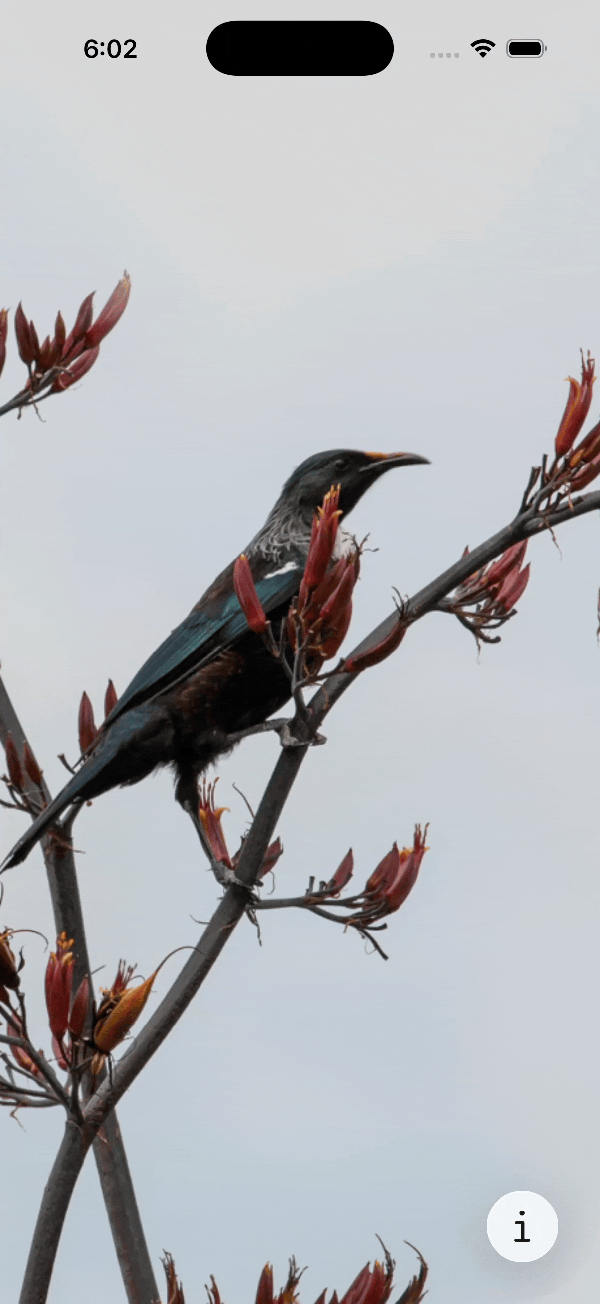
In iOS 26, partial height sheets appear to float above the interface, with rounded corners that follow the shape of the device and edges that don’t touch the screen. They also use the new Liquid Glass background by default.
To take advantage of this new design, we need to specify presentation detents in the sheet content and include at least one partial height option, such as medium or a custom height detent.
BirdImage()
    .sheet(isPresented: $showInfo) {
        InfoView()
            .presentationDetents([.medium, .large])
    }
When the sheet is expanded to the large detent, its background transitions to an opaque appearance, and it becomes attached to the sides and bottom of the screen.
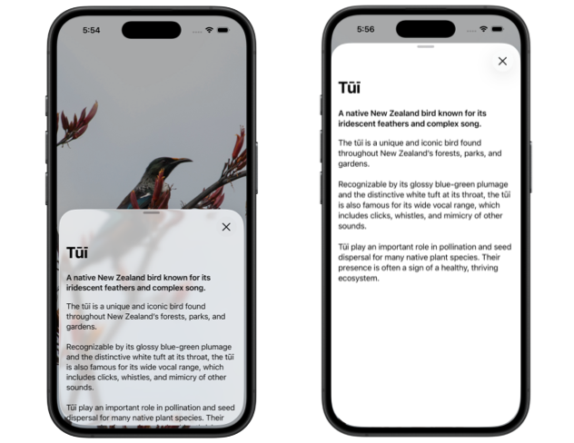
In earlier versions of iOS, we often customized sheet backgrounds using the presentationBackground() modifier, typically with a translucent material. On iOS 26, this is no longer needed and should be avoided if we want the system to apply the new Liquid Glass appearance automatically.
# Morphing sheet transitions
Another update in iOS 26 is that sheets can now morph from the toolbar button that presents them. This creates a fluid transition that fits with the Liquid Glass design and makes the sheet feel visually connected to its source.
To implement this behavior in our apps, we first need to indicate that the ToolbarItem presenting the sheet is the source by applying the matchedTransitionSource() modifier to it. We also need to apply a zoom navigation transition to the sheet content, using a matching sourceID to link it to the button.
struct ContentView: View {
    @Namespace private var transition
    @State private var showInfo = false

    var body: some View {
        NavigationStack {
            BirdImage()
                .toolbar {
                    ToolbarSpacer(placement: .bottomBar)

                    ToolbarItem(placement: .bottomBar) {
                        Button("Info", systemImage: "info") {
                            showInfo = true
                        }
                    }
                    .matchedTransitionSource(
                        id: "info", in: transition
                    )
                }
                .sheet(isPresented: $showInfo) {
                    InfoView()
                        .presentationDetents([.medium, .large])
                        .navigationTransition(
                            .zoom(sourceID: "info", in: transition)
                        )
                }
        }
    }
}
With this setup, the toolbar button will transition into the sheet when pressed, and the sheet will return to the button when dismissed.
Note that for the transition to work correctly, the view containing the toolbar must be inside a NavigationStack or NavigationSplitView, even when using a bottom bar that would otherwise work without navigation. As of beta 3, the transition can still be glitchy at times, but this will hopefully be improved in future betas.
By adopting both the new visual appearance and morphing transitions for our sheets, we can align our apps with the updated system design in iOS 26 and use the tools SwiftUI now provides to create presentations that fit naturally within the new interface style.
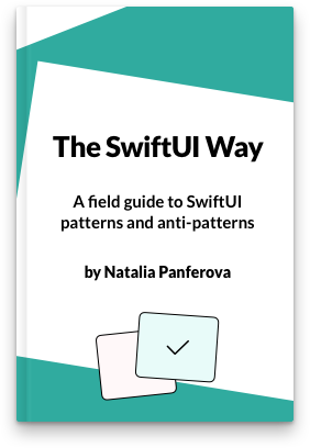
If you are looking to build a strong foundation in SwiftUI, my book SwiftUI Fundamentals takes a deep dive into the framework's core principles and APIs to help you understand how it works under the hood and how to use it effectively in your projects. And my new book The SwiftUI Way helps you adopt recommended patterns, avoid common pitfalls, and use SwiftUI's native tools appropriately to work with the framework rather than against it.
For more resources on Swift and SwiftUI, check out my other books and book bundles.

Work with SwiftUI. Not against it.$35
A field guide to SwiftUI patterns and anti-patterns
The SwiftUI Way
- Avoid common SwiftUI pitfalls
- Build deeper intuition for the framework
- Gain insights from a former SwiftUI Engineer at Apple
Work with SwiftUI. Not against it.
A field guide to SwiftUI patterns and anti-patterns
The SwiftUI Way