

Ways to customize text color in SwiftUI
SwiftUI provides several ways to change the color of text, including the foregroundStyle(_:) modifier, the older (now deprecated) foregroundColor(_), AttributedString attributes, the tint(_:) modifier, and, for advanced use cases, the textRenderer(_:) modifier. While some of these can produce similar visual results, they differ in behavior, styling capabilities, and how they interact with system themes and view hierarchies. In this post, we’ll look at common use cases and consider which approach works best in each context.
# Foreground style
In earlier versions of SwiftUI, foregroundColor(_:) was the standard way to set a custom color for text in SwiftUI. It accepted a Color and applied it in the environment, affecting text and other foreground elements within the view hierarchy. This modifier is now deprecated, and the recommended approach is to use foregroundStyle(_:) instead.
Introduced in iOS 15, foregroundStyle(_:) has since become the preferred way to control foreground appearance. It works with any value that conforms to ShapeStyle, which makes it more versatile than foregroundColor(_:).
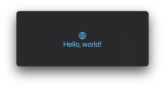
In its simplest form, foregroundStyle(_:) can be used to apply a solid color to all foreground elements within a view hierarchy:
VStack {
    Image(systemName: "globe")
    Text("Hello, world!")
}
.foregroundStyle(.cyan)
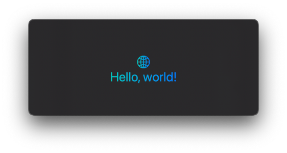
Unlike foregroundColor(_:), the foregroundStyle(_:) modifier supports more advanced styling. For example, it allows applying gradients:
VStack {
    Image(systemName: "globe")
    Text("Hello, world!")
}
.foregroundStyle(
    LinearGradient(
        colors: [.mint, .blue],
        startPoint: .leading,
        endPoint: .trailing
    )
)
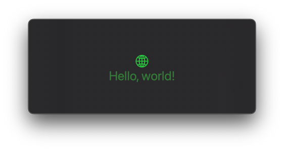
The modifier also supports hierarchical styling. We can use levels like primary, secondary, tertiary, and quaternary to control how elements are rendered in the current foreground style:
VStack {
    Image(systemName: "globe")
    Text("Hello, world!")
        .foregroundStyle(.secondary)
}
.foregroundStyle(.green)
In this example, the base style is green. The image uses the default primary level, while the text uses secondary. Both share the same base style but differ in intensity.
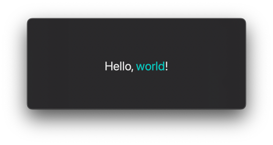
Starting with iOS 17, foregroundStyle(_:) can be used to style individual fragments of text inside a larger string. When applied directly to a Text instance, the modifier returns a Text instead of some View, which allows us to use it inside text interpolation:
Text("Hello, \(Text("world").foregroundStyle(.mint))!")
# Foreground color attribute in an AttributedString
Another way to customize text color in SwiftUI is by using AttributedString. This API offers a modern, strictly typed approach to styling specific portions of text, and it works well when we want to apply styles dynamically based on the content.
For example, we can search for a substring, set its foreground color, and pass the resulting attributed string to a Text view:
struct MessageView: View {
    var attrString: AttributedString {
        var attrString = AttributedString("Don't miss the event today!")

        if let range = attrString.range(of: "today") {
            attrString[range].foregroundColor = .yellow
        }

        return attrString
    }

    var body: some View {
        Text(attrString)
    }
}
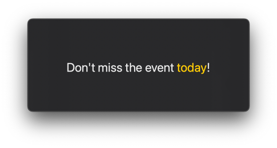
This gives us full control over which parts of the text are styled, and can be especially useful when the text content isn’t known ahead of time. However, the foreground color attribute only supports solid colors. We can’t use gradients or hierarchical styles like secondary when styling text via AttributedString.
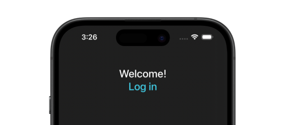
# Tint
The tint(_:) modifier was introduced in iOS 16. Its purpose is to override the accent color for a view rather than to set the color of all foreground elements. When applied to a view hierarchy, tint(_:) affects the color of text inside controls such as buttons and links, but it doesn't change the color of plain Text views.
VStack {
    Text("Welcome!")
    Button("Log in") {
        // perform login
    }
}
.tint(.teal)
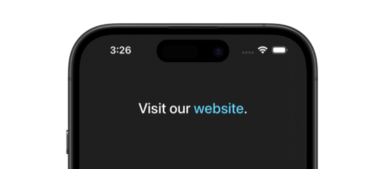
The tint(_:) modifier can also be used to change the color of links embedded inside Text views, whether they're defined using Markdown or an AttributedString. In this case, the modifier only affects the portion of text with the link attribute and leaves the rest of the string unchanged.
Text("Visit our [website](https://example.com).")
    .tint(.cyan)
# Text renderer
If we need more advanced control over how text is colored, SwiftUI offers the textRenderer(_:) modifier, introduced in iOS 18. This modifier lets us replace the system’s default text rendering with a fully custom renderer that conforms to the TextRenderer protocol.
This is a lower-level API intended for advanced visual effects and animations, but it can also be used when we want to apply complex coloring that isn't possible or is difficult to achieve with modifiers like foregroundStyle(_:).
For example, we can use hue rotation to apply a varying color across glyphs:
struct HueRotationRenderer: TextRenderer {
    func draw(layout: Text.Layout, in context: inout GraphicsContext) {
        for line in layout {
            for run in line {
                let glyphCount = run.count
                for (index, glyph) in run.enumerated() {
                    var glyphContext = context
                    let hueAngle = (Double(index) / Double(glyphCount)) * 360.0
                    glyphContext.addFilter(.hueRotation(.degrees(hueAngle)))
                    glyphContext.draw(glyph)
                }
            }
        }
    }
}

struct ContentView: View {
    var body: some View {
        Text("Hello, world!")
            .foregroundStyle(.blue)
            .textRenderer(HueRotationRenderer())
    }
}
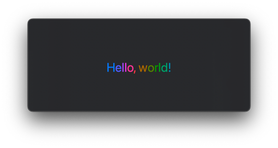
This approach gives us full flexibility in how we draw each glyph. While it’s not necessary for most text styling needs, it opens the door to rich, animated, or highly customized effects when needed.
If you are looking to build a strong foundation in SwiftUI, my book SwiftUI Fundamentals takes a deep dive into the framework's core principles and APIs to help you understand how it works under the hood and how to use it effectively in your projects. And my new book The SwiftUI Way helps you adopt recommended patterns, avoid common pitfalls, and use SwiftUI's native tools appropriately to work with the framework rather than against it.
For more resources on Swift and SwiftUI, check out my other books and book bundles.

Work with SwiftUI. Not against it.$35
A field guide to SwiftUI patterns and anti-patterns
The SwiftUI Way
- Avoid common SwiftUI pitfalls
- Build deeper intuition for the framework
- Gain insights from a former SwiftUI Engineer at Apple
Work with SwiftUI. Not against it.
A field guide to SwiftUI patterns and anti-patterns
The SwiftUI Way