

Create a fully custom About window for a Mac app in SwiftUI
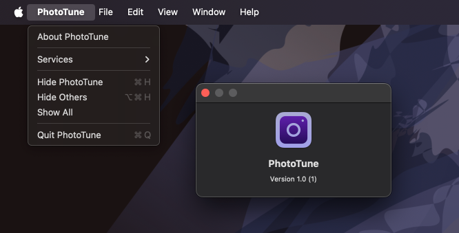
Mac apps typically include an About window that displays basic app information such as the version number and other details. Every macOS app project comes with a default About window accessible from the main app menu. This built-in panel shows the app icon, name, version, and build number.
Back in 2020, I wrote a post about how we can enhance this default panel using a mix of SwiftUI and AppKit APIs, along with credits files and Info.plist entries — Customize About panel on macOS. But starting with macOS 13, thanks to the introduction of the Window scene and the openWindow environment value, we can now create and present a fully custom About window using just standard SwiftUI APIs.
# Define a custom About window view
We can define the layout of the About window using SwiftUI, just like we would for any other window in the app. This gives us full control over the appearance and content, so we can make the About window match our app’s style and include whatever information we want.
struct AboutView: View {
    private var appVersionAndBuild: String {
        let version = Bundle.main
            .infoDictionary?["CFBundleShortVersionString"] as? String ?? "N/A"
        let build = Bundle.main
            .infoDictionary?["CFBundleVersion"] as? String ?? "N/A"
        return "Version \(version) (\(build))"
    }

    private var copyright: String {
        let calendar = Calendar.current
        let year = calendar.component(.year, from: Date())
        return "© \(year) Nil Coalescing Limited"
    }

    private var developerWebsite: URL {
        URL(string: "https://nilcoalescing.com/")!
    }

    var body: some View {
        VStack(spacing: 14) {
            Image(.mainIcon)
                .resizable().scaledToFit()
                .frame(width: 80)
            Text("PhotoTune")
                .font(.title)
            VStack(spacing: 6) {
                Text(appVersionAndBuild)
                Text(copyright)
            }
            .font(.callout)
            Link(
                "Developer Website",
                destination: developerWebsite
            )
            .foregroundStyle(.accent)
        }
        .padding()
        .frame(minWidth: 400, minHeight: 260)
    }
}
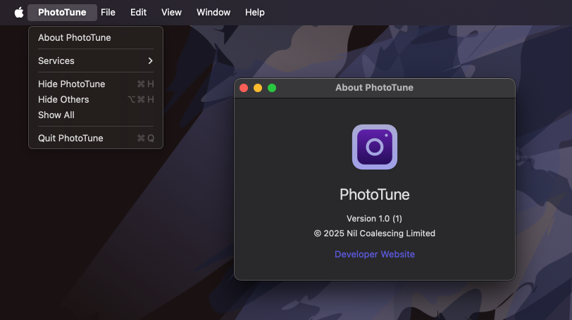
We are free to lay this out however we like, and include any details we find useful, such as version and build number, copyright, or a link to the developer’s website.
# Present the custom About window
To present our custom AboutView in place of the default About panel, we first need to wrap it in a Window scene. This is the right scene type to use because it creates a unique window, unlike WindowGroup, which allows users to open multiple instances of the same window template.
Once the scene is defined, we can replace the default About button in the app menu with a custom one. We'll do this by overriding the appInfo command placement with a new CommandGroup. Inside the custom button, we'll call the openWindow action from the environment to present our window.
@main
struct PhotoTuneApp: App {
    @Environment(\.openWindow) private var openWindow

    var body: some Scene {
        WindowGroup {
            ContentView()
        }
        .commands {
            CommandGroup(replacing: CommandGroupPlacement.appInfo) {
                Button {
                    openWindow(id: "about")
                } label: {
                    Text("About PhotoTune")
                }
            }
        }

        Window("About PhotoTune", id: "about") {
            AboutView()
        }
    }
}
Now, when selecting "About PhotoTune" from the app menu, our custom AboutView will be presented in a standalone window.
# Fine-tune window appearance and behavior
By presenting a custom window with the Window scene, we gain full control over not just the content of the About window, but also its appearance and behavior. This includes styling the background, adjusting window chrome, modifying drag and resize options, and more.
Let’s look at a few examples of what we can do, but note that while the Window scene and openWindow environment value have been available since macOS 13, many of the APIs for customizing window appearance and behavior, such as containerBackground(), windowBackgroundDragBehavior(), windowMinimizeBehavior(), and others, were introduced in later versions, so these features will require a newer deployment target.
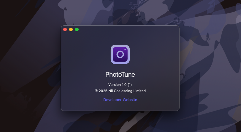
One example is applying a translucent material background to the window and removing the title and toolbar, allowing the material effect to extend all the way to the top. When doing this, it’s a good idea to let users drag the window by its background area, which we can enable using the windowBackgroundDragBehavior() scene modifier.
Window("About PhotoTune", id: "about") {
    AboutView()
        .containerBackground(.regularMaterial, for: .window)
        .toolbar(removing: .title)
        .toolbarBackground(.hidden, for: .windowToolbar)
}
.windowBackgroundDragBehavior(.enabled)
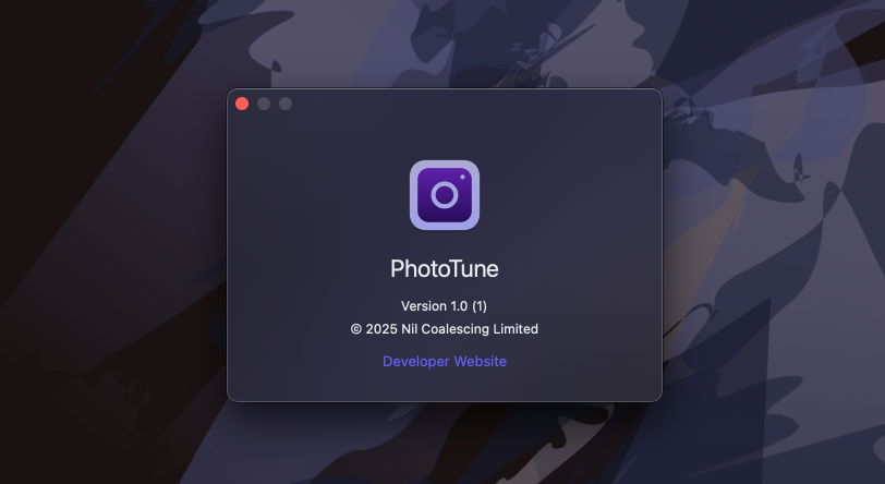
Another example is controlling how the window can be resized. Since the contents of our AboutView are static, we may want to prevent resizing altogether. We can do that by applying windowResizability(.contentSize) to the window.
We can also customize the window controls in the top-left corner. Because our window isn’t resizable, the green zoom control is already disabled by default, but we can additionally disable the yellow minimize control. This control isn't needed here, since the About window only shows static content and can always be reopened from the app menu.
Window("About PhotoTune", id: "about") {
    AboutView()
        .toolbar(removing: .title)
        .toolbarBackground(.hidden, for: .windowToolbar)
        .containerBackground(.regularMaterial, for: .window)
        .windowMinimizeBehavior(.disabled)
}
.windowBackgroundDragBehavior(.enabled)
.windowResizability(.contentSize)
By default, windows in SwiftUI support state restoration, they remember whether they were open when the app last quit and reopen automatically. This behavior isn’t necessary for an About window, so we can turn it off using the restorationBehavior() modifier.
Window("About PhotoTune", id: "about") {
    ...
}
.windowBackgroundDragBehavior(.enabled)
.windowResizability(.contentSize)
.restorationBehavior(.disabled)
Creating a fully custom About window in SwiftUI gives us the flexibility to match the design and behavior of the rest of the app, while still integrating cleanly with macOS conventions. With just a few modifiers, we can control layout, appearance, and window behavior — all using familiar SwiftUI tools.
If you want to build a strong foundation in SwiftUI, my new book SwiftUI Fundamentals takes a deep dive into the framework’s core principles and APIs to help you understand how it works under the hood and how to use it effectively in your projects.
For more resources on Swift and SwiftUI, check out my other books and book bundles.
Deepen your understanding of SwiftUI!$35
The essential guide to SwiftUI core concepts and APIs
SwiftUI Fundamentals
- Explore the key APIs and design patterns that form the foundation of SwiftUI
- Develop a deep, practical understanding of how SwiftUI works under the hood
- Learn from a former Apple engineer who worked on widely used SwiftUI APIs
Deepen your understanding of SwiftUI!
The essential guide to SwiftUI core concepts and APIs
SwiftUI Fundamentals