

Customizing modal presentation background and color scheme in SwiftUI
SwiftUI provides built-in modifiers to customize the background appearance of modal presentations. These modifiers allow us to apply a solid color, a gradient, a translucent material, or even a custom view as the background of sheets, popovers, and full-screen covers.
# Setting a background style
The presentationBackground(_:) modifier lets us define a background for a modal presentation using any ShapeStyle. This includes colors, gradients, and materials.
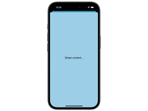
For example, we can make a sheet’s background translucent by applying a thin material:
.sheet(isPresented: $showSheet) {
    Text("Sheet content...")
        .presentationBackground(.thinMaterial)
}
This gives the sheet a frosted glass effect, allowing the content behind it to subtly show through, as seen in the screenshot below.
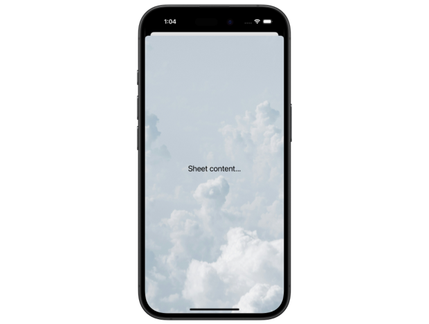
# Using a custom background view
For more flexibility, SwiftUI provides the presentationBackground(alignment:content:) modifier, which allows us to set a custom SwiftUI view as the background. This is particularly useful when we want to use an image or a complex visual design as the modal background.
.sheet(isPresented: $showSheet) {
    Text("Sheet content...")
        .presentationBackground {
            Image(.clouds)
                .resizable()
                .scaledToFill()
        }
}

These background customization options work consistently across all modal presentation types. However, one interesting detail is that translucency appears more pronounced in sheets and full-screen covers than in popovers.
# Removing default backgrounds from container views
Some SwiftUI container views, such as List and Form, come with a default opaque background. When placed inside a modal, they obscure the presentation background, preventing customizations from taking effect. To make the presentation background visible, we need to disable the default styling of these container views.
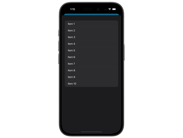
Consider the following example, where a List is placed inside a sheet with a material background applied:
.sheet(isPresented: $showSheet) {
    List(1...10, id: \.self) {
        Text("Item \($0)")
    }
    .presentationBackground(.thinMaterial)
}
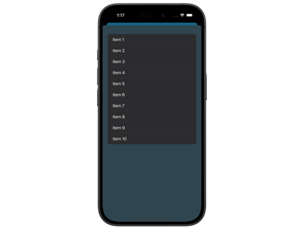
Even though we have applied a translucent material, the sheet appears fully opaque.

To allow the presentation background to show through, we first need to disable the List view's background using the scrollContentBackground(_:) modifier.
.sheet(isPresented: $showSheet) {
    List(1...10, id: \.self) {
        Text("Item \($0)")
    }
    .scrollContentBackground(.hidden)
    .presentationBackground(.thinMaterial)
}
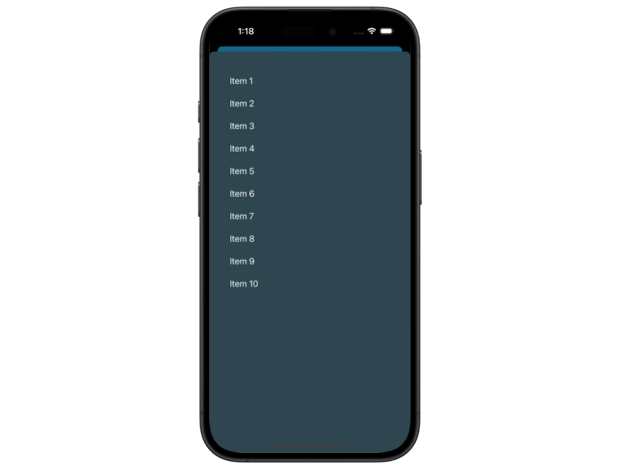
This removes the opaque background from the empty areas of the list, making them transparent. However, the default row backgrounds remain visible.

To ensure a fully translucent appearance, we also need to remove the background from list rows by setting it to a clear color.
.sheet(isPresented: $showSheet) {
    List(1...10, id: \.self) {
        Text("Item \($0)")
            .listRowBackground(Color.clear)
    }
    .scrollContentBackground(.hidden)
    .presentationBackground(.thinMaterial)
}
Now, both the list’s empty areas and its rows become translucent, creating a consistent material effect throughout the modal.

# Controlling the color scheme
In addition to customizing the background, we can also specify a preferred color scheme for modal presentations. This ensures that the text, controls, and other UI elements remain legible regardless of the system-wide appearance settings.
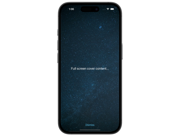
Setting a color scheme can be particularly useful when using a custom background. For example, if our modal uses a dark image, we may want the text and buttons to appear in a light color for contrast.
To enforce a dark appearance inside a full-screen cover, we can apply the preferredColorScheme(_:) modifier:
.fullScreenCover(isPresented: $showCover) {
    PresentationContent()
        .preferredColorScheme(.dark)
}
With this in place, even if the rest of the app adapts dynamically to light and dark mode, the full-screen cover will always be displayed in a dark color scheme with light text elements, ensuring proper contrast between foreground and background.

The preferred color scheme value flows up the view hierarchy and is intercepted at the nearest presentation. However, this modifier can also be used outside of modal content, in which case it will affect the entire application.
For a more detailed discussion on working with color schemes in SwiftUI, including how to detect the current mode and respond to system changes, you can read my post: Reading and setting color scheme in SwiftUI.
If you want to build a strong foundation in SwiftUI, my new book SwiftUI Fundamentals takes a deep dive into the framework’s core principles and APIs to help you understand how it works under the hood and how to use it effectively in your projects.
For more resources on Swift and SwiftUI, check out my other books and book bundles.


Deepen your understanding of SwiftUI!$35
The essential guide to SwiftUI core concepts and APIs
SwiftUI Fundamentals
- Explore the key APIs and design patterns that form the foundation of SwiftUI
- Develop a deep, practical understanding of how SwiftUI works under the hood
- Learn from a former Apple engineer who worked on widely used SwiftUI APIs
Deepen your understanding of SwiftUI!
The essential guide to SwiftUI core concepts and APIs
SwiftUI Fundamentals