

Plotting data distributions with Swift Charts
In this post I'm going to explore how to visualise data distributions with Swift Charts framework.
I want to look at a dataset of some survey data collected from penguin colonies. The dataset captures many different anatomical details, such as weight, flipper length and bill length. To start my investigation, I will look at the distribution of values for each of these parameters.
To build a histogram, I need to group my data into bins and count how many samples are within each bin. Charts provides a simple way to do the binning operation with NumberBins data types.
The NumberBins datatype has a range of constructors. The simplest one to use is init(data:desiredCount:), it detects the best placement of bin thresholds from the input data.
let bins = NumberBins(
    data: dataset.map(\.billLength),
    desiredCount: 30
)
However, just using NumberBins is not enough, it doesn't group the data into bins. It just provides a way to easily determine which bin each bit of data belongs to. To group the data I need to use Dictionary.init(grouping:by:) constructor along with the bins to group the data.
let groups = Dictionary(
    grouping: dataset.map(\.billLength),
    by: bins.index
)
Now I have a dictionary that maps the bin index to an array of all the values in that bin.
To plot a histogram, I need to compute the proportion of all the data samples that are in each bin.
let preparedData = groups.map { key, values in
    (
        index: key,
        range: bins[key],
        frequency: values.count
    )
}
I'm computing the proportion of samples and, at the same time, retrieving the range of values that correspond to this bin.
Since the number of samples is small enough, I will just place all of the above work into a computed property.
struct PenguinChart: View {
    let dataset: [PenguinsDataPoint]

    var binnedData: [
        (
            index: Int,
            range: ChartBinRange<Float>,
            frequency: Int
        )
    ] {
        let bins = NumberBins(
            data: dataset.map(\.billLength),
            desiredCount: 30
        )

        let groups = Dictionary(
            grouping: dataset.map(\.billLength),
            by: bins.index
        )

        let preparedData = groups.map { key, values in
             return (
                index: key,
                range: bins[key],
                frequency: values.count
            )
        }

        return preparedData
    }

    var body: some View { ... }
}
With the data aggregated into bins, it's time to plot a bar chart.
struct PenguinChart: View {
    let dataset: [PenguinsDataPoint]

    var binnedData: [(...)} { ... }

    var body: some View {
        Chart(
            self.binnedData, id: \.index
        ) { element in
            BarMark(
                x: .value(
                    "Bill Length",
                    element.range
                ),
                y: .value(
                    "Frequency",
                    element.frequency
                )
            )
        }
    }
}
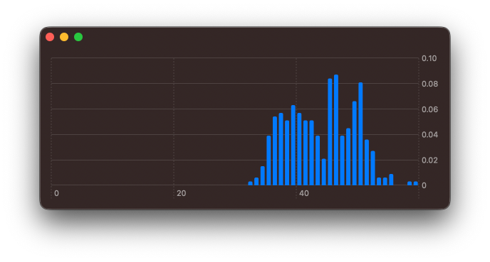
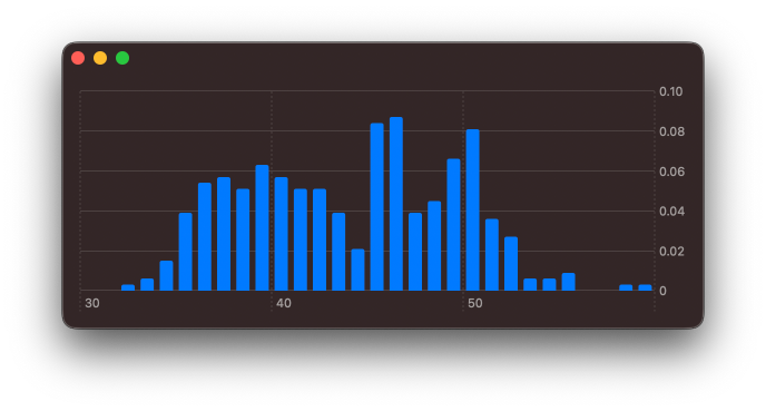
The chart looks a little off, since the framework always forces the axes to start at 0 by default. Using chartXScale(domain: .automatic(includesZero: false)) modifier I can override the default here.
struct PenguinChart: View {
    let dataset: [PenguinsDataPoint]

    var binnedData: [(...)} { ... }

    var body: some View {
        Chart(self.binnedData, id: \.index) { element in
            BarMark(
                x: .value(
                    "Bill Length",
                    element.range
                ),
                y: .value(
                    "Frequency",
                    element.frequency
                )
            )
        }
        .chartXScale(
            domain: .automatic(includesZero: false)
        )
    }
}
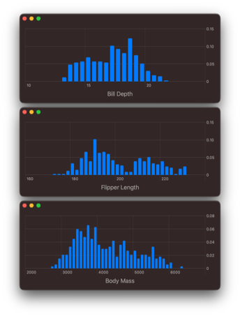
Let's explore the other numerical properties of the data set. I can adjust the computed binnedData to aggregate over other fields of the dataset.
Plotting just one attribute at a time is useful, however, I would love to drill down on the relationship between these variables.

Level up your Swift skills!$35
100+ tips to take your Swift code to the next level
Swift Gems
- Advanced Swift techniques for experienced developers bypassing basic tutorials
- Curated, actionable tips ready for immediate integration into any Swift project
- Strategies to improve code quality, structure, and performance across all platforms
Level up your Swift skills!
100+ tips to take your Swift code to the next level
Swift Gems
# Building a 2D density plot
I feel it would be best to look into the relationship between flipper length and bill length, as both of these appear to be multimodal distributions.
I need to adjust how I'm aggregating the data. To start with, I will create bins for both flipper length and bill length.
let flipperLengthBins = NumberBins(
    data: dataset.map(\.flipperLength),
    desiredCount: 30
)

let billLengthBins = NumberBins(
    data: dataset.map(\.billLength),
    desiredCount: 30
)
To represent each grid square, I will create an intermediate data type, that combines a flipperLengthBin index and a billLengthBin index.
struct TwoDimensionalBinIndex: Hashable {
    let xBinIndex: Int
    let yBinIndex: Int
}
TwoDimensionalBinIndex must conform to Hashable, so that it can be used with Dictionary.init(grouping:by:). When grouping the data, I will create the corresponding TwoDimensionalBinIndex for each value.
let groupedData = Dictionary(
    grouping: dataset
) { element in
    TwoDimensionalBinIndex(
        xBinIndex:
            flipperLengthBins
                .index(for: element.flipperLength),
        yBinIndex:
            billLengthBins
                .index(for: element.billLength)
    )
}
I'm calling index(for:) method of the NumberBin instances for each element in my data set and assigning that bin index to the corresponding x and y attributes in the TwoDimensionalBinIndex, that is used to group the data.
Enhance older apps with SwiftUI!$40
A detailed guide on gradually adopting SwiftUI in UIKit projects
Updated for iOS 26 and Xcode 26!
Integrating SwiftUI into UIKit Apps
- Upgrade your apps with new features like Swift Charts and Widgets
- Support older iOS versions with effective backward-compatible strategies
- Seamlessly bridge state and data between UIKit and SwiftUI using the latest APIs
Enhance older apps with SwiftUI!
A detailed guide on gradually adopting SwiftUI in UIKit projects
Integrating SwiftUI
into UIKit Apps
Updated for iOS 26 and Xcode 26!
As with the regular histogram, I now need to aggregate these values for each group. This time, rather than returning just a single range, I will need to return a range for x and a range for y.
let values = groupedData
    .map { key, values in
        return (
            index: key,
            xDataRange: flipperLengthBins[
                key.xBinIndex
            ],
            yDataRange: billLengthBins[
                key.yBinIndex
            ],
            frequency: values.count
        )
    }
Here subscript(position:) method on the respective NumberBins instances is used to retrieve the ChartBinRange values for each axes. To bring this all together, it's best to first declare a typealias for the aggregated binned values.
typealias BinnedValue = (
    index: TwoDimensionalBinIndex,
    xDataRange: ChartBinRange<Float>,
    yDataRange: ChartBinRange<Float>,
    frequency: Int
)
In my chart view, as with the histogram, I use a regular computed property.
struct PenguinChart: View {
    let dataSet: [PenguinsDataPoint]

    struct TwoDimensionalBinIndex: Hashable {
        let xBinIndex: Int
        let yBinIndex: Int
    }

    typealias BinnedValue = (
        index: TwoDimensionalBinIndex,
        xDataRange: ChartBinRange<Float>,
        yDataRange: ChartBinRange<Float>,
        frequency: Int
    )


    var bins: [BinnedValue] {
        let flipperLengthBins = NumberBins(
            data: dataset.map(\.flipperLength),
            desiredCount: 25
        )

        let billLengthBins = NumberBins(
            data: dataset.map(\.billLength),
            desiredCount: 25
        )

        let groupedData = Dictionary(
            grouping: dataset
        ) { element in
            TwoDimensionalBinIndex(
                xBinIndex: flipperLengthBins
                    .index(for: element.flipperLength),
                yBinIndex: billLengthBins
                    .index(for: element.billLength)
            )
        }

        let values = groupedData
            .map { key, values in
                return (
                    index: key,
                    xDataRange: flipperLengthBins[
                        key.xBinIndex
                    ],
                    yDataRange: billLengthBins[
                        key.yBinIndex
                    ],
                    frequency: values.count
                )
            }

        return values
    }

    var body: some View { ... }
}
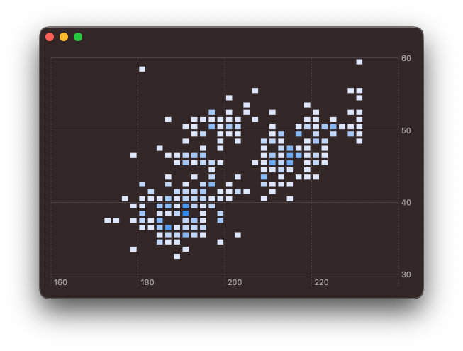
With all these bins computed, it's now a matter of plotting the values.
struct PenguinChart: View {
    let dataSet: [PenguinsDataPoint]

    ...

    var bins: [BinnedValue] { .. }

    var body: some View {
        Chart(
            self.bins, id: \.index
        ) { element in
            RectangleMark(
                x: .value(
                    "Flipper Length",
                    element.xDataRange
                ),
                y: .value(
                    "Bill Length",
                    element.yDataRange
                )
            )
            .foregroundStyle(
                by: .value(
                    "Frequency",
                    element.frequency
                )
            )
        }
        .chartXScale(
            domain: .automatic(
                includesZero: false
            )
        )
        .chartYScale(
            domain: .automatic(
                includesZero: false
            )
        )
    }
}
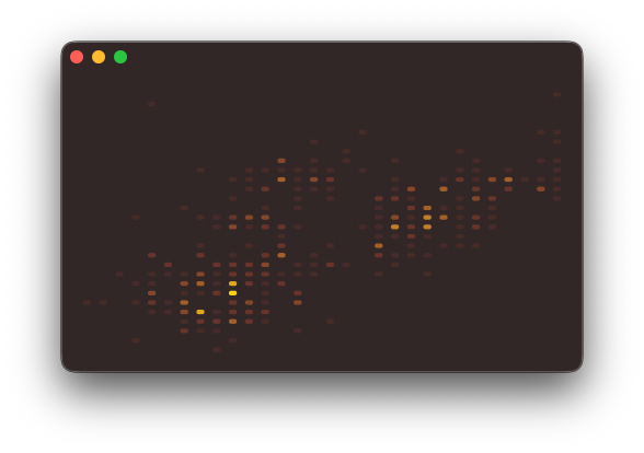
I use a RectangleMark to draw a rectangle for each x and y region, then I colour that region based on the frequency value. Furthermore, as with the histogram, I adjust the x and y axes to no longer start at 0.
Clearly, some styling is going to be needed. I will adjust the colour gradient and get rid of the spacing between each of the rectangles. The colour gradient can be adjusted using chartForegroundStyleScale(range:) modifier. And by passing width and height values to RectangleMark initialiser, I'm able to controle the spacing provided.
struct PenguinChart: View {

    ...

    var body: some View {
        Chart(
            self.bins, id: \.index
        ) { element in
            RectangleMark(
                x: .value(
                    "Flipper Length",
                    element.xDataRange
                ),
                y: .value(
                    "Bill Length",
                    element.yDataRange
                ),
                width: .ratio(1),
                height: .ratio(1)
            )
            .foregroundStyle(
                by: .value(
                    "Frequency",
                    element.frequency
                )
            )
        }
        .chartXScale(
            domain: .automatic(
                includesZero: false
            )
        )
        .chartYScale(
            domain: .automatic(
                includesZero: false
            )
        )
        .chartForegroundStyleScale(
            range: Gradient(
                colors: [
                    Color.red.opacity(0.1),
                    Color.yellow
                ]
            )
        )
    }
}
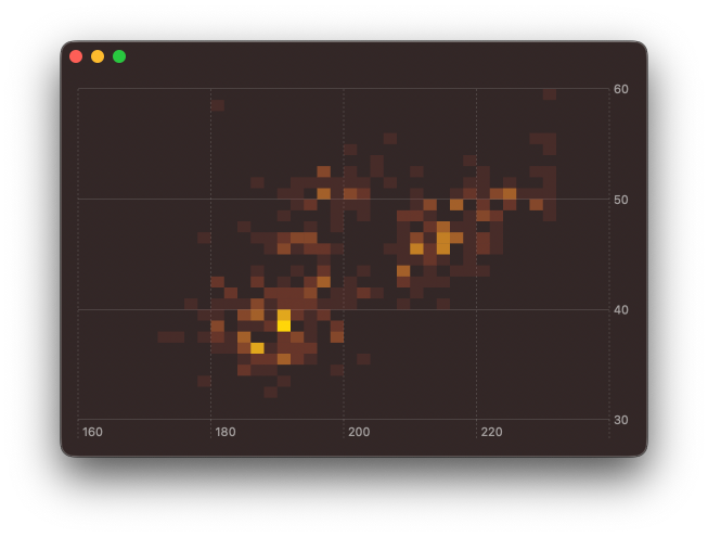
While exploring this, I did also tried using BarMark instead of or RectangleMark by varying the width and height and I was able to create some interesting effects. These could be very useful if animating between different plotted attributes, but that will need to wait for a follow up post.
You can find the code for this post in our GitHub project, this includes the code to download and parse the CSV file.
Swift Charts are designed to work with SwiftUI, but you can still use them in a UIKit project. You can check out Natalia Panferova's recent book Integrating SwiftUI into UIKit Apps for ways to add SwiftUI views to an existing UIKit project to take full advantage of the new iOS 16 APIs.
Level up your Swift skills!$35
100+ tips to take your Swift code to the next level
Swift Gems
- Advanced Swift techniques for experienced developers bypassing basic tutorials
- Curated, actionable tips ready for immediate integration into any Swift project
- Strategies to improve code quality, structure, and performance across all platforms
Level up your Swift skills!
100+ tips to take your Swift code to the next level
Swift Gems