

Swift Charts Beyond the Basics: creating clear and beautiful data visualizations
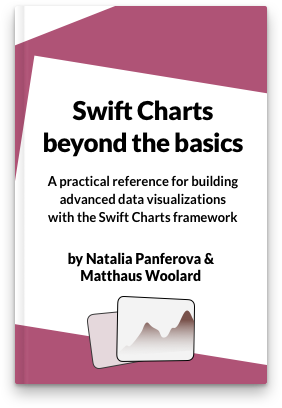
I'm very happy to announce the release of a new book that Matthaus Woolard and I wrote together: Swift Charts Beyond the Basics. It is a practical reference for developers who want to create advanced data visualizations with the Swift Charts framework.
A well-designed chart can make an app's data immediately more useful. It can reveal a comparison or trend that would be difficult to see in a list of values, help people notice changes over time, and let them explore information without losing its broader context. Clear and beautiful data visualizations can also give an app a distinct visual identity and make a complex feature feel approachable.
This is useful far beyond dedicated analytics apps. Health and fitness apps can show progress and relationships between measurements. Finance apps can make changes and proportions easier to assess. Weather, productivity, travel, education, and many other kinds of apps collect information that becomes more meaningful when people can see its patterns rather than only read individual values.
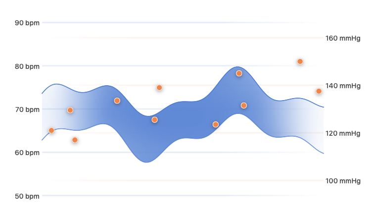
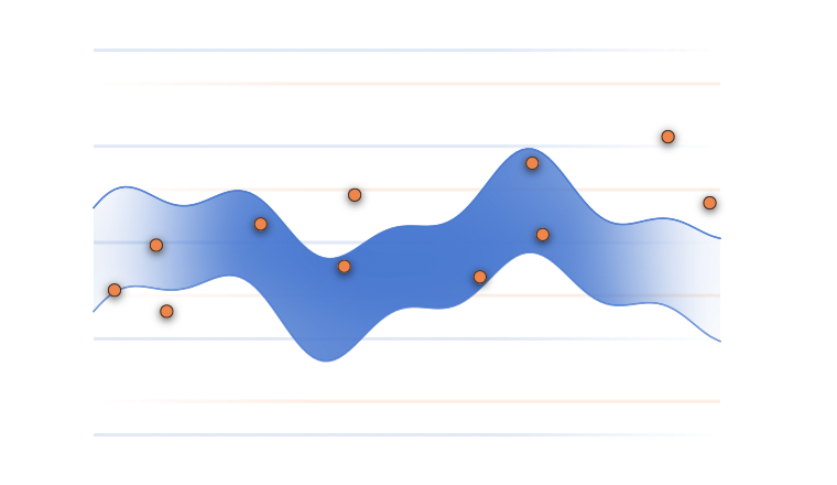
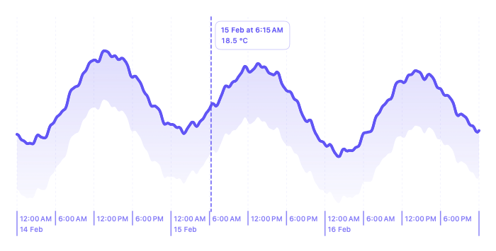
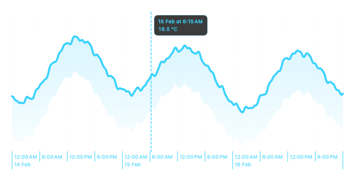
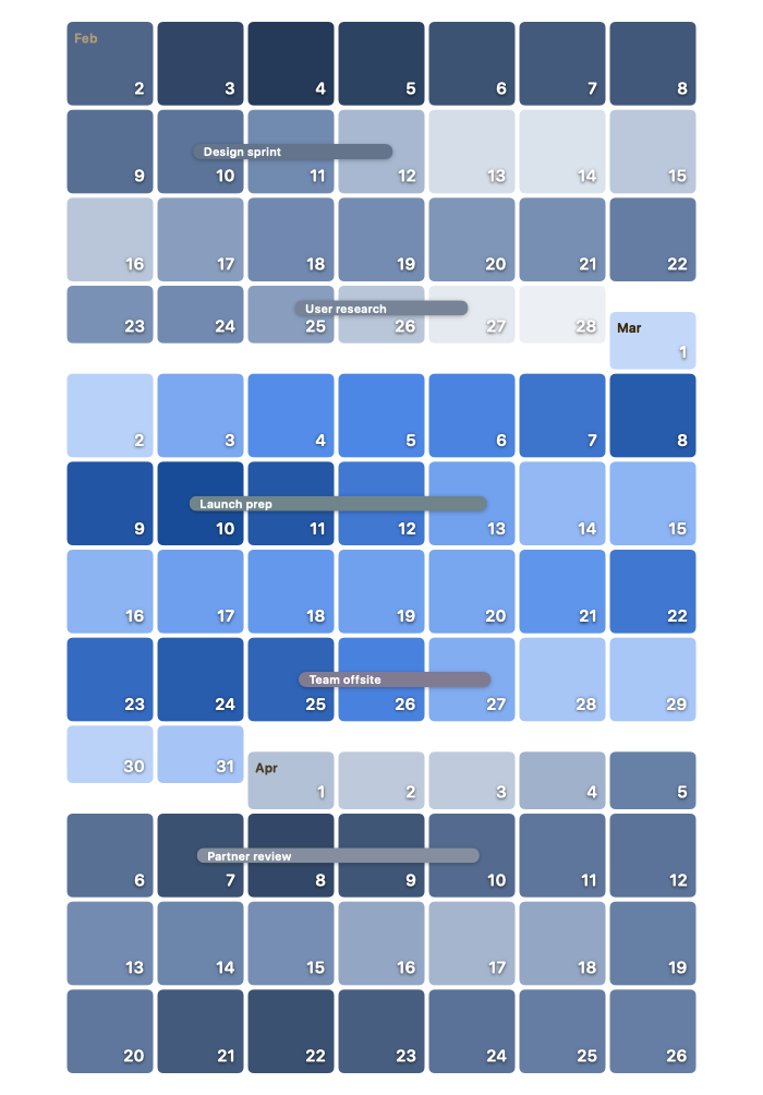
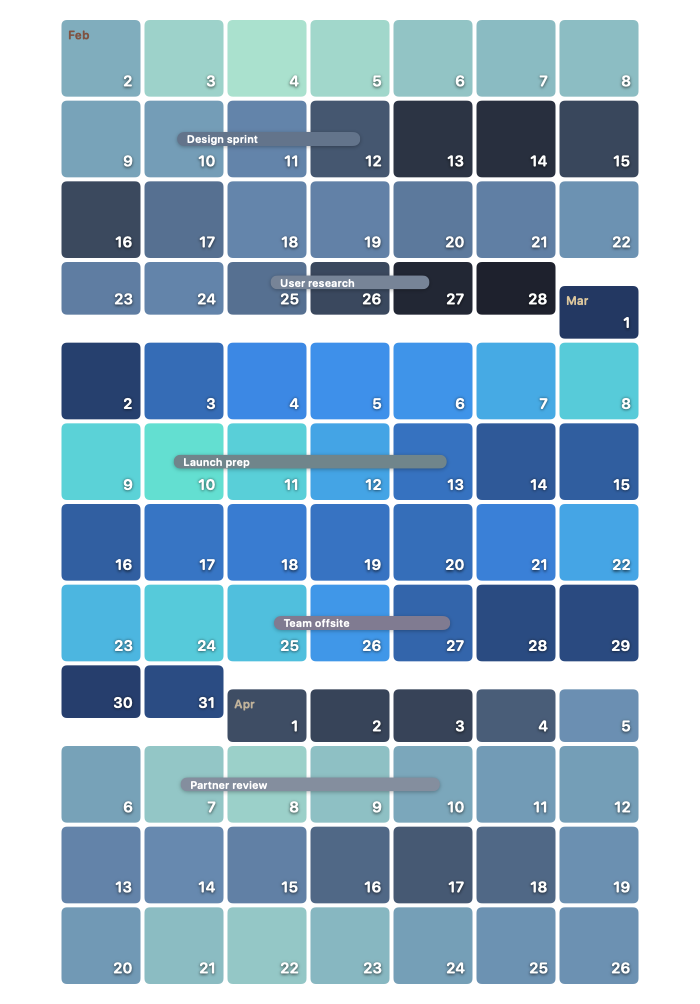
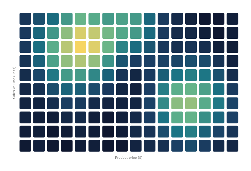
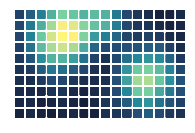
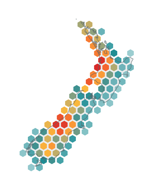
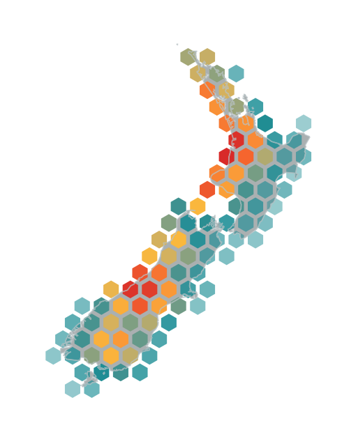
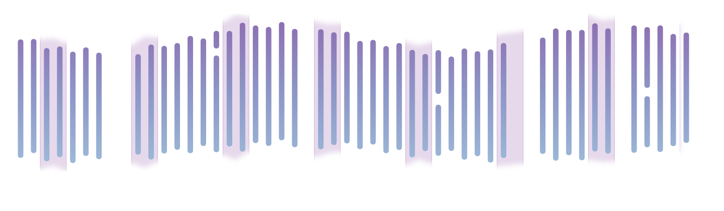
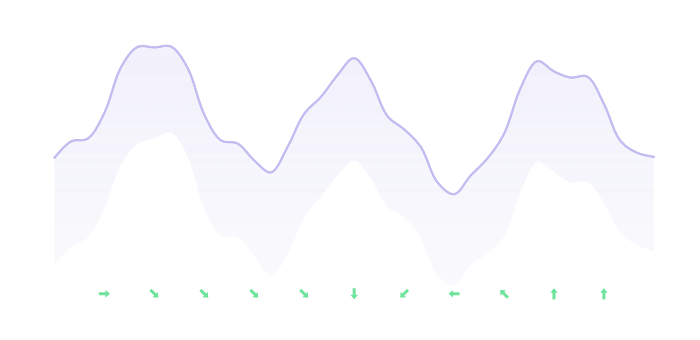
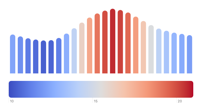
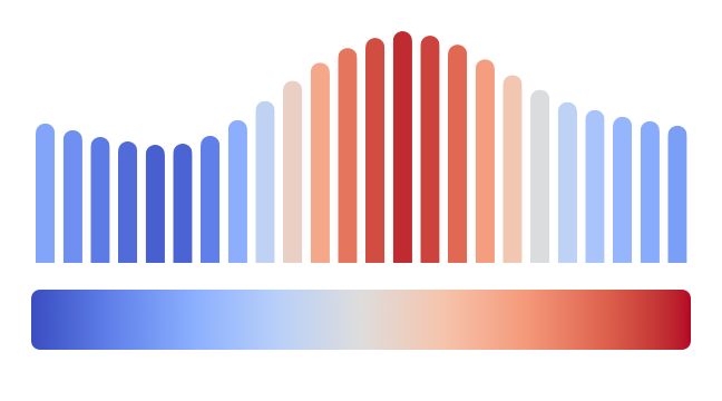
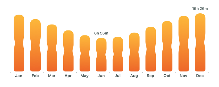
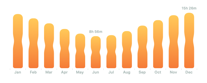
Swift Charts gives us a remarkably capable foundation for building these experiences, but it is often used only for a familiar bar, line, or sector chart. Those are valuable, but they represent only a small part of what the framework can do. We can build multi-metric visualizations, calendars, heat maps, spatial presentations, layered compositions, custom styles, interactive inspectors, scrollable timelines, and animated transitions between different levels of detail. Once we understand how data, scales, composition, and rendering work together, Swift Charts gives us a lot of freedom to create something that fits both the information and the character of an app.


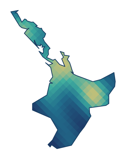
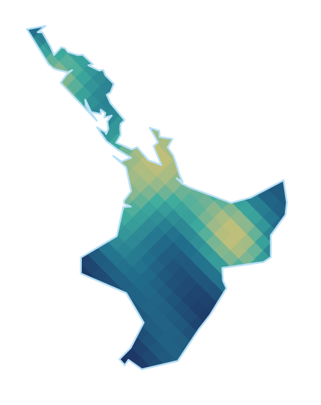
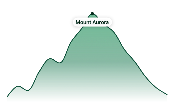
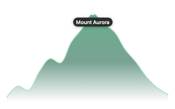

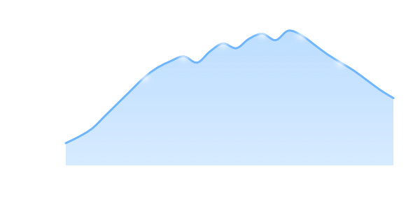
Matthaus has wanted to write a book about Swift Charts for a long time. Through his freelance and consulting work, he has helped clients building complex apps with large amounts of data make their data visualizations more advanced and performant. He wanted to share that knowledge so that more developers could do the same. We decided to write this book together, combining my experience building UI frameworks and writing about them with his experience working with Swift Charts and his background in data science.
We wrote the book to help developers move beyond the framework's defaults with purpose. A visually impressive chart still needs to represent its source data accurately, make the intended comparison clear, remain responsive while people interact with it, and provide an equivalent experience through accessibility features. The book explains the framework behavior behind these decisions so that you can adapt the techniques to your own data and interface rather than being limited to a collection of fixed recipes.
If you already know Swift and SwiftUI and can build a basic chart, the book will help you choose more effective representations, create more distinctive visual treatments, and add selection, scrolling, and animation without losing clarity, performance, or accessibility. It is designed to be read from beginning to end or used as a practical reference when a project presents a new visualization challenge.
You can find more details, view the full table of contents, read a sample chapter, and get your copy on the Swift Charts Beyond the Basics book page.
We hope it inspires you to explore how much more Swift Charts can bring to your apps and helps you turn complex data into experiences that are clear, useful, and enjoyable to explore.
Turn app data into insight$35
Build clear, beautiful, and interactive visualizations with Swift Charts
Swift Charts Beyond the Basics
- Reveal patterns and relationships in complex app data
- Create custom charts that stay responsive and accessible
Turn app data into insight
Build clear, beautiful, and interactive visualizations with Swift Charts
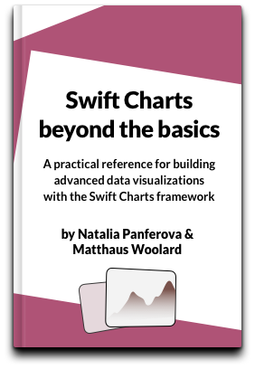
Swift Charts Beyond the Basics