

Nil Coalescing Newsletter – August 2026
Hi there,
It's the end of August, and this month has been almost entirely taken up by one big project: Matt and I have released our new book, Swift Charts Beyond the Basics.
This is the first book we have written together. Matt has wanted to write a practical guide to Swift Charts for a long time, drawing on his background in data science and his experience helping teams build complex and performant visualizations. When we started planning the book together, we realized that it should approach charts both as representations of data and as interactive parts of an app's interface. The result is a book that goes far beyond showing how to assemble individual chart types.
In this issue, I want to share more about why we wrote the book, who it is for, and some of the technical ideas that shaped it. There is also the usual roundup of this month's blog posts, my article for the first issue of Those Who Swift's new "Devs for Devs" series, and a look ahead to our trip to iOSDevUK in September.
Swift Charts Beyond the Basics
Swift Charts is a powerful framework, but developers still tend to use only a small part of what it offers. It's often associated with familiar bar, line, and sector charts, even though it can also support calendars, heat maps, layered compositions, and interactive visualizations. Using these capabilities well requires understanding how data, scales, composition, and rendering work together.
We wrote Swift Charts Beyond the Basics to help developers make better use of that flexibility. It explains how the structure of data affects its visual representation, how to prepare values without losing their meaning, and how Swift Charts maps them to positions and styles. It then moves into composition and rendering, update boundaries, selection and scrolling, and animation, with accessibility considered at every stage.
Throughout the book, we explain the framework behavior involved in turning source data into a clear and delightful visualization. This helps you develop a mental model of Swift Charts and adapt the techniques to your own data and interface, rather than simply reproduce a particular chart step by step.
One important part of that model is recognizing the different structures within source data and the visual representations they support.
Time-series data can record measurements at particular moments, summarize calendar periods, or describe intervals with defined start and end points. These structures can be represented by a discontinuous line, an area chart of daily temperature ranges, a sleep interval chart, or a calendar heat map.
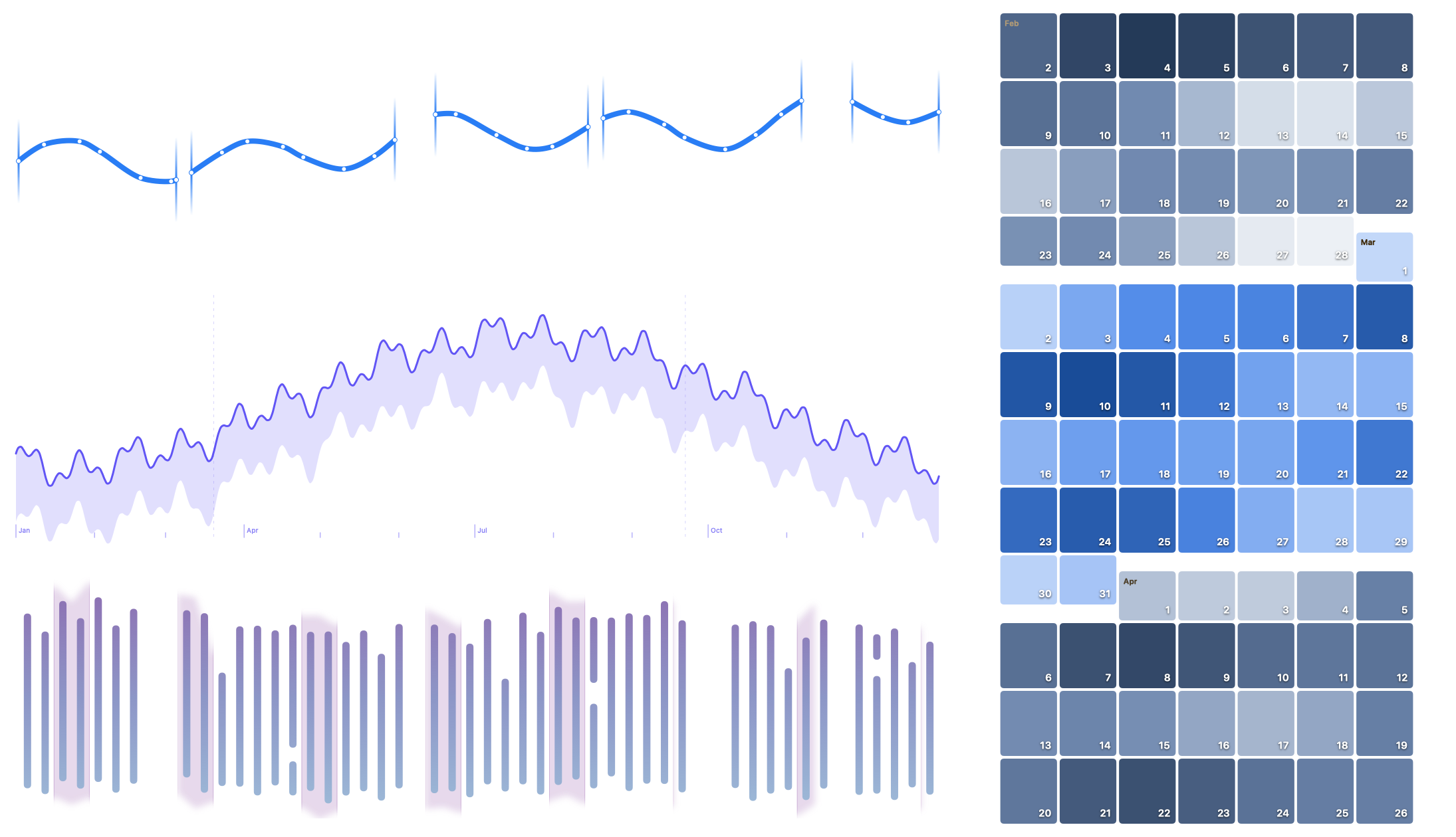
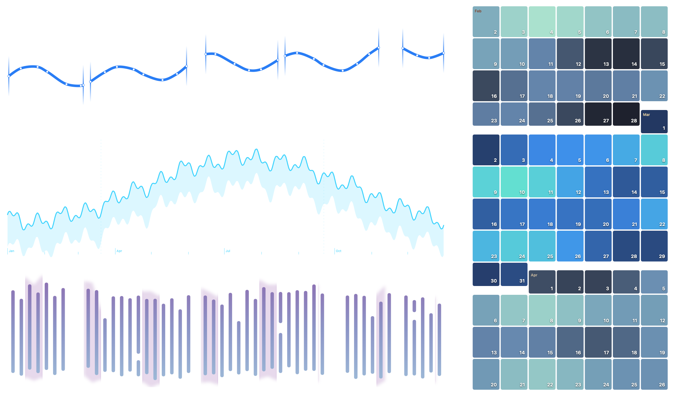
Time-series visualizations for point observations, calendar-aligned summaries, and intervals
Categorical data can describe independent comparison groups, components of a total, observations with several measurements, or levels in a hierarchy. The grouped bars, stacked bars, bubble chart, and sunburst below preserve those different relationships.
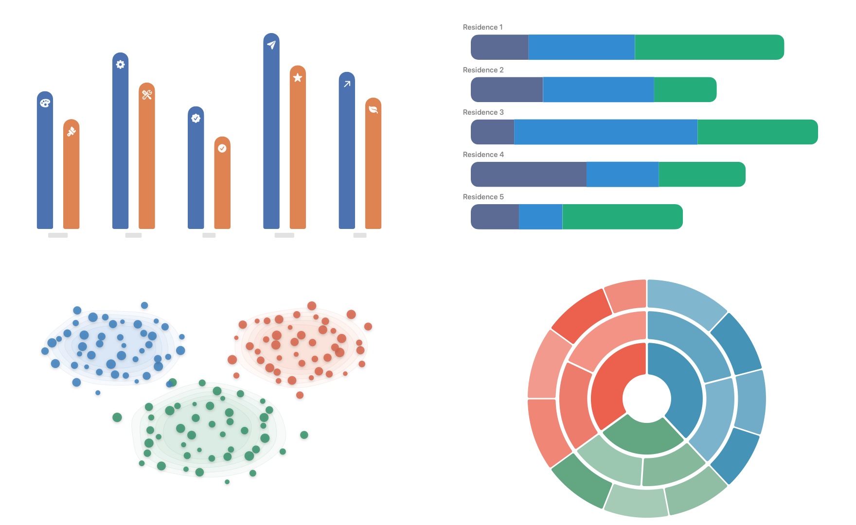
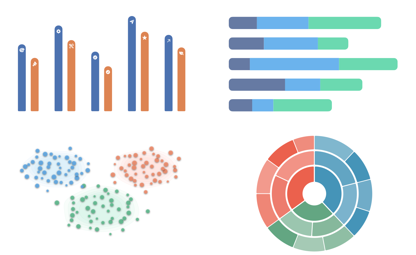
Grouped bars, stacked bars, a bubble chart, and a sunburst representing different categorical relationships
With distributional data, individual values are considered together to show where observations concentrate, how widely they vary, and how groups differ. We prepare these views by binning observations for a histogram or estimating density for violin plots.

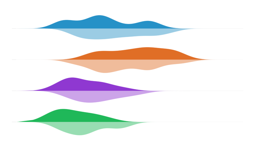
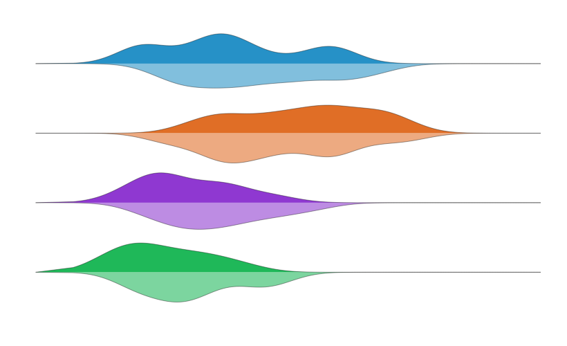
A power-usage histogram and split bird-sighting violin plots
Spatial data relates observations through location as well as value. The rectangular and hexagonal heat maps group nearby observations into cells, while their treatment of geographic boundaries reflects the domains represented by the source data.
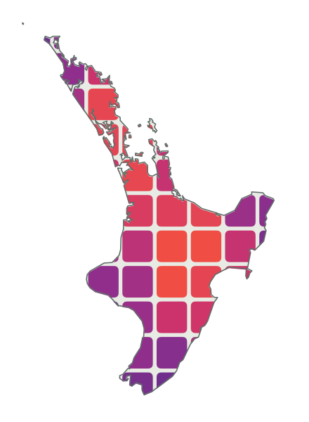
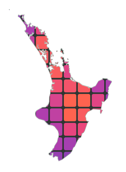

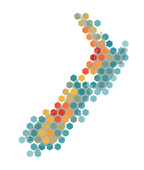
A rectangular power-draw heat map and a hexagonal earthquake-frequency heat map of New Zealand
Representing source data faithfully requires preserving both its overall structure and the meaning of its individual values. In Swift Charts, a value can retain its primitive representation, semantic label, and role within the composition even when its numerical representation changes for plotting.
That becomes especially useful when metrics with different units share a plot, as in the example below comparing resting heart rate with blood pressure. Swift Charts provides one numerical domain for each positional scale, so the blood-pressure readings are projected into the resting-heart-rate domain. Their semantic labels and accessibility values, together with the trailing axis, continue to express blood pressure in its original units.
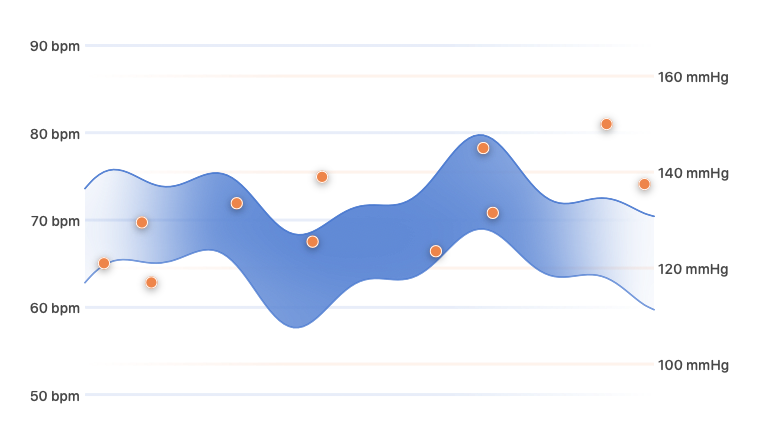
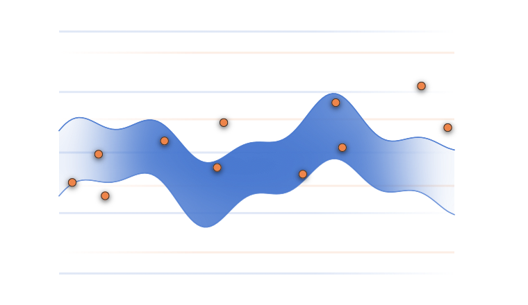
Resting heart rate and blood pressure plotted together using scale projection
Scale projection changes the values that enter a positional scale, while composition and rendering operate later in the process. Understanding where a change is applied helps you predict how it will affect the final visualization. Masks can reveal chart content using data-aligned geometry, while a clip shape is fitted separately to each mark's resolved frame. In the daylight chart below, a custom hourglass clip shape changes the silhouette of every bar without changing the value it represents or its accessible description.
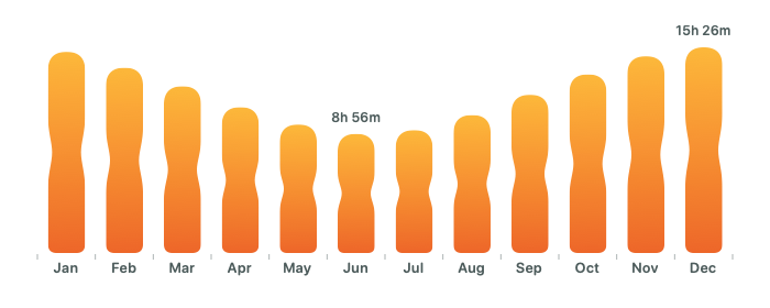
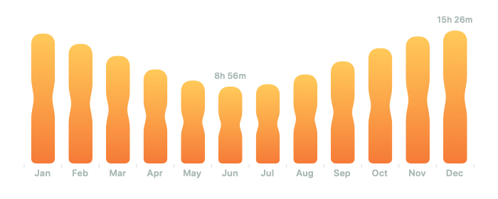
Monthly daylight duration shown with custom hourglass-shaped bars
When a chart becomes interactive, the rendered visualization needs to connect back to its source data. Positional selection returns a value from a scale rather than a hit-tested mark, so the app resolves that value against the prepared data before presenting an inspector. In the example below, the selected time is matched to the temperature series while the complete band remains visible for context.
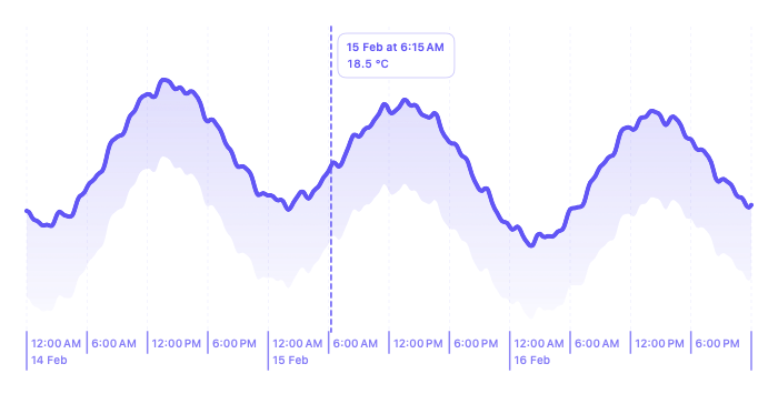
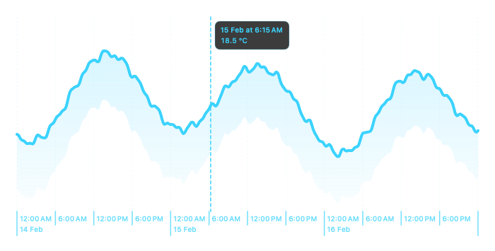
An interactive temperature chart with a selected time and inspector
The selected value can change continuously as the pointer moves, so the place where that state is read can have a significant effect on performance. We use this behavior to explain update boundaries and show where presentation state can be handled without reevaluating more of the chart than necessary. These ideas extend to scrolling and animation, giving you a consistent way to reason about frequent changes while keeping complex charts responsive.
If you already know Swift and SwiftUI and can build a basic chart, the book will help you choose more effective representations, create more distinctive visual treatments, and add selection, scrolling, and animation without losing clarity, performance, or accessibility. It is designed to be read from beginning to end or used as a practical reference when a project presents a new visualization challenge.
The book is available to read online or download in EPUB and PDF formats, with lifetime access to future updates. You can view the full table of contents, read a sample chapter, and get your copy on the Swift Charts Beyond the Basics book page.
New blog posts this month
Building adaptive SwiftUI layouts with containerRelativeFrame()
Keep SwiftUI layouts responsive across changing window sizes by deriving view dimensions directly from their containers.
Responding to geometry changes in SwiftUI
Adapt a SwiftUI interface to its available space using onGeometryChange(), while limiting state updates to the geometry changes that matter.
Creating multi-step animations with PhaseAnimator in SwiftUI
Build repeating and event-driven animations with PhaseAnimator, using phase values and per-phase transitions to control each sequence.
Adaptive SwiftUI toolbars in iOS 27
Use the new iOS 27 toolbar APIs to prioritize visible actions, move secondary commands into overflow, pin important items, and configure minimization while scrolling.
Alignment guides in SwiftUI
Learn how alignment guides position views in SwiftUI, how to override a built-in guide, and how to define a custom alignment for views in nested containers.
Tracking value sources to prevent recursive SwiftUI updates
Use SwiftUI transaction values to identify updates made by wrapped UITextView and NSTextView editors, preventing the same values from being applied again when SwiftUI sends them back.
Those Who Swift: "Devs for Devs"
Earlier this month, my friends who run the Those Who Swift newsletter invited me to write the first issue of their new "Devs for Devs" series, and I wrote about preparing your apps for iOS 27.
Since WWDC, I've been working through what iOS 27 means for the apps I maintain. In my article, I share how I'm approaching that work, from adapting interfaces to flexible sizes and reviewing the latest Liquid Glass refinements to addressing SwiftUI errors and warnings when rebuilding with Xcode 27. I also look at where new APIs can replace custom code and what developers should check before the public release.
I really enjoyed writing the first issue, and it's been great to see the series continue with new contributions from other developers every Sunday.
iOSDevUK conference plans
Next month, Matt and I are making the long trip from New Zealand to Aberystwyth for iOSDevUK, which runs from September 7 to 10. I've spoken at the conference twice before, both times remotely, but this will be my first chance to attend in person. It will also be my first visit to Wales, and I'm really looking forward to finally experiencing the conference and exploring Aberystwyth for myself.
I'll be running my first workshop at an in-person conference, "Mastering SwiftUI Data Flow and Avoiding View Update Pitfalls". We'll explore SwiftUI's data flow and invalidation model in detail, looking at how data dependencies shape view updates and where common problems come from.
Matt will be speaking too. His talk, "No More Jitter: Optimizing Interactive Swift Charts for Large Datasets", will look at how to keep charts smooth and responsive as their data grows and users interact with them.
We're both really looking forward to meeting everyone and learning from the other speakers while we're there.
Discounts
Every month, I share exclusive, limited-time offers on my books with email newsletter subscribers. Sign up so you don't miss future newsletter issues and can take advantage of upcoming discounts!