

Corner concentricity in SwiftUI on iOS 26
At WWDC 25, Apple talked a lot about corner concentricity in their new design system. The idea of concentric corners, rounded corners where the curved portions of the inner and outer shapes share the same center and create a visually consistent and nested appearance, was highlighted multiple times. They also showed how to create concentric shapes in SwiftUI in one of the WWDC sessions, but the API was missing from the early betas.
Now that we are approaching the iOS 26 launch and the ConcentricRectangle API is finally available in SwiftUI, I thought it would be a good time to take a closer look at how concentric shapes work in practice, where in our apps they can be applied, and the caveats to be aware of along the way.
# Concentric shape definition
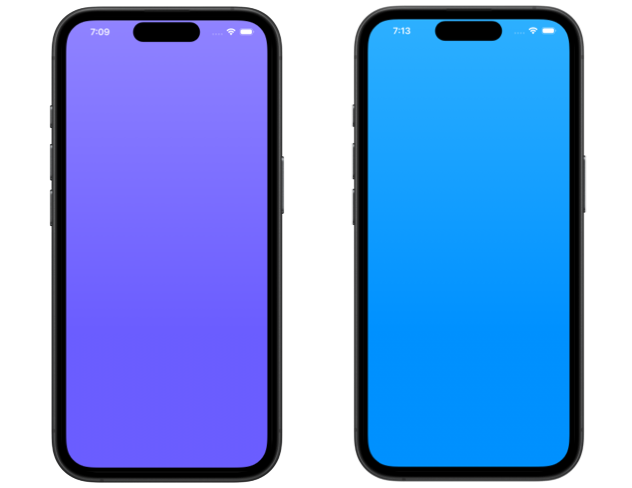
To define a concentric shape in SwiftUI we can either use one of the ConcentricRectangle initializers or call the static rect(corners:) function defined on the Shape protocol passing it a concentric corner style.
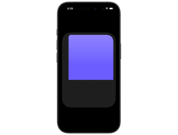
ConcentricRectangle()
    .fill(Color.indigo.gradient)
    .padding(8)
    .ignoresSafeArea()
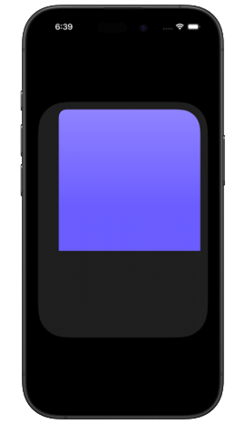
Rectangle()
    .fill(Color.blue.gradient)
    .clipShape(.rect(corners: .concentric))
    .padding(8)
    .ignoresSafeArea()
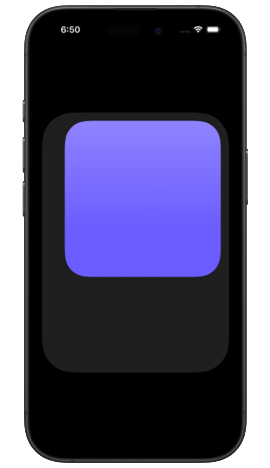
Both of these versions will produce the same visual result, which is a concentric version of the current container shape. If it's the root view of the app, or a full screen cover, then the container shape comes from the device.
The corner radii for the concentric shape are derived from the container corner radii and the distance between the container and the inner shape corners. If the distance between the inner shape's corners and the container corners is larger than the container’s corner radii, the radii of the inner corners will be set to 0. That is why I applied ignoresSafeArea() in my examples to remove the default distance between my shape and the device's edge for demo purposes.
# Default container shapes
Depending on where in the app hierarchy we need a concentric shape, its container shape will either be provided by the system or defined by us. The default container shape could be the device’s bezel, or the shape of a sheet or a popover, for example.
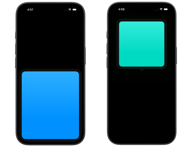
I noticed that to get a uniform concentric shape inside a sheet, I just needed to ignore the safe area, similar to a shape concentric to the device bezel. But for a shape inside a popover, I had to add the isUniform parameter set to true, otherwise the two corners closer to the popover arrow wouldn’t be rounded enough for visual balance.
.sheet(isPresented: .constant(true)) {
    ConcentricRectangle()
        .fill(.blue.gradient)
        .padding()
        .ignoresSafeArea()
        .presentationDetents([.medium])
}
.popover(isPresented: .constant(true)) {
    ConcentricRectangle(
        corners: .concentric, isUniform: true
    )
    .fill(.mint.gradient)
    .frame(width: 200, height: 200)
    .padding()
    .presentationDetents([.medium])
    .presentationCompactAdaptation(.popover)
}
# Setting a custom container shape
For many custom UI elements, such as cards, tags, custom controls and containers, we'll need to set a custom container shape if we want the corners of nested views to be correctly rounded. We can do it by applying the new containerShape(_:) modifier to the parent container.
struct Card: View {
    let color: Color
    let text: String

    var body: some View {
        ZStack {
            ConcentricRectangle()
                .fill(.thickMaterial)

            VStack {
                ConcentricRectangle(
                    corners: .concentric,
                    isUniform: true
                )
                .fill(color.gradient)

                Text(text)
                    .font(.headline)
            }
            .padding(12)
        }
        .containerShape(
            .rect(cornerRadius: 24)
        )
    }
}
In this example, applying .containerShape(.rect(cornerRadius: 24)) to the ZStack in Card ensures that the background ConcentricRectangle matches the 24‑point corner radius exactly, while the foreground ConcentricRectangle becomes a concentric version of the container shape where the corner radius is computed as 24 minus the padding. The top corners of the foreground ConcentricRectangle will be rounded by default, but the bottom corners would get a radius of 0 because of their greater distance to the parent container corners unless we set isUniform to true.
The container shape that we use must conform to the RoundedRectangularShape protocol, otherwise, ConcentricRectangle won't be able to resolve its corner radius based on concentricity and will revert to a ContainerRelativeShape. Standard SwiftUI shapes such as RoundedRectangle, Capsule, and Circle all conform to RoundedRectangularShape, so they can be used as container shapes for concentric rectangles.
# Corner radius resolution
The resolved corner radius for each corner of a concentric shape can vary based on how the shape is positioned within its container. If it’s not centered, the corners closer to the edge will get a larger radius than those farther away. Corners that are too far from the container’s edge will default to a radius of 0 points.
ZStack(alignment: .topTrailing) {
    ConcentricRectangle()
        .fill(.thickMaterial)

    ConcentricRectangle()
        .fill(.indigo.gradient)
        .frame(width: 300, height: 300)
        .padding()
}
.containerShape(
    .rect(cornerRadius: 60)
)
.frame(width: 360, height: 500)
If we want a uniform shape instead, we need to use the init(corners:isUniform:) initializer and pass true to isUniform, which is false by default.
ConcentricRectangle(
    corners: .concentric,
    isUniform: true
)
.fill(.indigo.gradient)
.frame(width: 300, height: 300)
.padding()
Corners of a uniform concentric shape will all have the same corner radius, equal to the largest resolved radius among the corners.

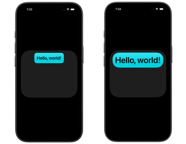
# Minimum corner radius
To make sure a concentric shape never gets corners that are not rounded, we can provide a minimum corner radius.
Text("Hello, world!")
    .padding()
    .background(
        .teal.gradient,
        in: .rect(
            corners: .concentric(minimum: 24),
            isUniform: true
        )
    )
When the shape is too far from the edge of its container to resolve rounded concentric corners, it will use the minimum radius. If it moves closer to the edge or grows, for example as dynamic text size changes, it will switch to concentric corners that match the container.
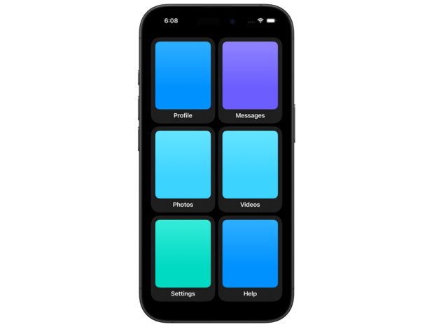
There are a few more customizations we can do with concentric rectangles, such as setting a corner style for each corner individually, or applying styles to groups of corners like the top or bottom ones, in case we need more control over how our shapes adapt to different layouts and containers.
Overall, I think that concentric rectangles are a welcome addition to SwiftUI that give us new ways to make our interfaces more consistent, adaptive, and polished for iOS 26.
If you are looking to build a strong foundation in SwiftUI, my book SwiftUI Fundamentals takes a deep dive into the framework's core principles and APIs to help you understand how it works under the hood and how to use it effectively in your projects. And my new book The SwiftUI Way helps you adopt recommended patterns, avoid common pitfalls, and use SwiftUI's native tools appropriately to work with the framework rather than against it.
For more resources on Swift and SwiftUI, check out my other books and book bundles.

Work with SwiftUI. Not against it.$35
A field guide to SwiftUI patterns and anti-patterns
The SwiftUI Way
- Avoid common SwiftUI pitfalls
- Build deeper intuition for the framework
- Gain insights from a former SwiftUI Engineer at Apple
Work with SwiftUI. Not against it.
A field guide to SwiftUI patterns and anti-patterns
The SwiftUI Way