

SwiftUI Search Enhancements in iOS and iPadOS 26
In iOS and iPadOS 26, the search experience has been updated with new placement behaviors and visual styling, and we also have new SwiftUI APIs to support the changes. In this post, we'll explore how we can take advantage of these enhancements to build search interfaces that feel modern and consistent with the system.
We'll focus on two common search patterns in iOS apps: search in the toolbar and search in the tab bar, and review how each works, what has changed, and how to implement them in SwiftUI.
# Toolbar search
In apps that use hierarchical navigation with NavigationStack or NavigationSplitView, it's common to enable global search by applying the searchable() modifier to the entire navigation view.
NavigationSplitView {
    List(notes, selection: $selectedNote) { note in
        NavigationLink(note.title, value: note)
    }
    .navigationTitle("Notes")
} detail: {
    NoteDetailView(note: selectedNote)
}
.searchable(text: $searchText)
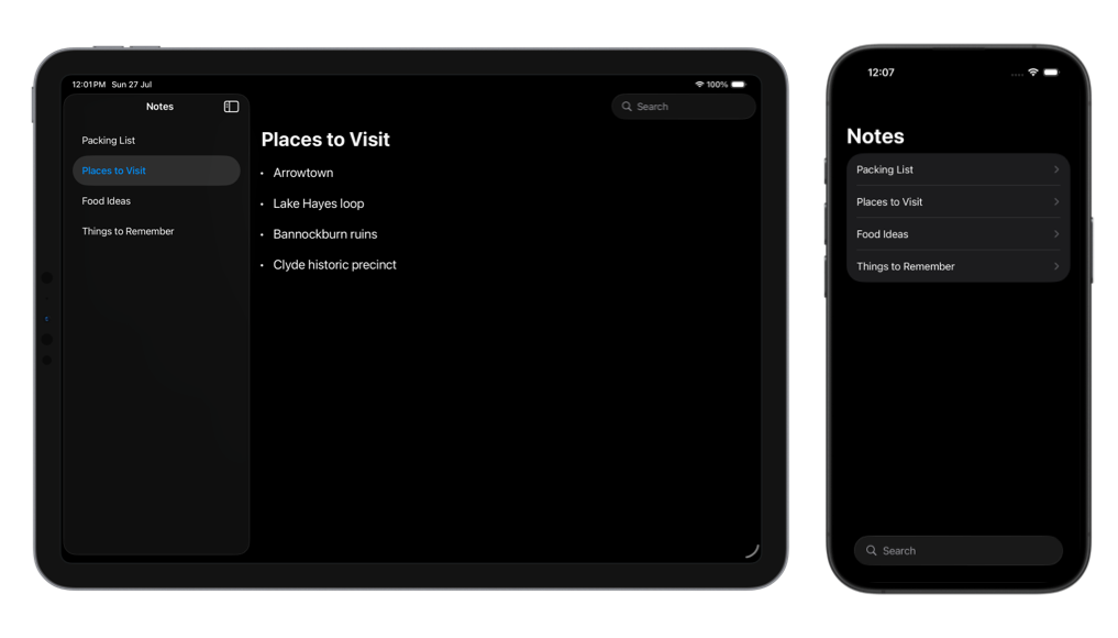
Applying searchable() to the navigation container instead of an individual column allows the system to determine the appropriate placement for the search field.
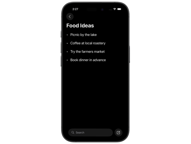
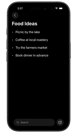
In earlier versions of iOS and iPadOS, this setup would place the search field at the top of the sidebar on iPad and at the top of the root view on iPhone. Starting with iOS 26, the same configuration results in a search field presented in a Liquid Glass container, positioned in the top trailing corner of the window on iPad, and at the bottom of the screen on iPhone for easier reach.
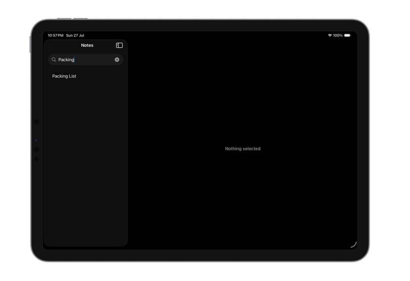
We can still explicitly position the search field in the sidebar on iPad if that better suits our app by specifying the sidebar placement in the searchable() modifier.
NavigationSplitView {
    List(filteredNotes, selection: $selectedNote) { note in
        NavigationLink(note.title, value: note)
    }
    .navigationTitle("Notes")
} detail: {
    NoteDetailView(note: selectedNote)
}
.searchable(text: $searchText, placement: .sidebar)
This restores the previous behavior, placing the search field at the top of the sidebar column instead of using the new floating style.
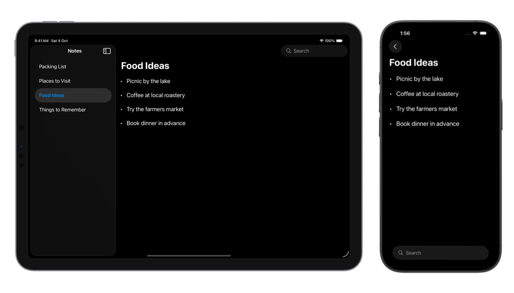
For applications where search is scoped to the detail content rather than applied globally, we should attach the searchable() modifier directly to the detail view.
NavigationSplitView {
    List(notes, selection: $selectedNote) { note in
        NavigationLink(note.title, value: note)
    }
    .navigationTitle("Notes")
} detail: {
    NoteDetailView(note: selectedNote)
        .searchable(text: $searchText)
}
This placement has also been updated with the new design in iOS and iPadOS 26.

Level up your Swift skills!$35
100+ tips to take your Swift code to the next level
Swift Gems
- Advanced Swift techniques for experienced developers bypassing basic tutorials
- Curated, actionable tips ready for immediate integration into any Swift project
- Strategies to improve code quality, structure, and performance across all platforms
Level up your Swift skills!
100+ tips to take your Swift code to the next level
Swift Gems
When the detail view includes other bottom toolbar items on iPhone, and we want the search field to still appear at the bottom, we can use two new toolbar content types introduced in iOS 26: DefaultToolbarItem with the search kind, and ToolbarSpacer.
NoteDetailView(note: selectedNote)
    .toolbar {
        if #available(iOS 26.0, *) {
            DefaultToolbarItem(kind: .search, placement: .bottomBar)
            ToolbarSpacer(.flexible, placement: .bottomBar)
        }
        ToolbarItem(placement: .bottomBar) {
            NewNoteButton()
        }
    }
    .searchable(text: $searchText)
This ensures that the search field is allocated space in the bottom toolbar layout and remains visually separated from the other toolbar items.
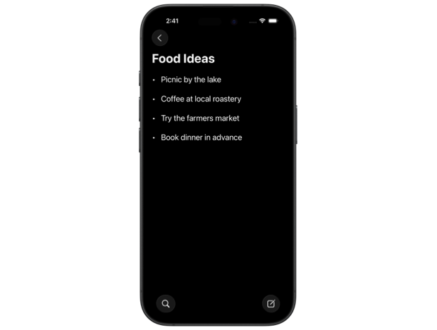
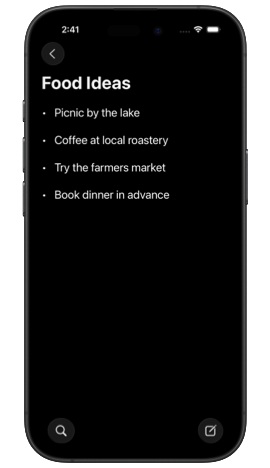
If search isn't the primary experience we want to promote in our app, we can use the new SwiftUI modifier searchToolbarBehavior() to minimize the search field into a toolbar button. The system may also apply this behavior automatically based on factors such as device size or the number of toolbar items.
extension View {
    @ViewBuilder func minimizedSearch() -> some View {
        if #available(iOS 26.0, *) {
            self.searchToolbarBehavior(.minimize)
        } else { self }
    }
}

struct NotesView: View {
    ...

    var body: some View {
        NavigationSplitView {
            ...
        } detail: {
            NoteDetailView(note: selectedNote)
                .toolbar {
                    if #available(iOS 26.0, *) {
                        DefaultToolbarItem(kind: .search, placement: .bottomBar)
                        ToolbarSpacer(.flexible, placement: .bottomBar)
                    }
                    ToolbarItem(placement: .bottomBar) {
                        NewNoteButton()
                    }
                }
                .searchable(text: $searchText)
                .minimizedSearch()
        }
    }
}
# Tab bar search
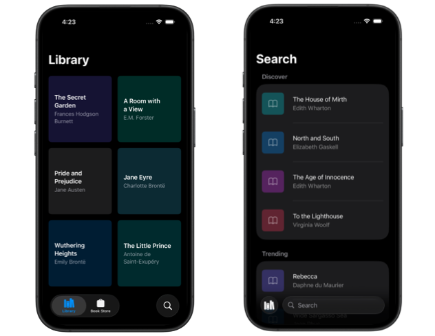
In apps that use tab-based navigation, it’s common to place search in a dedicated tab where users can browse suggestions or enter queries directly. This pattern appears in many Apple apps such as Health, Music, and Books. To adopt it, we can create a Tab with the search role and apply the searchable() modifier to the view inside the tab. For the search field to appear and function correctly, the contents of the search tab should be wrapped in a NavigationStack.
TabView {
    Tab("Library", systemImage: "books.vertical") {
        LibraryView()
    }
    Tab("Book Store", systemImage: "bag") {
        StoreView()
    }

    Tab(role: .search) {
        NavigationStack {
            SearchView()
                .navigationTitle("Search")
        }
        .searchable(text: $searchText)
    }
}
With the new Liquid Glass tab bar design in iOS 26, the search tab appears visually separated from the others and transforms into a search field when selected.
Just like with other standard system components, adopting the new Liquid Glass design for search doesn’t require much effort. By taking advantage of the updates to standard search patterns and adjusting behavior to suit our app’s needs, we can ensure that our search experience feels at home on iOS and iPadOS 26.
If you are looking to build a strong foundation in SwiftUI, my book SwiftUI Fundamentals takes a deep dive into the framework's core principles and APIs to help you understand how it works under the hood and how to use it effectively in your projects. And my new book The SwiftUI Way helps you adopt recommended patterns, avoid common pitfalls, and use SwiftUI's native tools appropriately to work with the framework rather than against it.
For more resources on Swift and SwiftUI, check out my other books and book bundles.

Work with SwiftUI. Not against it.$35
A field guide to SwiftUI patterns and anti-patterns
The SwiftUI Way
- Avoid common SwiftUI pitfalls
- Build deeper intuition for the framework
- Gain insights from a former SwiftUI Engineer at Apple
Work with SwiftUI. Not against it.
A field guide to SwiftUI patterns and anti-patterns
The SwiftUI Way