

Customizable toolbar on iPad in SwiftUI
User customization for toolbars has existed on macOS for a while, but starting from iPadOS 16, this feature is also available on iPad. This was part of many other iPad specific improvements added this year to help us build desktop class iPad apps. We can easily add toolbar customization functionality in our apps using SwiftUI to let users configure toolbars for their specific needs and workflows.
# Initial setup
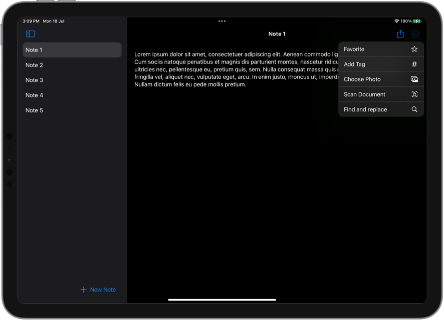
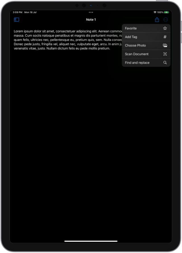
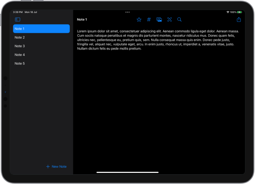
We are going to look at an example note taking app, where we are providing many different actions for the users. They can favorite notes, add custom tags, insert images and document scans, share notes and summon the new find and replace UI for searching the current note.
We think that the most common action in our particular app is to share notes, so we defined the ShareButton as the primary action. All the other items are placed in a secondary action item group. secondaryAction placement is new in iPadOS 16, and it allows the items to be collapsed into a menu by default, when it's passed to a ToolbarItemGroup.
struct NoteView: View {
    @Binding var text: String

    var body: some View {
        TextEditor(text: $text)
            .toolbar {
                ToolbarItemGroup(placement: .primaryAction) {
                    ShareButton()
                }
                ToolbarItemGroup(placement: .secondaryAction) {
                    FavoriteButton()
                    TagButton()
                    AddPhotoButton()
                    AddDocumentScanButton()
                    FindButton()
                }
            }
    }
}
In the our initial setup the share button is always visible, while the other items need to be expanded from the menu button.
Enhance older apps with SwiftUI!$40
A detailed guide on gradually adopting SwiftUI in UIKit projects
Updated for iOS 26 and Xcode 26!
Integrating SwiftUI into UIKit Apps
- Upgrade your apps with new features like Swift Charts and Widgets
- Support older iOS versions with effective backward-compatible strategies
- Seamlessly bridge state and data between UIKit and SwiftUI using the latest APIs
Enhance older apps with SwiftUI!
A detailed guide on gradually adopting SwiftUI in UIKit projects
Integrating SwiftUI
into UIKit Apps
Updated for iOS 26 and Xcode 26!
# Place items in the center
While our initial setup could work well in compact horizontal size class, it doesn't really take advantage of all the available space in regular size class on iPad. To fix that, we can use the new toolbarRole(_:) modifier and assign it the editor role.
struct NoteView: View {
    @Binding var text: String

    var body: some View {
        TextEditor(text: $text)
            .toolbar {
                ...
            }
            .toolbarRole(.editor)
    }
}
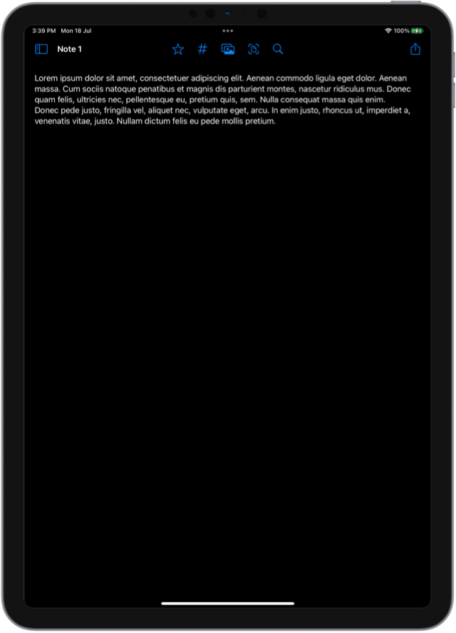
The editor role indicates that the toolbar is used for editing document-like content. It will move the navigation title to the leading edge of the toolbar and free up the space in the middle for all the secondary actions.
# Allow toolbar customization
If we provide a lot of actions in the app, the toolbar can get a bit crowded. Luckily, we can allow users to customize it for their personal workflows and show only the actions useful to them.
To make toolbar customizable, we first need to move all our secondary actions out of the ToolbarItemGroup and create separate toolbar items. Then, we need to assign an id to each item and an id for the toolbar as a whole. We have to make sure that ids are unique and stable between the app launches. Another thing to note, is that only secondary actions can be customized. To keep our share button as primary action, we'll need to move it into a separate toolbar modifier.
struct NoteView: View {
    @Binding var text: String

    var body: some View {
        TextEditor(text: $text)
            .toolbar(id: "note") {
                ToolbarItem(id: "favorite", placement: .secondaryAction) {
                    FavoriteButton()
                }
                ToolbarItem(id: "tag", placement: .secondaryAction) {
                    TagButton()
                }
                ToolbarItem(id: "photo", placement: .secondaryAction) {
                    AddPhotoButton()
                }
                ToolbarItem(id: "scan", placement: .secondaryAction) {
                    AddDocumentScanButton()
                }
                ToolbarItem(id: "Find", placement: .secondaryAction) {
                    FindButton()
                }
            }
            .toolbar {
                ToolbarItem(placement: .primaryAction) {
                    ShareButton()
                }
            }
            .toolbarRole(.editor)
    }
}
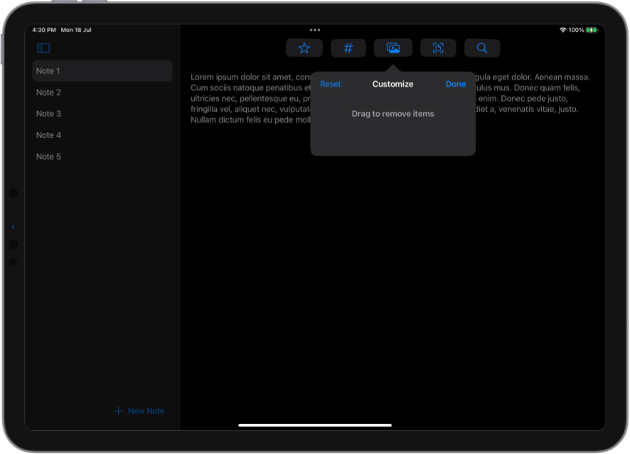
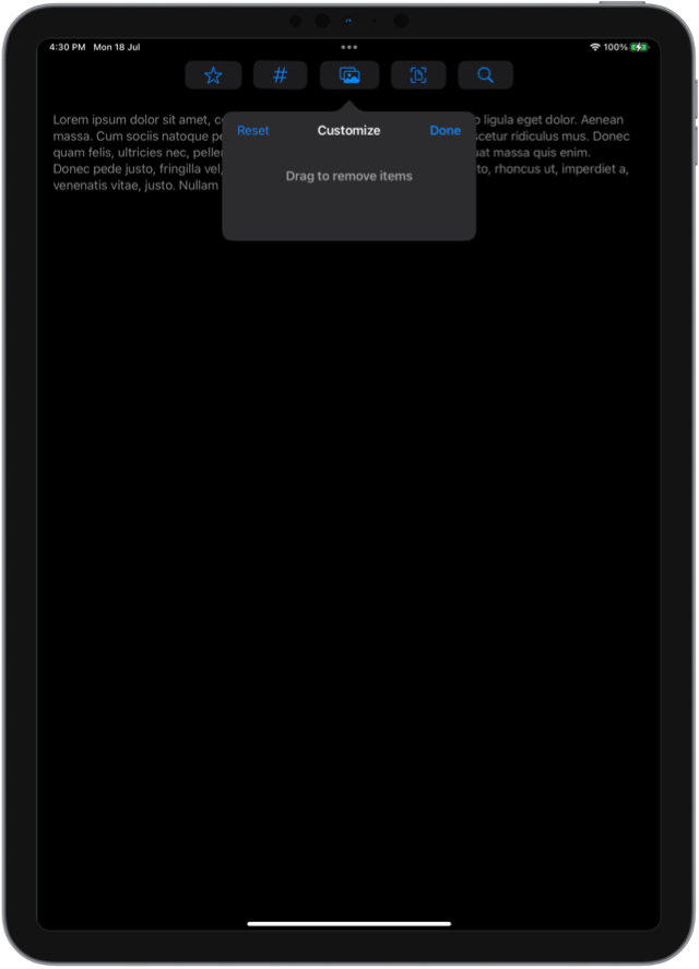
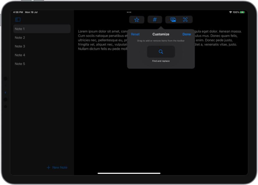
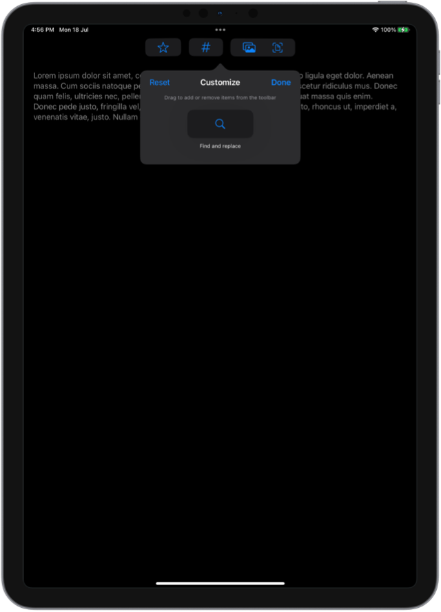
If we run our app now, we can see that users can press on the trailing menu button and choose to customize the toolbar. Inside the customization UI they can drag out any items that are not needed out of the bar and into the customization popover.
If we want to hide an item by default, we can pass false to showsByDefault parameter in the item initializer. The following code will make the FindButton be hidden inside the customization popover by default and it won't be present in the bar when the user first launches the app. They will be able to add it to the bar themselves if needed.
struct NoteView: View {
    @Binding var text: String

    var body: some View {
        TextEditor(text: $text)
            .toolbar(id: "note") {
                ...
                ToolbarItem(
                    id: "Find", placement: .secondaryAction,
                    showsByDefault: false
                ) {
                    FindButton()
                }
            }
    }
}

Level up your Swift skills!$35
100+ tips to take your Swift code to the next level
Swift Gems
- Advanced Swift techniques for experienced developers bypassing basic tutorials
- Curated, actionable tips ready for immediate integration into any Swift project
- Strategies to improve code quality, structure, and performance across all platforms
Level up your Swift skills!
100+ tips to take your Swift code to the next level
Swift Gems
# Group related items
When we have closely related actions in the app, we can group them together, so that they can only be added or removed as a group. In our example, it would be good to combine AddPhotoButton and AddDocumentScanButton, because they are both responsible for inserting images.
To combine actions together, we need to place them into the same ToolbarItem and wrap them into a ControlGroup.
struct NoteView: View {
    @Binding var text: String

    var body: some View {
        TextEditor(text: $text)
            .toolbar(id: "note") {
                ...
                ToolbarItem(id: "image", placement: .secondaryAction) {
                    ControlGroup {
                        AddPhotoButton()
                        AddDocumentScanButton()
                    }
                }
            }
    }
}
Now users will only be able to add or remove the photo and document scan buttons together as a group.
With these new toolbar capabilities we can now build richer iPad apps that take better advantage of the available space and can be tailored specifically for the user's individual needs.
You can get the final code for the example described in this article from our GitHub repository.