

Customize ShareLink appearance in SwiftUI with view modifiers
While we can provide a fully custom view as a label of the ShareLink in SwiftUI, we can also customize the default appearance with view modifiers instead.
The default style of the ShareLink adapts to its context, but changing its appearance can be useful when we are designing a custom toolbar, for example.
All the style changes that we can apply to a regular SwiftUI Label view can be applied to the ShareLink as well. We can set the label style to only show the icon or the text, adjust the image scale or choose a symbol variant.
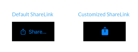
ShareLink(item: url)
    .labelStyle(.iconOnly)
    .imageScale(.large)
    .symbolVariant(.fill)
These modifiers set values in the environment, which SwiftUI reads internally to configure the label inside the ShareLink. This allows us to adjust its appearance without providing a custom view.


Deepen your understanding of SwiftUI!$35
The essential guide to SwiftUI core concepts and APIs
SwiftUI Fundamentals
- Explore the key APIs and design patterns that form the foundation of SwiftUI
- Develop a deep, practical understanding of how SwiftUI works under the hood
- Learn from a former Apple engineer who worked on widely used SwiftUI APIs
Deepen your understanding of SwiftUI!
The essential guide to SwiftUI core concepts and APIs
SwiftUI Fundamentals