

SwiftUI Liquid Glass sheets with NavigationStack and Form
A few weeks ago I wrote a post on Presenting Liquid Glass sheets in SwiftUI on iOS 26, including setting up presentation detents and configuring morphing transitions from toolbar buttons. But if sheets include forms or push views onto a NavigationStack, which is common for preferences sheets in many apps, they won't get the Liquid Glass appearance by default. In this post I'm going to walk through the extra steps required in such cases to keep the Liquid Glass effect visible throughout.
# Liquid Glass sheet with a Form
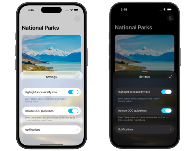
Form views, like lists, provide their own opaque background that covers the glassy sheet surface. To give a sheet with a form the Liquid Glass appearance, in addition to specifying at least one partial-height detent in its presentation detents, the default form background needs to be hidden. This can be done by applying .scrollContentBackground(.hidden) directly to the Form.
struct SettingsSheet: View {
    var body: some View {
        NavigationStack {
            Form {
                SettingsToggles()
                NotificationsSection()
            }
            .settingsToolbar()
            .scrollContentBackground(.hidden)
        }
        .presentationDetents([.medium, .large])
    }
}
With this configuration the main form background will be removed, leaving only the row backgrounds visible, which results in a glassy sheet appearance in the medium detent.
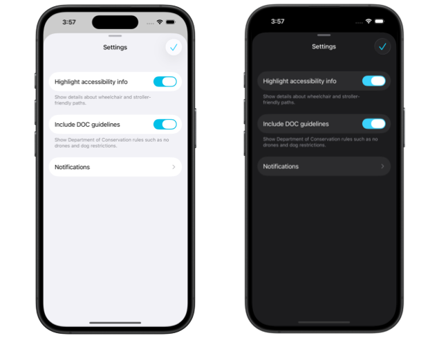
As the sheet transitions to the large detent and takes the full height of the screen, the Liquid Glass background will get replaced by a regular opaque one. In dark color scheme the form will still look as expected, but in light the row backgrounds will not be visible anymore. This is slightly inconsistent and might not be what you want in your design. To fix this issue we can dynamically hide and show the default form background based on the current sheet detent. We can keep the glassy appearance in half-sheet by hiding the scroll content background and set it back to default in full screen sheet.
struct SettingsSheet: View {
    @State
    private var currentDetent: PresentationDetent = .medium

    var body: some View {
        NavigationStack {
            Form {
                SettingsToggles()
                NotificationsSection(currentDetent: currentDetent)
            }
            .settingsToolbar()
            .scrollContentBackground(
                currentDetent == .medium ? .hidden : .automatic
            )
        }
        .presentationDetents(
            [.medium, .large], selection: $currentDetent
        )
    }
}
This keeps the form appearance consistent in both light and dark color schemes.
In case we do want to remove the row backgrounds altogether to maximize the glassy look of the sheet, we can apply the listRowBackground() modifier to the form sections or to individual rows and set their backgrounds to Color.clear.
# Liquid Glass sheet with navigation destinations
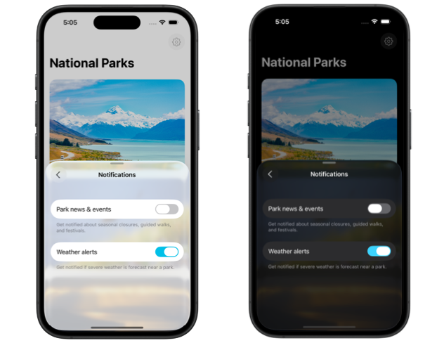
While the root view of the NavigationStack doesn't set an opaque background for its content by default, navigation destinations pushed onto the stack have an opaque extra layer behind, which obscures the Liquid Glass in the sheet. To maintain the translucency of the sheet as users navigate inside it, we need to remove that default background from navigation destinations.
For example, we might have a screen with multiple notification settings that has its own form and is pushed onto the root view of the settings sheet. To make it translucent, apart from removing the form scroll content background like we saw earlier, we also have to remove its container background by adding .containerBackground(.clear, for: .navigation).
struct NotificationsSection: View {
    let currentDetent: PresentationDetent

    var body: some View {
        Section {
            NavigationLink("Notifications") {
                Form {
                    NotificationSettingsForm(currentDetent: currentDetent)
                }
                .scrollContentBackground(
                    currentDetent == .medium ? .hidden : .automatic
                )
                .containerBackground(.clear, for: .navigation)
                .navigationTitle("Notifications")
            }
        }
    }
}
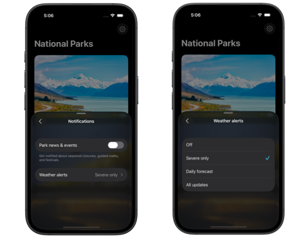
It's also common to include a picker with a navigationLink style in the settings, which pushes the list of options onto the navigation stack. The setup to ensure that the sheet maintains its glassy appearance with such pickers is similar to the one with plain navigation destinations. We have to remove the scroll content background first by applying the scrollContentBackground() modifier to the Picker view, and then remove the navigation container background by adding containerBackground(.clear, for: .navigation) to the picker content.
struct WeatherAlertsSections: View {
    let currentDetent: PresentationDetent

    @State private var selection = "Off"
    let options = ["Off", "Severe only", "Daily forecast", "All updates"]

    var body: some View {
        Section {
            Picker("Weather alerts", selection: $selection) {
                ForEach(options, id: \.self) { option in
                    Text(option)
                }
                .containerBackground(.clear, for: .navigation)
            }
            .pickerStyle(.navigationLink)
            .scrollContentBackground(
                currentDetent == .medium ? .hidden : .automatic
            )
        }
    }
}
With these few extra steps, our sheets can take full advantage of the Liquid Glass design and preserve their translucent appearance at partial height in all contexts.
If you are looking to build a strong foundation in SwiftUI, my book SwiftUI Fundamentals takes a deep dive into the framework's core principles and APIs to help you understand how it works under the hood and how to use it effectively in your projects. And my new book The SwiftUI Way helps you adopt recommended patterns, avoid common pitfalls, and use SwiftUI's native tools appropriately to work with the framework rather than against it.
For more resources on Swift and SwiftUI, check out my other books and book bundles.

Work with SwiftUI. Not against it.$35
A field guide to SwiftUI patterns and anti-patterns
The SwiftUI Way
- Avoid common SwiftUI pitfalls
- Build deeper intuition for the framework
- Gain insights from a former SwiftUI Engineer at Apple
Work with SwiftUI. Not against it.
A field guide to SwiftUI patterns and anti-patterns
The SwiftUI Way