

Ridgeline plot with Swift Charts
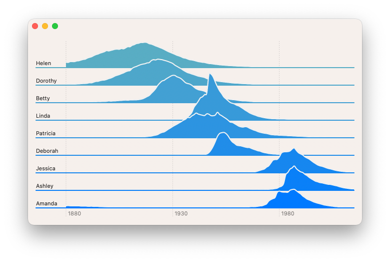
Continuing on from my last post where I build a stream graph, I will take that same dataset of popular US baby names to build a different view. The goal this time is to make it easier to see the change in each name's individual popularity over time while keeping the context of the other names visible. I'll break out each name into its own area graph and offset it, so that they appear like a landscape of mountain ranges going into the distance.
First, I need to group my data by name so that I can control the visual offset for each name. I can use Dictionary.init(grouping:) for this.
let groupedDataPoints = Dictionary(
    grouping: babyDataPoints
) { dataPoint in
    dataPoint.name
}
It will create a Dictionary<String, [BabyNamesDataPoint]>, grouping my datapoints by name, so I can control how I plot each name separately.
To plot these values, I will create a new struct that conforms to ChartContent. This is like a SwiftUI View but for use inside a Chart. Breaking up a complex chart is not just useful for code organisation but also helps the compiler infer the types. I have found that if I'm having lots of compiler crashes, timeouts or strange errors, breaking up the chart into multiple smaller ChartContent building blocks resolves these issues.
struct AreaChartForName: ChartContent {
    let name: String
    let dataPoints: [BabyNamesDataPoint]

    var body: some ChartContent {
        // Body goes here
    }
}
Like SwiftUI's View protocol, ChartContent's body property is implicitly a ChartContentBuilder, so I can build the nested charts content using the same declarative pattern I'm used to.

Level up your Swift skills!$35
100+ tips to take your Swift code to the next level
Swift Gems
- Advanced Swift techniques for experienced developers bypassing basic tutorials
- Curated, actionable tips ready for immediate integration into any Swift project
- Strategies to improve code quality, structure, and performance across all platforms
Level up your Swift skills!
100+ tips to take your Swift code to the next level
Swift Gems
Let's start with a simple AreaMark that is configured to be unstacked and coloured by the name.
struct AreaChartForName: ChartContent {
    let name: String
    let dataPoints: [BabyNamesDataPoint]

    var body: some ChartContent {
        ForEach(dataPoints) { point in
            AreaMark(
                x: .value("Year", point.year),
                y: .value("Proportion", point.proportion),
                stacking: .unstacked
            )
            .foregroundStyle(
                by: .value("Baby Name", point.name)
            )
        }
    }
}
Now I will use my AreaChartForName in the chart.
struct RidgeBabyChart: View {
    let groupedData: Dictionary<String, [BabyNamesDataPoint]>

    var body: some View {
        Chart {
            ForEach(
                Array(groupedData),
                id: \.key
            ) { (key, values) in
                AreaChartForName(
                    name: key,
                    dataPoints: values
                )
            }
        }
    }
}
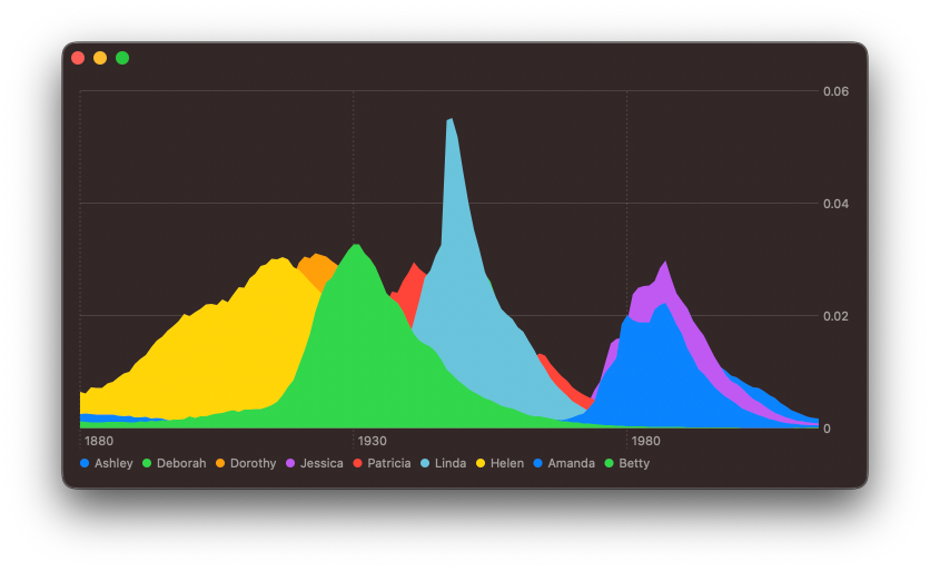
The next step is to offset the area marks, so that each one appears on its own baseline. I have found that the best way to do this is to use the offset(y:) modifier. I need to offset the first marks the most, so that the distant ridges are behind those in-front.
struct RidgeBabyChart: View {
    let groupedData: Dictionary<String, [BabyNamesDataPoint]>

    var body: some View {
        Chart {
            ForEach(
                Array(groupedData.enumerated()),
                id: \.offset
            ) { (offset, element) in
                let offsetFactor: CGFloat = CGFloat(
                    groupedData.count - 1 - offset
                ) * -35

                AreaChartForName(
                    name: element.key,
                    dataPoints: element.value
                )
                .offset(y: offsetFactor)
            }
        }
    }
}
So that I can offset each area mark by a different amount, I changed ForEach statement to operate on an enumerated array of values.
I can see an issue here, the y-axis domain has been automatically scaled by Charts to fit the largest data value. However, this does not take into account the offset I have applied. What I need is the range of values for the y-axis to be increased, so that the height of each of these area marks is reduced. The chartYScale(domain:) modifier allows me to set a custom range for the y-axis.
struct RidgeBabyChart: View {
    let groupedData: Dictionary<String, [BabyNamesDataPoint]>

    var body: some View {
        Chart {
            ...
        }
        .chartYScale(domain: 0 ... 0.2)
    }
}
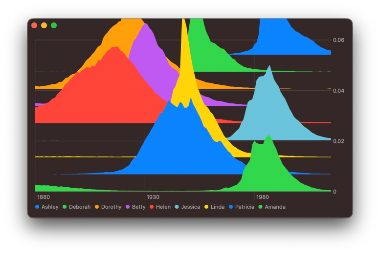
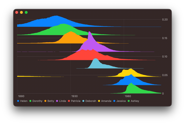
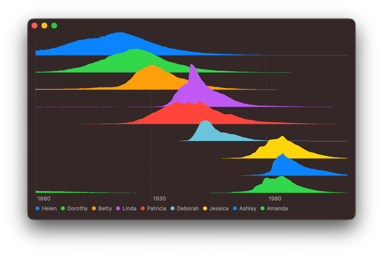
The chart is starting to look nice, but since I'm using a dictionary, every time I run the application the order of the names changes. Swift Collections package provides an OrderedDictionary type that will help me ensure the order is stable. Furthermore, I would like to sort the names by their date of maximum popularity, doing so will naturally sort the names visually back to front.
let groupedDataPoints = Dictionary(
    grouping: babyDataPoints
) { dataPoint in
    dataPoint.name
}

let sortedGroupedDataPoints = groupedDataPoints
    .sorted { a, b in
        a.value.yearOfMaxProportion < b.value.yearOfMaxProportion
    }

let orderedDataPoints = OrderedDictionary(
    uniqueKeysWithValues: sortedGroupedDataPoints
)
extension Array where Element == BabyNamesDataPoint {
    var yearOfMaxProportion: Date {
        guard let first = self.first else {
            fatalError("There must be at least one data point!")
        }
        var year = first.year
        var proportion = first.proportion
        for element in self {
            if element.proportion > proportion {
                year = element.year
                proportion = element.proportion
            }
        }
        return year
    }
}
Using the ordered dictionary in my chart just requires changing the signature of groupedData.
struct RidgeBabyChart: View {
    let groupedData: OrderedDictionary<String, [BabyNamesDataPoint]>

    var body: some View {
        ...
    }
}


Enhance older apps with SwiftUI!$40
A detailed guide on gradually adopting SwiftUI in UIKit projects
Updated for iOS 18 and Xcode 16!
Integrating SwiftUI into UIKit Apps
- Upgrade your apps with new features like Swift Charts and Widgets
- Support older iOS versions with effective backward-compatible strategies
- Seamlessly bridge state and data between UIKit and SwiftUI using the latest APIs
Enhance older apps with SwiftUI!
A detailed guide on gradually adopting SwiftUI in UIKit projects
Integrating SwiftUI
into UIKit Apps
Updated for iOS 18 and Xcode 16!
# Styling the Chart
That is so much easer to read! However, I feel it could look better. I want to first smooth the area sections a little bit. My aim is to show a general trend rather than read off individual values for a single year, so a smother line will do this better. I will add interpolationMethod() inside my AreaChartForName body to automatically adjust the data being plotted.
struct AreaChartForName: ChartContent {
    let name: String
    let dataPoints: [BabyNamesDataPoint]

    var body: some ChartContent {
        ForEach(dataPoints) { point in
            AreaMark(
                x: .value("Year", point.year),
                y: .value("Proportion", point.proportion),
                stacking: .unstacked
            )
            .interpolationMethod(.cardinal)
            .foregroundStyle(
                by: .value("Baby Name", point.name)
            )
        }
    }
}
My goal is to let users compare the relative difference between these names, so the y-axis labels are misleading and cluttering up the chart. To remove them I will use chartYAxis(.hidden).
struct RidgeBabyChart: View {
    let groupedData: Dictionary<String, [BabyNamesDataPoint]>

    var body: some View {
        Chart {
            ...
        }
        .chartYScale(domain: 0 ... 0.2)
        .chartYAxis(.hidden)
    }
}
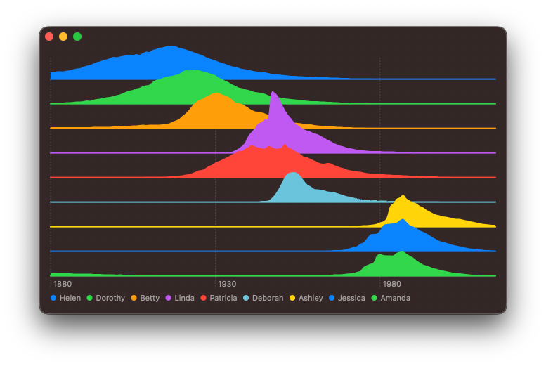
Looking at the chart, it feels a little off. Since I offset the area marks from the x-axis in spots where there is no data point for a given year, Charts opt to not render anything visually. This makes it hard to read the chart. I will try adding a RuleMark at the base of each of these subgraphs.
struct AreaChartForName: ChartContent {
    let name: String
    let dataPoints: [BabyNamesDataPoint]

    var body: some ChartContent {
        ForEach(dataPoints) { point in
            AreaMark(
                x: .value("Year", point.year),
                y: .value("Proportion", point.proportion),
                stacking: .unstacked
            )
            .interpolationMethod(.cardinal)
            .foregroundStyle(by: .value("Baby Name", point.name))
        }

        RuleMark(y: .value("", 0))
        .foregroundStyle(by: .value("Baby Name", name))
        .accessibilityHidden(true)
    }
}
Doing this inside of the AreaChartForName means that it will be offset up along with the AreaMark. In addition, I used the accessibilityHidden() modifier on the ruler, so it doesn't contribute to VoiceOver when reading the chart.
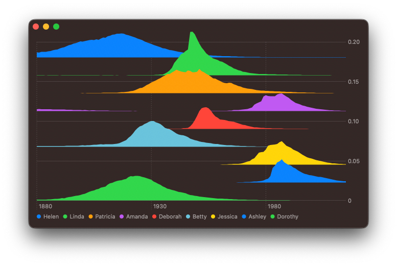
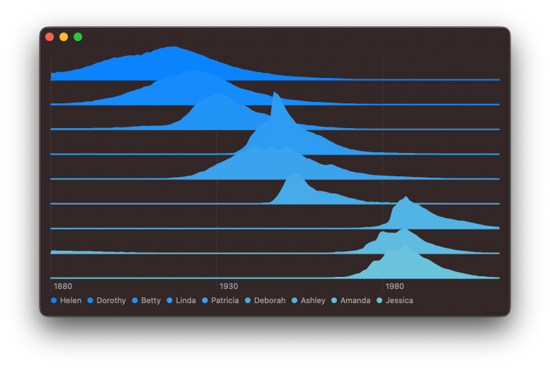
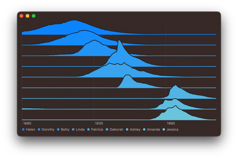
So much better! Next, I feel like I should address the colours. My aim here is to have a visual feel that guides the eye across the graph and through time to the most recently popular names. A gentle gradient gives a better impression of distant mountains.
struct RidgeBabyChart: View {
    let groupedData: Dictionary<String, [BabyNamesDataPoint]>

    var body: some View {
        Chart {
            ...
        }
        .chartYScale(domain: 0 ... 0.2)
        .chartYAxis(.hidden)
        .chartForegroundStyleScale(
            range: Gradient (
                colors: [
                    .blue,
                    .teal
                ]
            )
        )
    }
}
Visually this has the layering, but the overlapping sections are now very hard to see. Let me try adding an outline using a LineMark. Like the ruler, this is just for visual clarity, so should be hidden from accessibility.
struct AreaChartForName: ChartContent {
    ...

    var body: some ChartContent {
        ForEach(dataPoints) { point in
            AreaMark( ... )
            .interpolationMethod(.cardinal)
            .foregroundStyle(
                by: .value("Baby Name", point.name)
            )

            LineMark(
                x: .value("Year", point.year),
                y: .value("Proportion", point.proportion),
                series: .value("Baby Name", point.name)
            )
            .interpolationMethod(.cardinal)
            .accessibilityHidden(true)
            .foregroundStyle(.thinMaterial)
        }

        ...
    }
}
# Adding labels
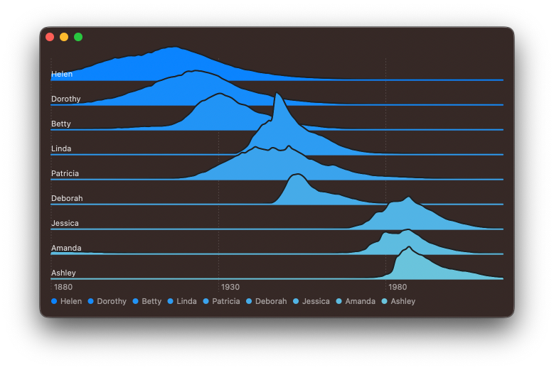
I feel that I should add some labels to the leading edge of each subchart, so that it's easer to link the data to the name. I will create an annotation on the top of the RuleMark with leading alignment.
struct AreaChartForName: ChartContent {
    ...

    var body: some ChartContent {
        ForEach(dataPoints) { ... }

        RuleMark(y: .value("", 0))
        .foregroundStyle(by: .value("Baby Name", name))
        .annotation(
            position: .top, alignment: .leading, spacing: 2
        ) {
            Text(name).font(.subheadline)
        }
        .accessibilityHidden(true)
    }
}
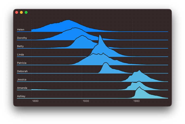
I see an issue here, the label might sometimes overlap the value points. I could write some code to try to detect if this is going to happen and shift up the label, but instead I will extend the chart out on the leading edge by a small amount to provide enough space for the label. I can do this using the chartXScale(range:) modifier. I will also hide the automatically provided legend as it's now redundant by applying chartLegend(.hidden) modifier.
struct RidgeBabyChart: View {
    let groupedData: OrderedDictionary<String, [BabyNamesDataPoint]>

    var body: some View {
        Chart { ... }
        .chartYScale(domain: 0 ... 0.2)
        .chartYAxis(.hidden)
        .chartForegroundStyleScale( ... )

        // New modifiers added
        .chartXScale(
            range: .plotDimension(startPadding: 60)
        )
        .chartLegend(.hidden)
    }
}
Level up your Swift skills!$35
100+ tips to take your Swift code to the next level
Swift Gems
- Advanced Swift techniques for experienced developers bypassing basic tutorials
- Curated, actionable tips ready for immediate integration into any Swift project
- Strategies to improve code quality, structure, and performance across all platforms
Level up your Swift skills!
100+ tips to take your Swift code to the next level
Swift Gems
# Supporting light and dark mode
So far I have just been building the chart in dark mode, but it's important to test how it will look in light mode as well.
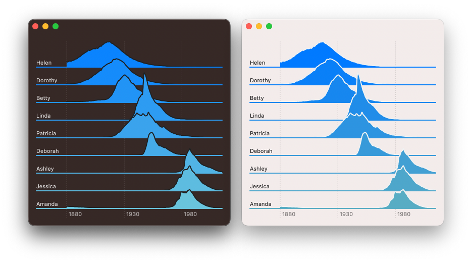
This looks good, but in the day time distant mountains are faint due to the atmosphere, and closer mountains are darker, so I will try reversing the gradient depending on colorScheme.
struct RidgeBabyChart: View {
    @Environment(\.colorScheme) var scheme

    let groupedData: OrderedDictionary<String, [BabyNamesDataPoint]>

    var body: some View {
        Chart {... }
        .chartYScale( ... )
        .chartYAxis( ...)
        .chartForegroundStyleScale(
            range: gradient
        )
        .chartXScale( ... )
        .chartLegend( ... )
    }

    var gradient: Gradient {
        var colors: [Color] = [
            .blue,
            .teal
        ]

        if scheme == .light {
            colors.reverse()
        }

        return Gradient (colors: colors)
    }
}
Dark mode is unchanged but light mode now feels more correct to the eye.
You can find the code for this chart in our GitHub project, this includes the code to download and parse the CSV file.
Swift Charts are designed to work with SwiftUI, but you can still use them in a UIKit project. You can check out Natalia Panferova's recent book Integrating SwiftUI into UIKit Apps for ways to add SwiftUI views to an existing UIKit project to take full advantage of the new iOS 16 APIs.