

Building adaptive non-modal panels in SwiftUI
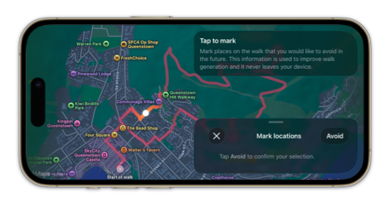
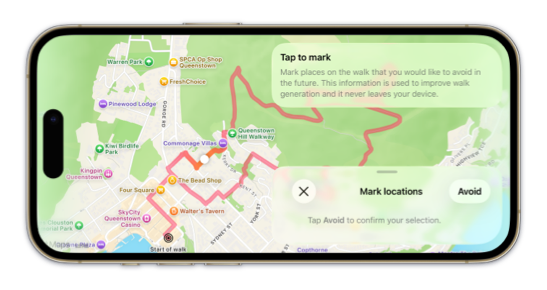
In our walking app Strolly, we make heavy use of non-modal sheets with small and medium detents so users can interact with the map and its controls at the same time. Until recently, the app only supported portrait orientation on iPhone. As part of our latest update, we wanted to support landscape layouts in preparation for the app resizability requirements coming with iOS 27. The system sheet API does not preserve its non-modal presentation when an iPhone rotates to landscape, so we had to find another solution.
In this post, we'll examine how we built a new overlay-based presentation API for a sheet-like panel and the design decisions that let it support detents across portrait and landscape. We assume familiarity with custom SwiftUI layouts and won't cover layout fundamentals.
# Defining a sheet-like panel API
We wanted the panel API to feel similar to SwiftUI's existing sheet(isPresented:onDismiss:content:) API. A panel is presented with a binding, and its content declares the supported detents from inside the presentation closure.
struct MapScreen: View {
    @State private var isPanelPresented = false
    @State private var selectedDetent = PanelDetent.adaptive

    var body: some View {
        Map()
            .panel(isPresented: $isPanelPresented) {
                PanelContent()
                    .panelDetents(
                        [.adaptive, .medium, .large],
                        selection: $selectedDetent
                    )
            }
    }
}
The panel(isPresented:content:) modifier places a PanelOverlay above the map using overlay(alignment:content:). Modifiers on the child content write configuration values, such as detents, using preferences. PanelOverlay reads those values and passes them into the layout while owning placement, dragging and dismissal. The child content therefore does not need to know whether it appears across the bottom or at the edge of the scene.
Our PanelDetent type closely follows the options available on PresentationDetent, with an additional adaptive case that fits the panel to its content.
enum PanelDetent: Hashable {
    case adaptive
    case height(CGFloat)
    case fraction(CGFloat)
    case medium
    case large
}
If the content does not provide any detents, the panel defaults to adaptive. The adaptive default works well for small controls and confirmation views where a fixed or fractional height would leave unnecessary empty space.
# Adapting to the available width
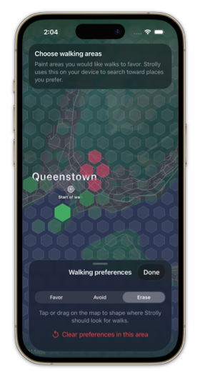
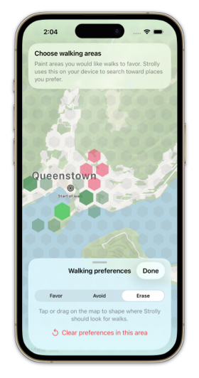
We cannot decide between the panel presentations from SwiftUI's horizontalSizeClass environment value alone. Smaller iPhone models can still report .compact after rotating to landscape, even when there is enough width for a panel alongside the map. If we switched only on size class, these phones would keep the bottom presentation, blocking much of the map.
Instead, the panel selects its presentation from the measured scene width, using an edge-aligned panel when there is enough room for both the panel and a useful area of map. We make that measurement available to every panel by applying an observation modifier to the root view in our WindowGroup. The modifier uses onGeometryChange(for:of:action:) to record the scene size and safe-area insets, then writes both values into the environment with environment(_:_:).
WindowGroup {
    MainScreenView()
        .modifier(PanelSceneGeometryModifier())
}

extension EnvironmentValues {
    @Entry var panelSceneSize = CGSize.zero
    @Entry var panelSceneSafeAreaInsets = PanelSafeAreaInsets()
}

private struct PanelSceneGeometryModifier: ViewModifier {
    @State private var sceneGeometry = PanelSceneGeometry()

    func body(content: Content) -> some View {
        content
            .onGeometryChange(for: PanelSceneGeometry.self) { proxy in
                PanelSceneGeometry(
                    size: proxy.size,
                    safeAreaInsets: PanelSafeAreaInsets(proxy.safeAreaInsets)
                )
            } action: { newValue in
                sceneGeometry = newValue
            }
            .environment(\.panelSceneSize, sceneGeometry.size)
            .environment(
                \.panelSceneSafeAreaInsets,
                sceneGeometry.safeAreaInsets
            )
    }
}
PanelOverlay reads the scene size and safe-area insets from the environment. The scene width determines whether the panel uses its bottom or edge-aligned presentation, while the scene height is used to resolve and order detents. Measuring both values at the scene root provides a single source of truth across rotation, iPad multitasking and window resizing.
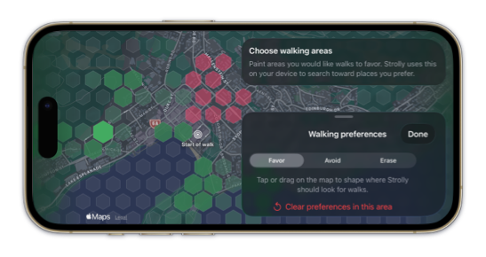
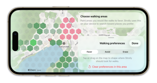
struct PanelRegularAdaptation {
    var minWidth: CGFloat = 320
    var idealWidth: CGFloat = 380
    var maxWidth: CGFloat = 420

    // "Regular" means the constrained-width, edge-aligned panel,
    // rather than the full-width bottom presentation.
    func usesRegularDisplayMode(
        availableWidth: CGFloat
    ) -> Bool {
        availableWidth >= minWidth * 2 &&
            availableWidth > maxWidth
    }
}
When the available width cannot fit two minimum-width columns, the panel fills the available width and remains attached to the bottom edge. Once there is room for both the panel and the map, it switches to an edge-aligned presentation at the trailing edge. Individual panels can override that alignment and width with panelRegularAdaptation(), which emits a preference for PanelOverlay to use when resolving the layout.
# Resolving detents from scene geometry
The panel is measured and placed using a custom Layout. Keeping these calculations inside the layout is important because the final height depends on the proposed size, the selected detent, the measured content and the safe area available on the current edge.
Each detent first resolves to an intended height. The layout can then clamp that value to the space left after accounting for the scene safe areas.
extension PanelDetent {
    func intendedHeight(
        sceneHeight: CGFloat,
        adaptiveContentHeight: CGFloat
    ) -> CGFloat {
        switch self {
        case .adaptive:
            return adaptiveContentHeight
        case .height(let height):
            return height
        case .fraction(let fraction):
            return sceneHeight * fraction
        case .medium:
            return sceneHeight * 0.5
        case .large:
            return sceneHeight
        }
    }
}
The adaptive detent is the only case that requires measuring the content. Other detents resolve directly from their configured value and the scene height. The layout then clamps the intended height to the space available within the scene's safe areas.
When the device rotates, SwiftUI proposes a new size to the layout. The layout measures the content in the new space, resolves the selected detent again and places the panel using the presentation mode for the new width. The selection can remain medium, for example, while its concrete height and horizontal placement change.
# Keeping the panel interactive while dragging
The drag gesture is attached to both the panel background and content with simultaneousGesture(_:including:). Attaching the drag as a simultaneous gesture allows controls such as ScrollView instances inside the panel to continue receiving their own gestures instead of giving the panel drag priority over every interaction.
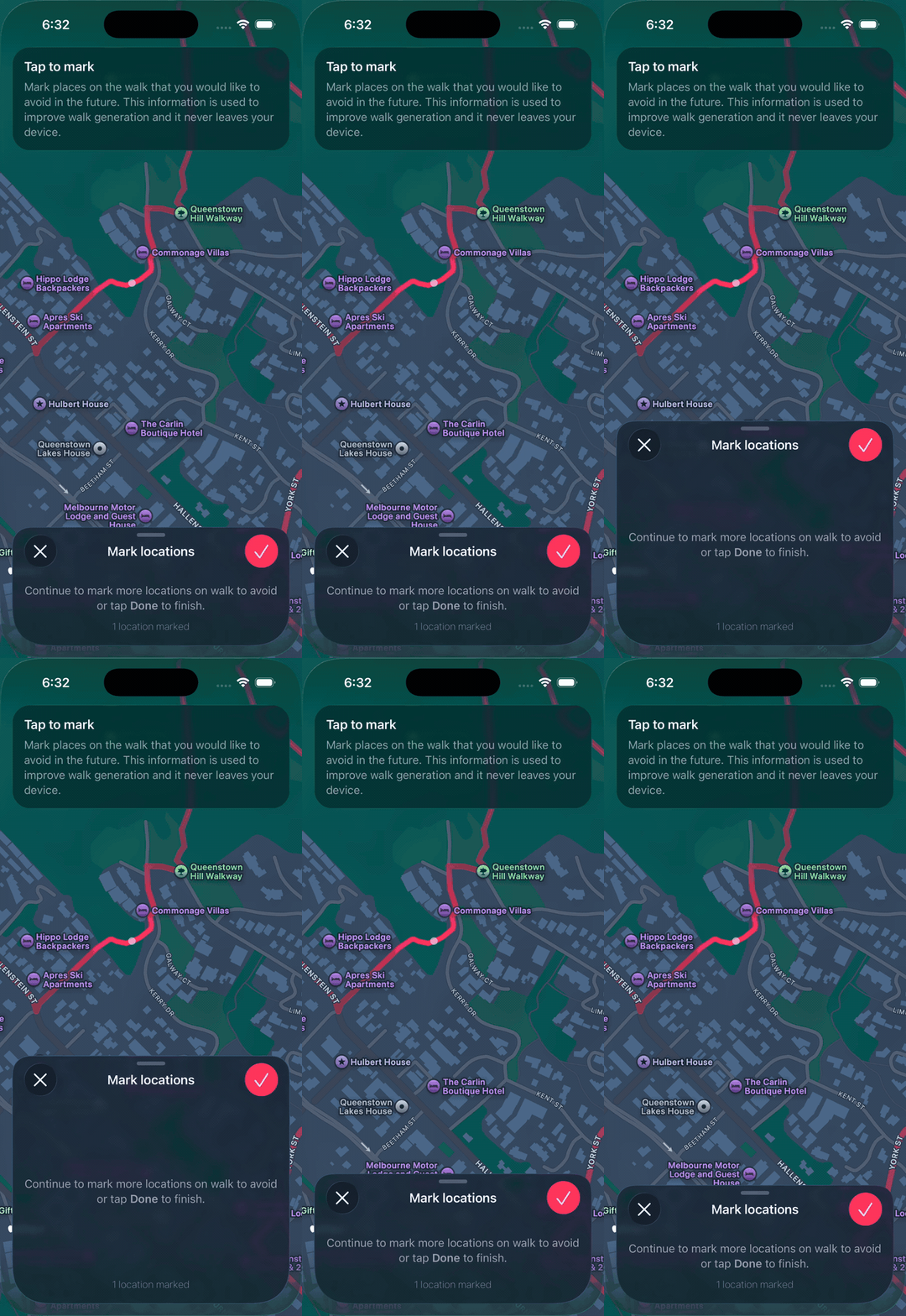
After resolving the selected detent, the layout stores the settled height and origin in the cache created with makeCache(subviews:). The important part is that updateCache(_:subviews:) does nothing while a drag is in progress, preserving those settled measurements for the duration of the gesture.
struct PanelPlacementLayoutCache {
    var hasSettledMetrics = false
    var settledAvailableHeight: CGFloat = 0
    var settledOrigin = CGPoint.zero
    var settledHeight: CGFloat?
}

extension PanelPlacementLayout {
    func makeCache(
        subviews: Subviews
    ) -> PanelPlacementLayoutCache {
        PanelPlacementLayoutCache()
    }

    func updateCache(
        _ cache: inout PanelPlacementLayoutCache,
        subviews: Subviews
    ) {
        guard !isDragging else { return }
        cache = makeCache(subviews: subviews)
    }
}
During a vertical drag, the layout applies the gesture translation to the preserved values without measuring the content again or calling intendedHeight(). As placeSubviews(in:proposal:subviews:cache:) resolves the placement, it stores the latest settled values in the cache, but only while the panel is not being dragged.
if !isDragging {
    cache.hasSettledMetrics = true
    cache.settledPanelBounds = panelBounds
    cache.settledAvailableHeight = availableHeight
    cache.settledOrigin = origin
    cache.settledHeight = resolvedHeight
    cache.settledBackgroundRect = backgroundRect
}
Outside a drag, each update starts with a new empty cache, which we populate for the next potential drag. Caching the resolved size is critical while handling the gesture because it prevents the panel from jumping in size, especially when using an adaptive detent or adaptively sized content.
When the drag gesture ends, its onEnded(_:) closure uses predictedEndTranslation to account for the drag velocity and choose the next detent. Updating the selected detent invalidates the custom layout, which runs again and places the panel at the new target height. Dragging below the smallest detent dismisses the panel unless the content has applied panelInteractiveDismissDisabled().
# Using the panel across Strolly
Each flow can choose detents and interaction behavior without implementing its own adaptive container. For example, the area preferences panel starts at an adaptive height and can be expanded to the medium detent.
.panel(isPresented: $showAreaPreferences) {
    AreaPreferenceSheetContent()
        .panelDetents([.adaptive, .medium])
}
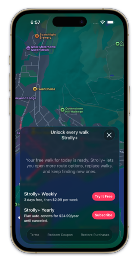
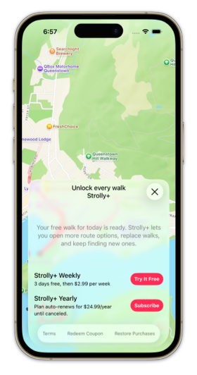
Other panels use a single adaptive detent, bind their current selection for programmatic control, hide the drag indicator or disable interactive dismissal while a required onboarding step is in progress. Each configuration modifier writes a preference, allowing the same API to work with both the bottom and edge-aligned presentations.
Building a custom presentation means taking responsibility for behavior that a system sheet normally provides, including layout, safe areas, gestures and animation. For Strolly, that tradeoff gives us one presentation model across device rotations and wider layouts while preserving interaction with the map.
By keeping the API close to SwiftUI's sheet API, we should be able to migrate back to a native presentation if Apple provides one that supports resizable iPhone layouts in the future.
Deepen your understanding of SwiftUI!$35
The essential guide to SwiftUI core concepts and APIs
SwiftUI Fundamentals
- Explore the key APIs and design patterns that form the foundation of SwiftUI
- Develop a deep, practical understanding of how SwiftUI works under the hood
- Learn from a former Apple engineer who worked on widely used SwiftUI APIs
Deepen your understanding of SwiftUI!
The essential guide to SwiftUI core concepts and APIs
SwiftUI Fundamentals